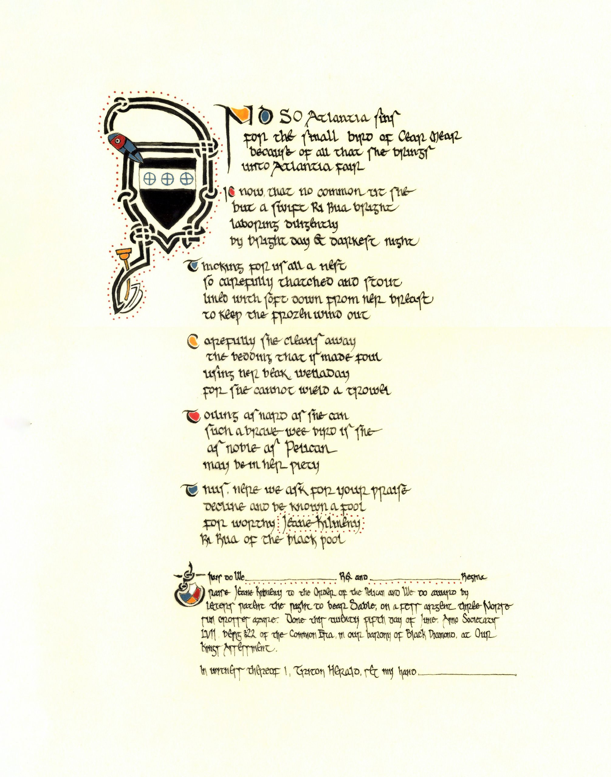
Scroll for Jeane Kilmeny’s Pelican elevation. Design, calligraphy, and illumination by Bran Mydwynter. Wordifying by Ruaidhri An Cu. Presented at King’s Assessment, 25 June 2022.
I was so, so honored to be asked to create the scroll for Jeane Kilmeny’s elevation. Not only do I know how much work she pours into the Society, but I know how much it means to receive a personalized scroll, and even more so one which represents an “early period” place and time. It was a delight to be given a chance to deliver something designed specifically for her.
Scroll text by Ruaidhri An Cu:
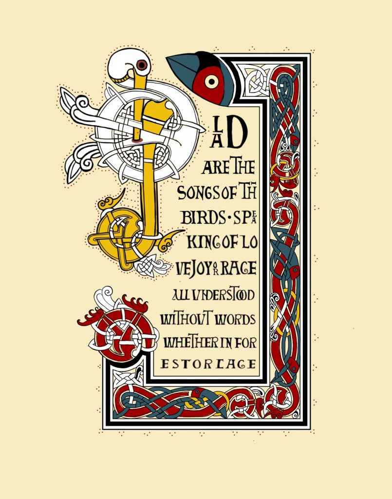
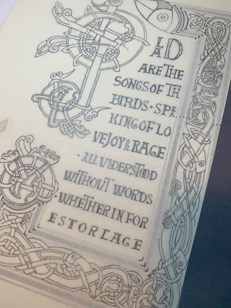
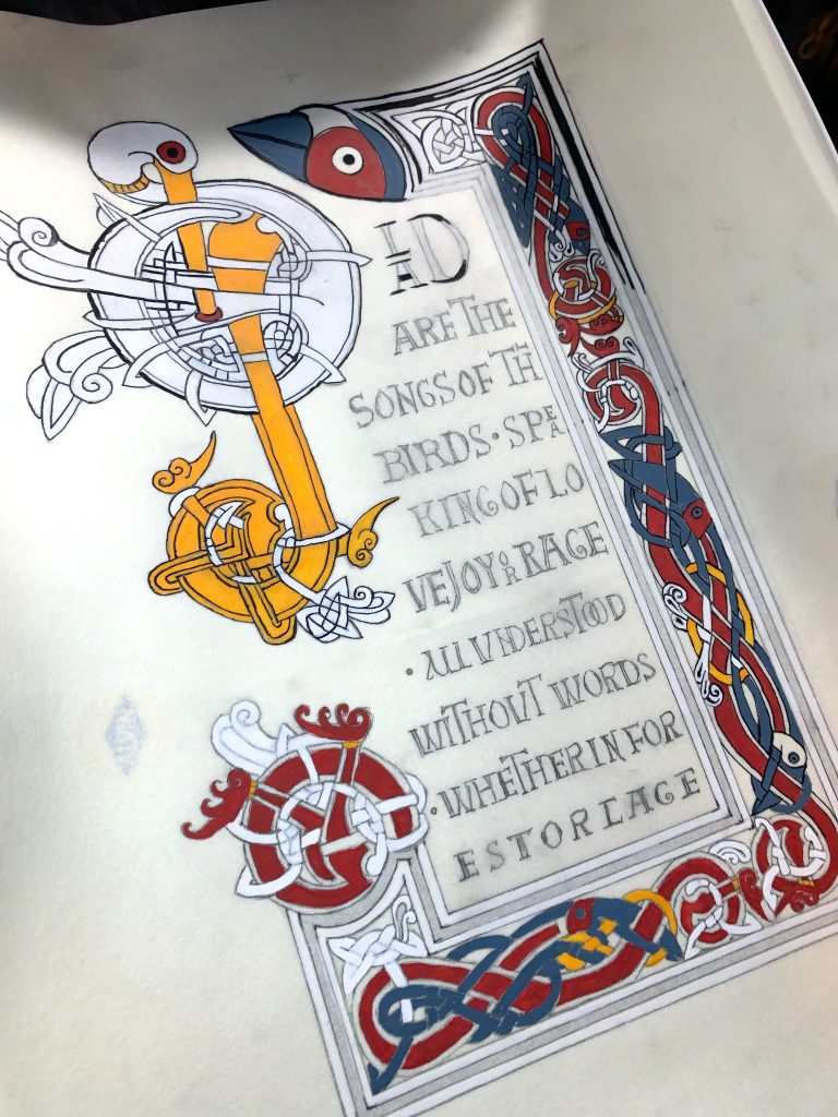
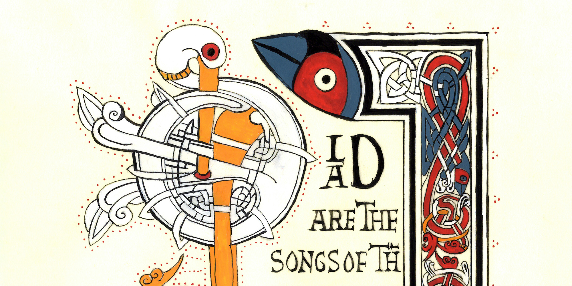
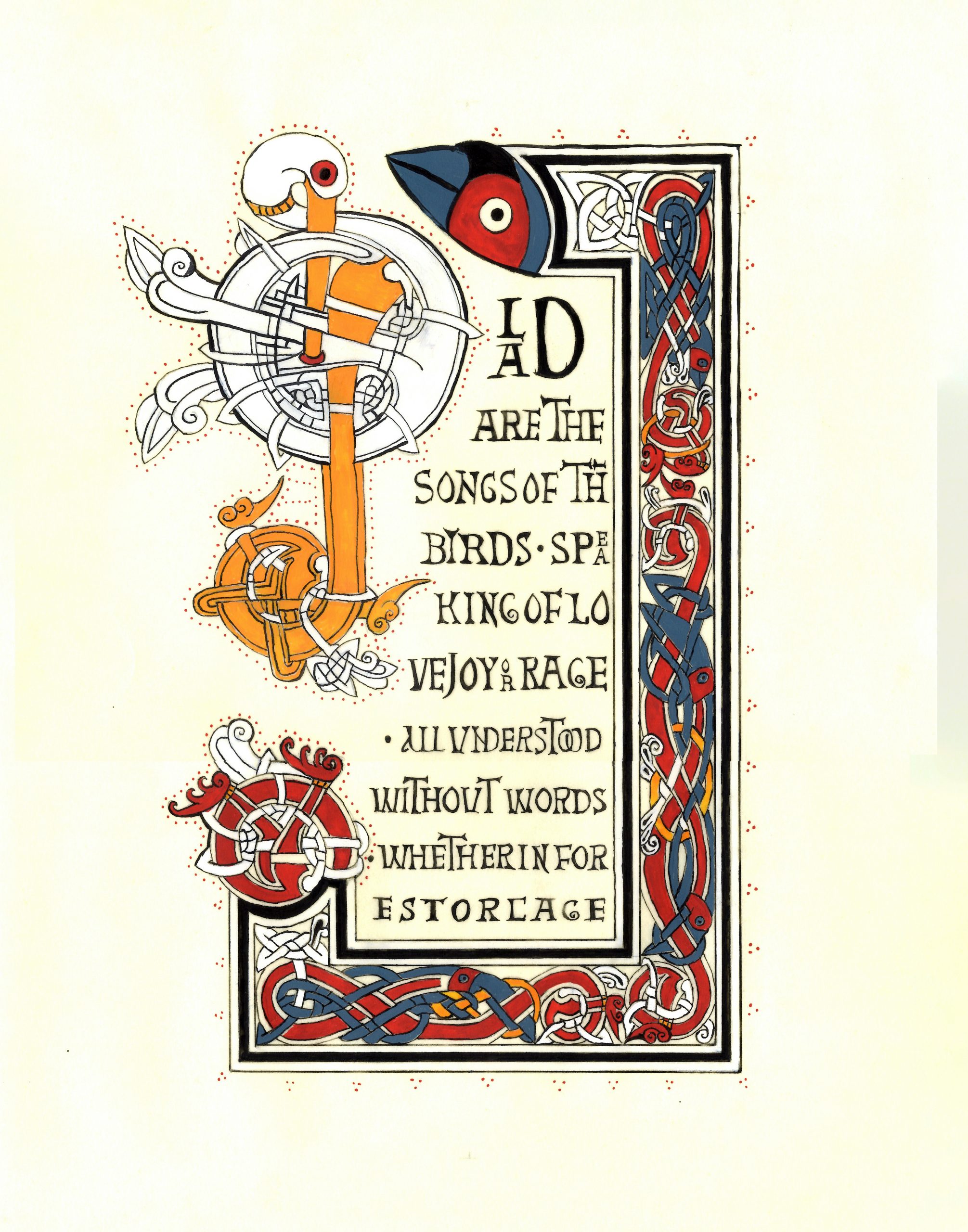
Glad are the songs of the birds
Speaking of love, joy, or rage
All understood without words
Whether in forest or cage
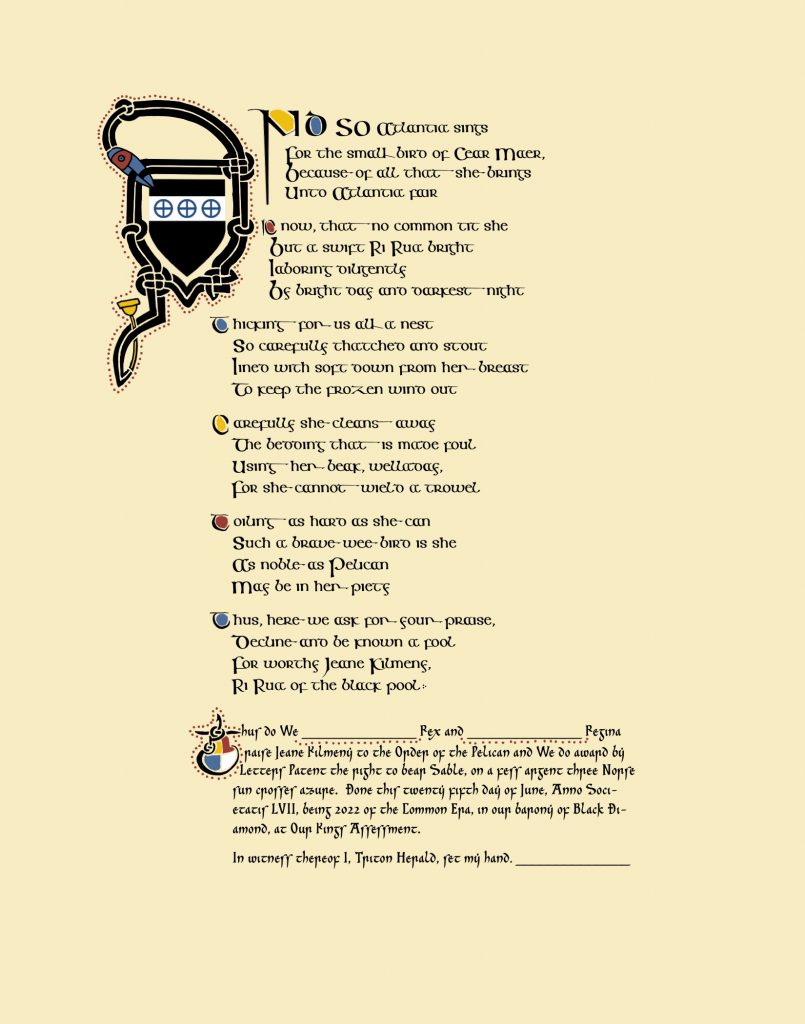
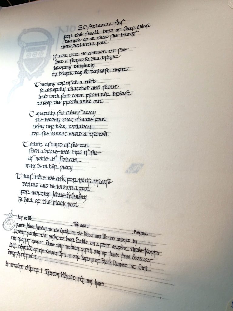
And so Atlantia sings
For the small bird of Cear Maer,
Because of all that she brings
Unto Atlantia fair
Know, that no common tit she
But a swift Ri Rua bright
Laboring diligently
By bright day and darkest night
Thicking for us all a nest
So carefully thatched and stout
Lined with soft down from her breast
To keep the frozen wind out
Carefully she cleans away
The bedding that is made foul
Using her beak, welladay,
For she cannot wield a trowel
Toiling as hard as she can
Such a brave wee bird is she
As noble as Pelican
May be in her piety
Thus, here we ask for your praise,
Decline and be known a fool
For worthy Jeane Kilmeny,
Ri Rua of the black pool.
Thus do We _________ Rex and _________ Regina raise Jeane Kilmeny to the Order of the Pelican and We do award by Letters Patent the right to bear Sable, on a fess argent three Norse sun crosses azure. Done this twenty fifth day of June, Anno Societatis LVII, being 2022 of the Common Era, in our barony of Black Diamond, at Our Kings Assessment.
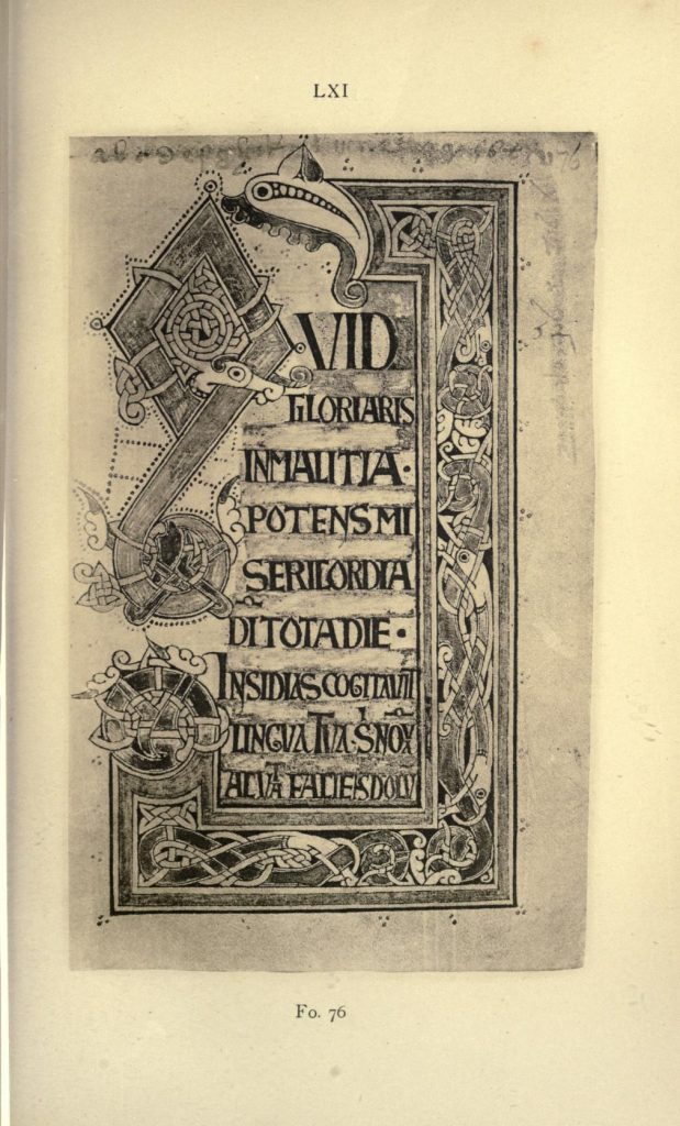
When I was given the brief—11th century Dublin Norse/Irish—at first I forgot about the Ricemarch Psalter, thinking instead about the Danish-English blend of the Winchcombe Psalter. But I really needed something in the Irish tradition, because it very much matters, so I turned my thoughts to the manuscripts available at Irish Script on Screen. I found a few extras there, but nothing solid.
Luckily, I have a spreadsheet of Insular mss for just this sort of occasion. And it woke me up.

The Ricemarch Psalter (aka Rycymarch Psalter) was created in Wales in approximately 1079 for Ricemarch/Rycymarch/Rhygyfarch the Wise, bishop of St David’s at the time. This is later than the most popular time period of Irish Insular mss, which is around 600 to around 900. (If you think of the Book of Kells, by far the most popular Insular manuscript, this happens nearly three hundred years later.) In spite of being created in Wales, the scribes used various Irish exemplars for their texts, as well as nearly-identical scribal abbreviations; Wales is deeply connected to the Irish style of Christianity, which had been emanating via missionaries from Ireland since the end of the Roman period.
Insular art styles between the islands and the continent had had generations to trade back and forth and influence each other. Viking settlers had been on the islands for three centuries at this point—they first landed around the time of the Book of Kells, as a matter of fact—and the Normans were doing their thing over in England, and the Franks had been integrating Insular styles for centuries, brought over with those same aforementioned Irish missionaries.
Everybody was talking to everyone else.
Now unfortunately, at this current moment there is no high-quality scan of this manuscript. Trinity College Dublin (which holds the ms) would have photographed specific pages for me for a fee, but given the time constraints as well as how many pages I’d want to look at, I tabled that option for the moment, and decided to make do with a 1914 facsimile version uploaded onto archive.org.
This isn’t the first time I’d wanted to look at this manuscript, however, so I’m sure the dude who emailed me from TCD has only been given a brief reprieve from my requests, not a full stay. I really want to interrogate this manuscript.
Anyway.
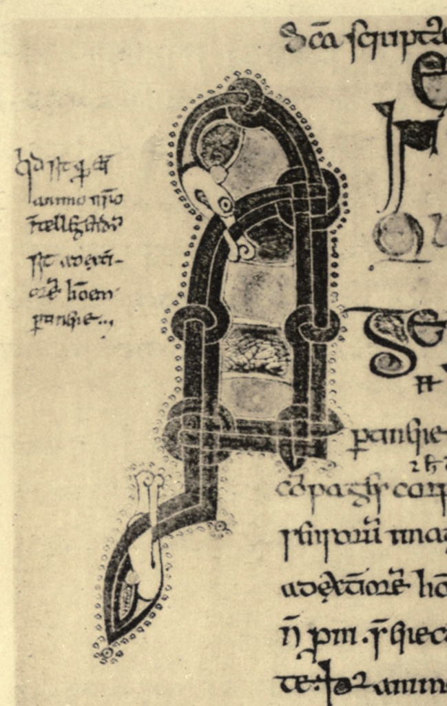
the illustration page
Given the lack of pelicans and lack of large G initials in this Psalter, I needed to create one.
I grabbed the top of the existing monogram abbreviation “domine” (…ex audio rationem), and combined it with a horizontally-flipped tail from the “q” in “quid gloriaris”. I swapped out the dog-like figure from the original, and turned it into a pelican’s head, interlacing its beak down into its body, and replaced the feet with wings. The feather design I stole from a few of the intermediate initials of the manuscript which seemed to be depicting birds. The angle of the neck was also suggested by one of the bird-like, bird-ish, bird-kinda figures.
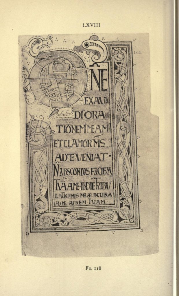
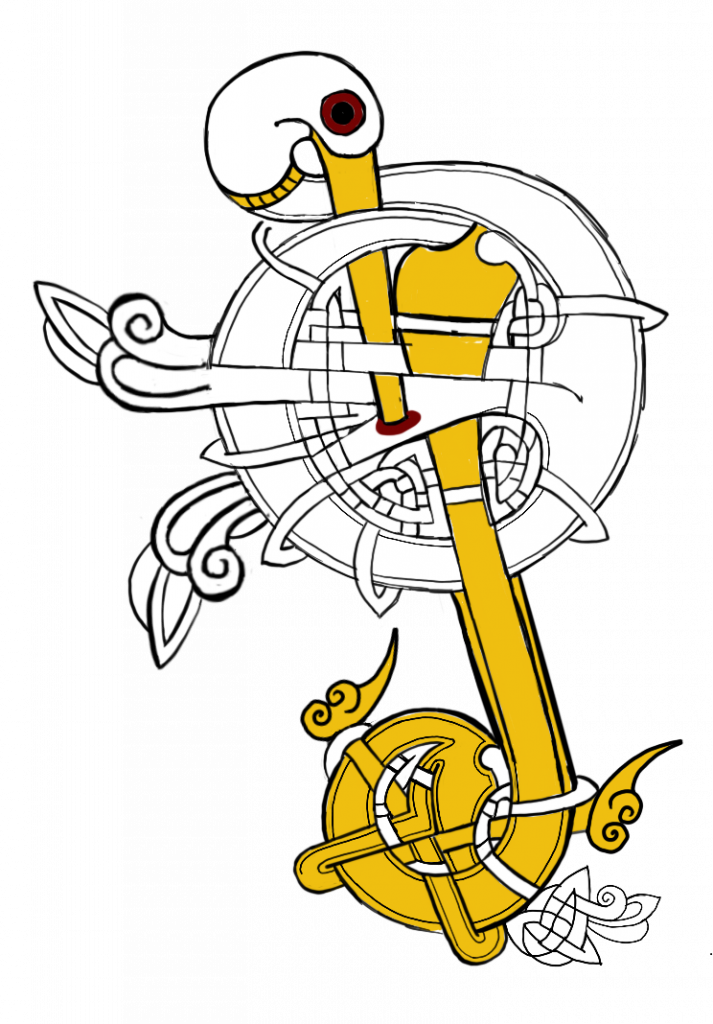
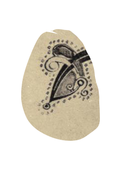
Deciding on a color palette barely required any decision at all. It was already set out for me by heraldic necessity that the pelican of the main initial needed to be white, with yellow beak and feet, with red blood spilled from its breast to feed its young. (Because historically baby pelicans were determined to drink blood in the same way that Indian Swamp Adders drink milk, which is to say: 😵💫 💯🤷♂️👍) Kilmeny’s arms contain black, white, and blue. So black, white, yellow, red, and blue seemed to be the logical choice.
“wyd, boo”
-me, repeatedly, to a late-11th century Welsh scribe
This is not my first rodeo with interlace.
Not by a long shot
Back in college my friends and I drew interlace for entertainment and Celtic Pagan Spirituality Bonus Points, and I thoroughly enjoyed it…until 2003, when I discovered La Tene-style spiralwork and it fully took over my brain, kicking interlace to the curb. So while I don’t make it for idle amusement anymore, interlace and I have history.
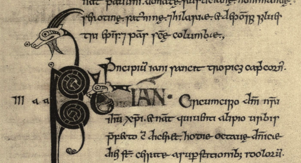
In working on the border and initial for the fully-illuminated lefthand page, I ran into some weird sections that didn’t parse well. And then it happened again. And again. Whether the monk made a mistake (probably not) or it was an artefact of the low-quality reproduction (much more likely) the result was the same: the interlace is very tight, almost checkboard-like, and I had to trace, test, and fix all of it before I could figure out what line—and therefore what color—went with what. It was…quite an absorbing riddle. As tracing interlace is meant to be.
the main text
The Ricemarch Psalter’s text was penned by at least two different scribes, one of whom used a fascinating (and, I feel, rather lovely) combination between a set minuscule and a cursive minuscule, combining the formality, roundness, serifs, and some of the lightness of a set minuscule with the letterspacing and tall ‘s’ of a cursive.It’s not even remotely rare for Insular scribes to play with letterforms (<–understatement), and the scribe had a propensity toward drama with the crossbar of the ‘e’ which suits my hand particularly well, so I just delighted in the ductus and got on with it.
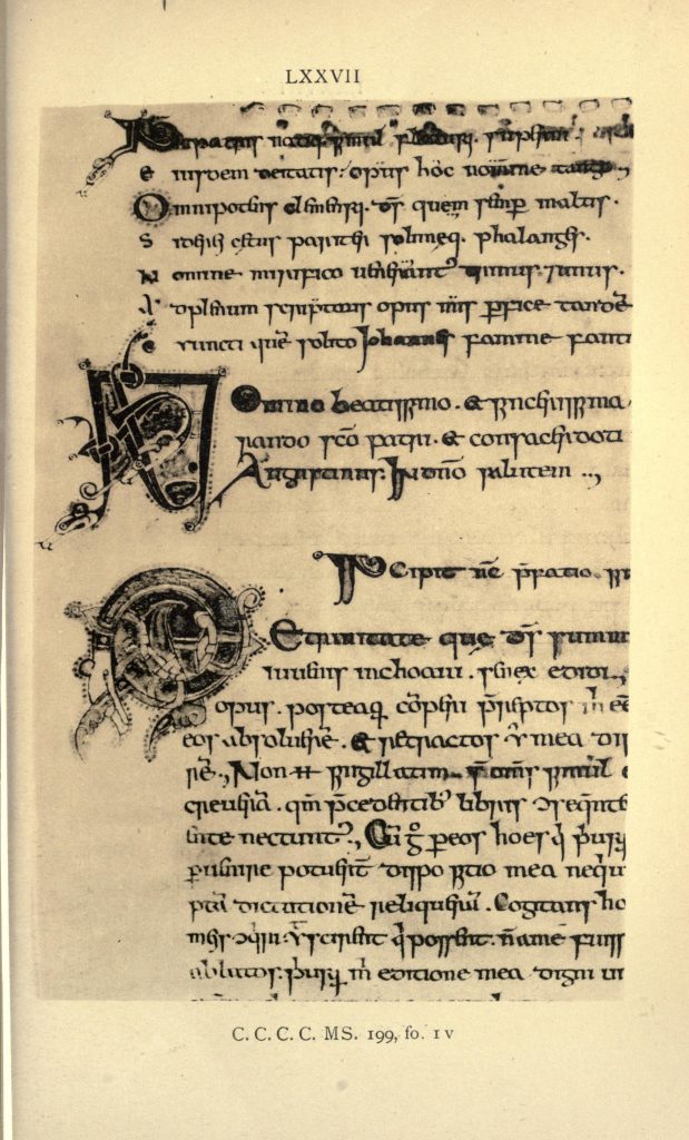
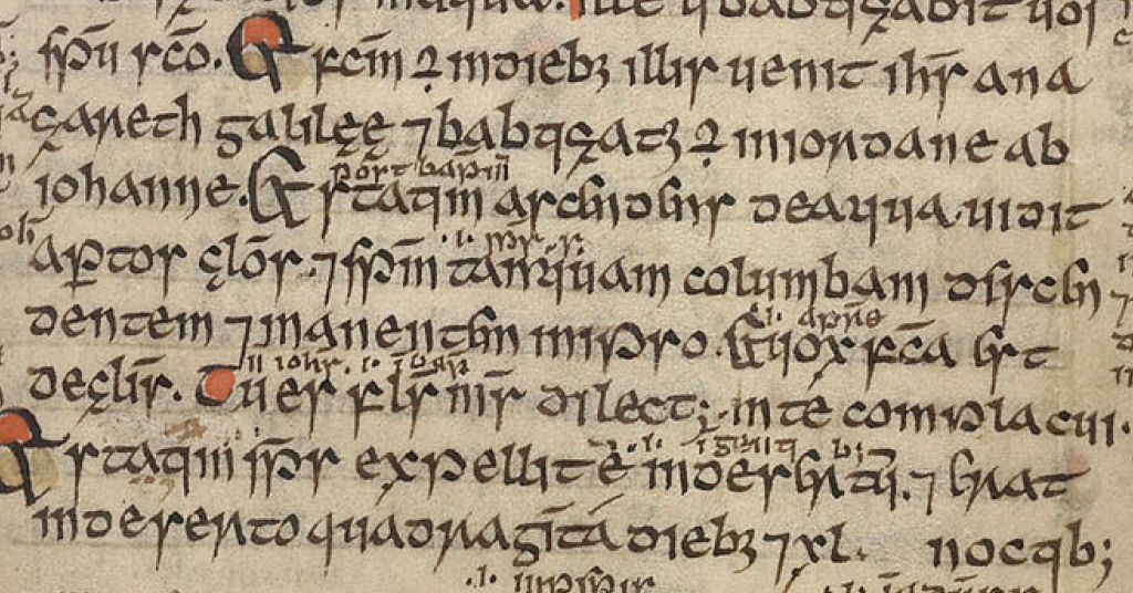
Because all I had was the 100-year-old scans to inform the paint on the text page, and because I was going to need a few more initials for the layout of this scroll, I gleaned a little more information from two supplemental late 11th/early 12th century manuscripts: the Psalter of St Caimín (University College Dublin MS A 1) and the Liber Hymnorum (University College Dublin MS A 2).
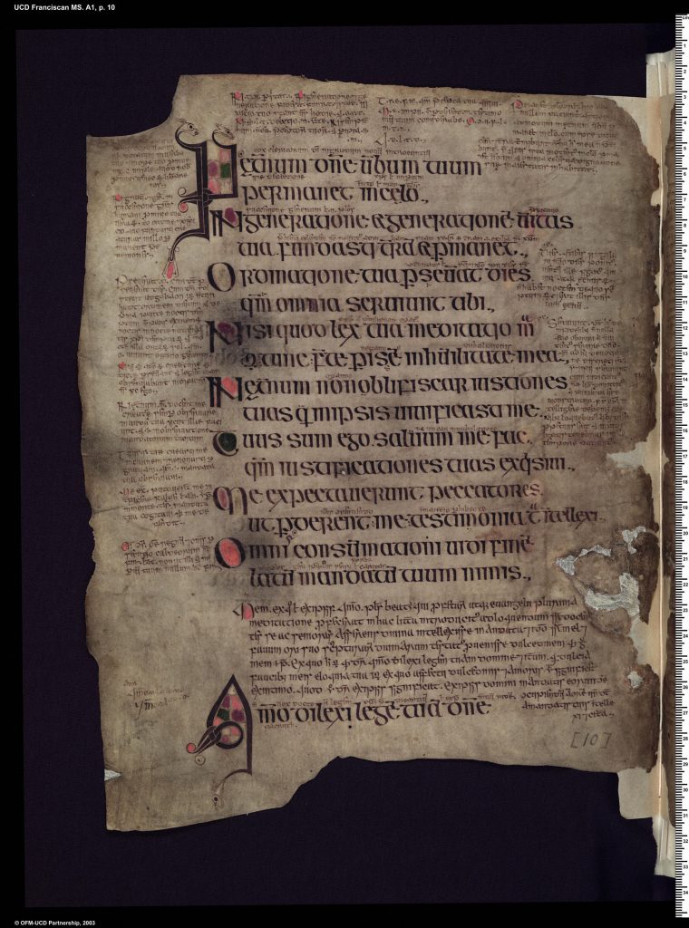
All three of these manuscripts have very similar styles to their intermediate-sized initials, so when I needed one to kick off the text page, that’s what mine had to be as well. The initial I used just happens to also be from the Ricemarch, since it needed to easily hold a shield and look like a bird, but it just as well could have come from one of the other two.
When I needed a very small initial for the final block of small print, I knew I could simply grab it from one of these three manuscripts, and it would work great. And when I needed to know how to treat the initials in the margins, I could refer to any of the three as well.
I really appreciate how similar in style all of these manuscripts are. It forms the basis of a really solid and coherent moment in art historical space and time.
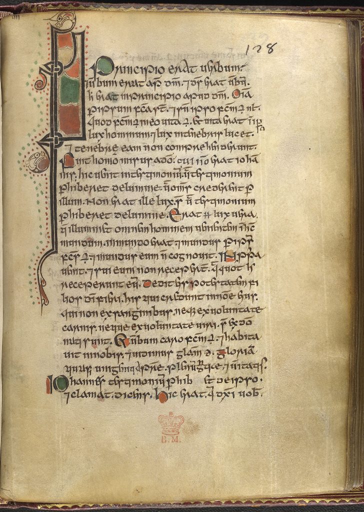
the small print
Insular scripts often had a sort of graded hierarchy, leading from uncial to half uncial to a variety of minuscules, with many stops and fusions in between. These grades started off being about the importance of the text, with uncial meaning “very important” and cursive minuscule meaning “whatever, get it done”, but over time the use of scripts becomes more about the function of the text within the page itself, much as we designers use different fonts today. Which is helpful for us.
And by us, I mean me.
As you can see from both the Psalter of St Caimín and the Liber Hymnorum above, scribes at this point frequently mixed scripts throughout their pages, for semantic and visual effect. I always think of the last paragraph of a scroll as the “fine print” section, the section where the business gets done. Accordingly, I switched scripts.
My clearest example of a relevant cursive minuscule came from the Gospels of Mael Brigte, a gospel book from ca1138/1139 Ireland. It’s a lot more pointed than the script above, with sharp descenders on letters like i, l, m, and n, owing to this scripts relative informality and utility. If you want fine print, something literally small with the soul of a scribe taking notes, you can’t do much better.
This scroll comprises two 11″x14″ sheets of perg, done in Noodler’s Black and a handful of M. Graham gouache paints, with Rosemary and Co. brushes and various Brause pens, created with joy and congratulations.
I hope it does her, and her great accomplishment, honor.