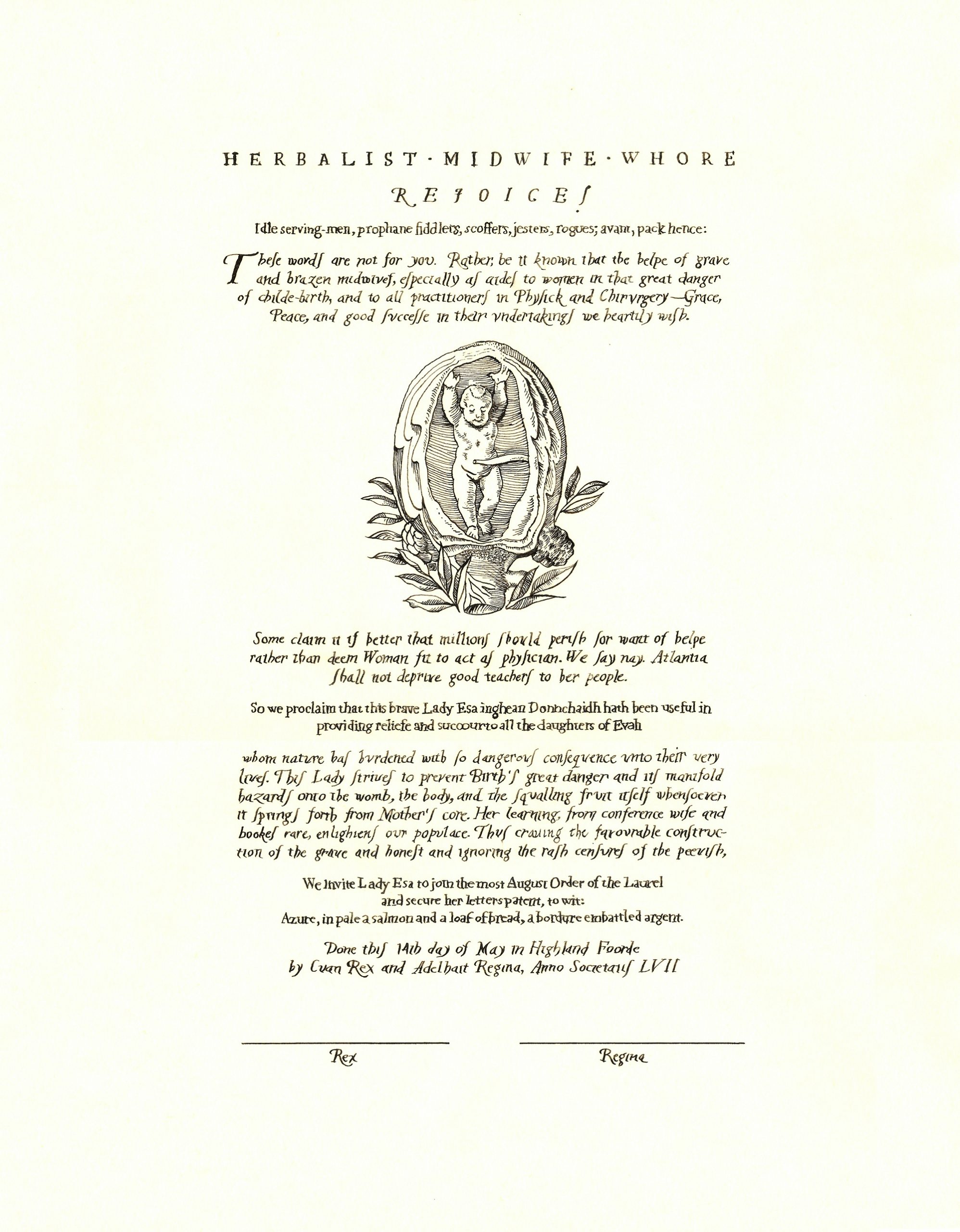
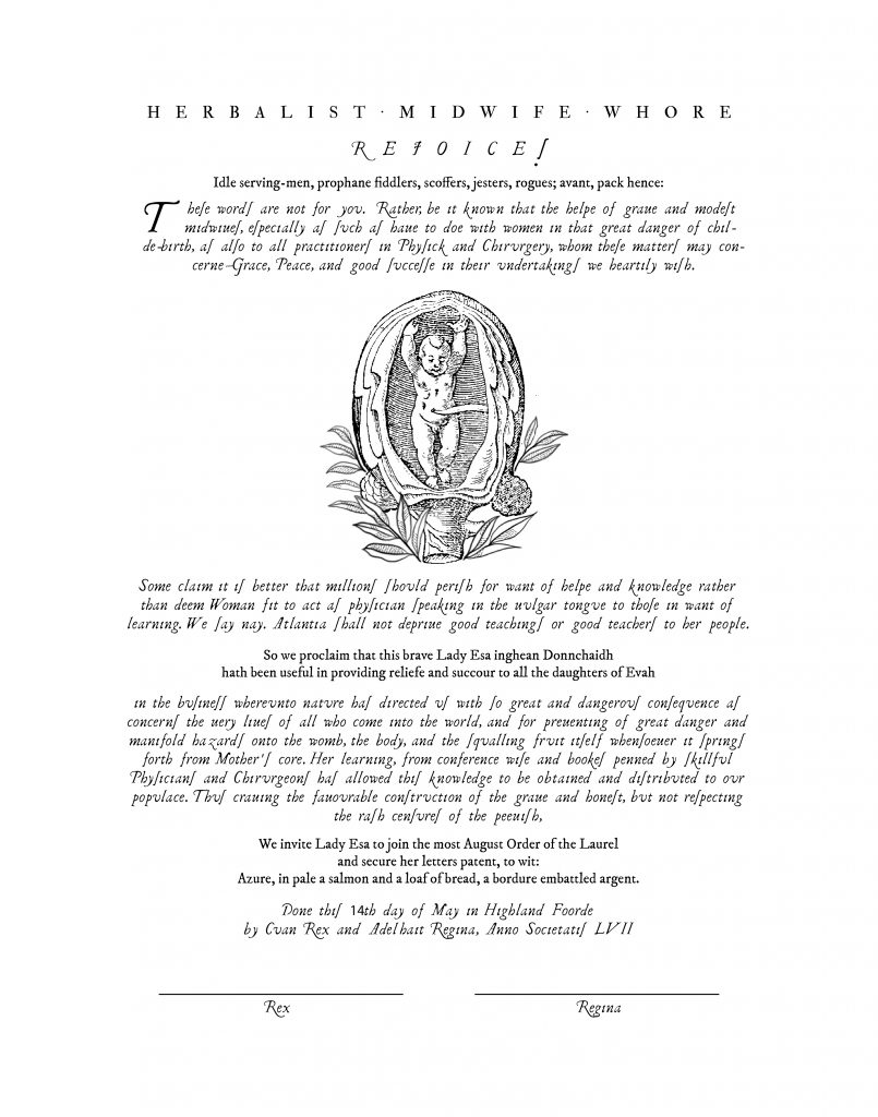
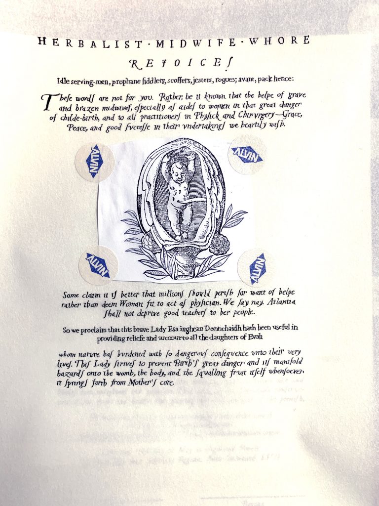
Laurel promissory scroll for Esa inghean Donnchaidh. Words by Lanea inghean Uí Chiaragáin; design, art, and calligraphy by me.
There is a particular episode of the show Leverage where the “hacker” turns to “forger”. I thought of that episode a lot when I was working on this scroll.
In the show, the character uses a computer to replicate the typeface he needs, and now I have experienced why: forgers train for a long time in order to do their work.
I had three days.
DAY ZERO
Day zero was prep day.
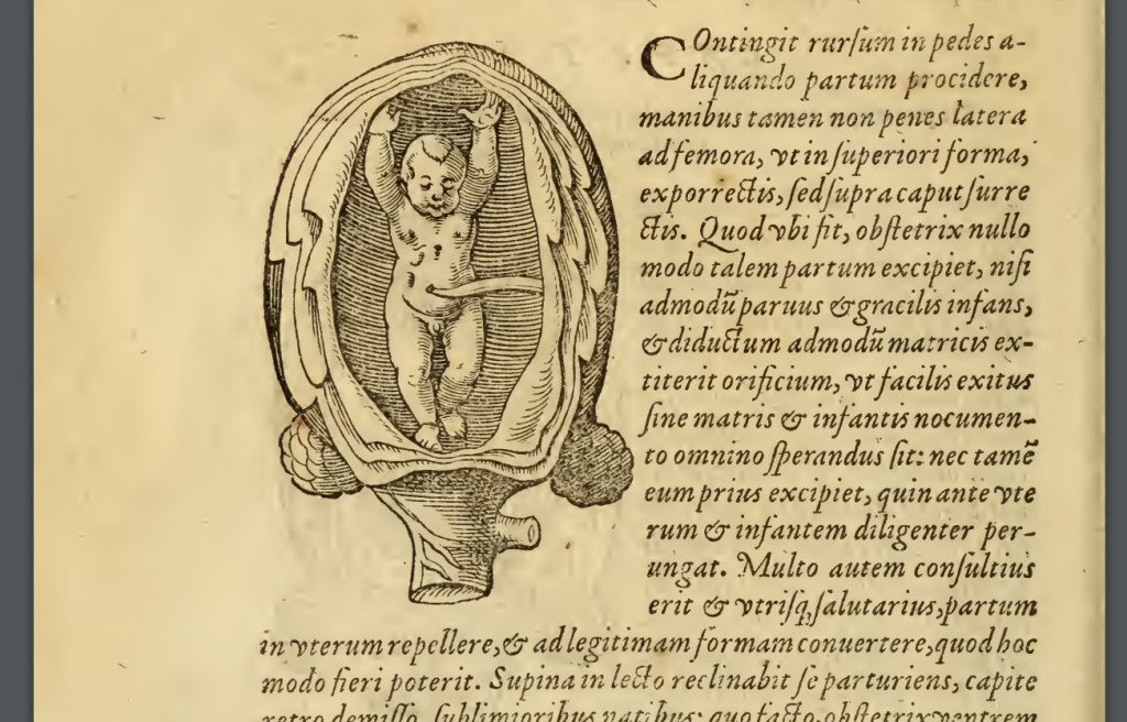
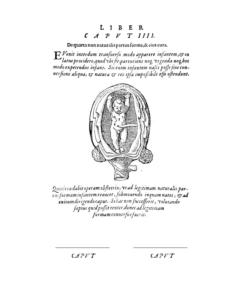
Esa’s scholarly focus is “The Medieval Gynecologist”. In her In Case of Peerage document she had expressed an interest in Jakob Reuff’s 1554 “The Expert Midwife”, and since we found out she was scheduled to be elevated with two weeks’ notice, this seemed to me (and my frequent partner in scroll-crimes Kolfinna Valravn) to be the best direction to sprint in.
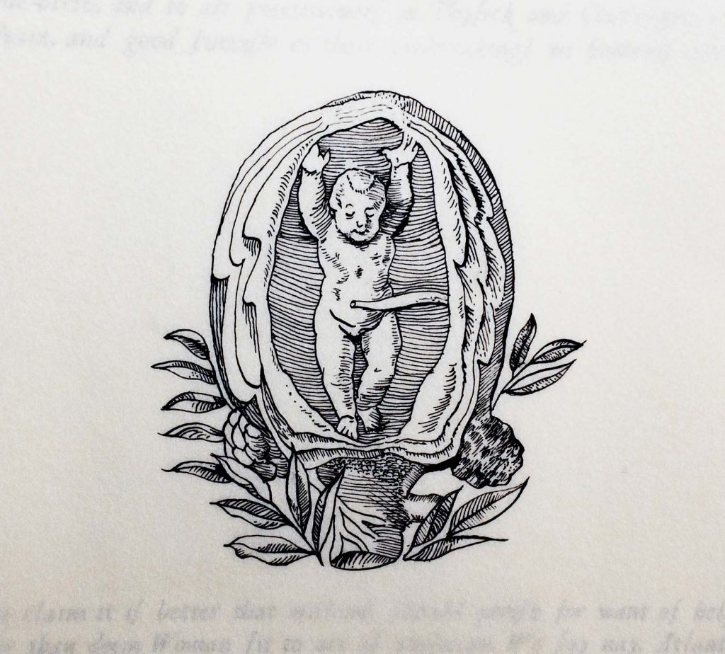
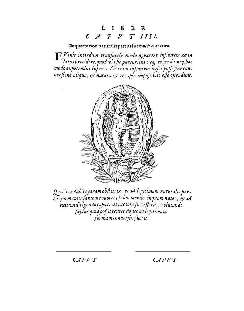
While Lanea was working on the text, I found a 1580 version of Reuff’s work, complete with graceful page layout and lovely illustrations. So I started there. About a third of the way in begins a series of pages describing the gestation process, including an illustration that looked like the bebé was raising the roof in celebration. (Please pronounce that in your head like Moira Rose. I certainly did.) I stole that illustration, but placed it within a page which had a layout I thought more helpful for our scroll.
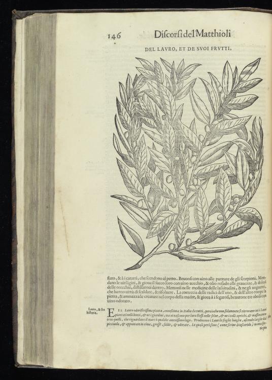
Around the cabbage-womb I arranged laurel leaves partially inspired by those found in Pietro Andrea Matthioli’s 1568 “I discorsi…”, his commentary on Discorides’ de materia medica, illustrated by Giorgio Liberale. I say “partially”, because the scale and media of these two illustrations are quite different—the originals are woodcuts—so I needed to simplify. Regardless, it’s almost always helpful to see how another illustrator handles turning a three-dimensional subject into a two-dimensional one.
One upside to developing a scroll concurrent with the writer is the words can affect the layout and vice versa, so while Lanea was working I could dynamically update my file until we both reached equilibrium.
I got started in earnest the next day.
DAY ONE
Someday I’d like to set up a printing press, and in the future I’d like to experiment with woodcuts and perhaps etchings, but for the moment this scroll needed to be pen and ink.
Usually I start with the calligraphy before I do any painting. But this time I really wanted to tackle the illustration before anything else, because I deemed the bebé the element most likely to stray into unfixable territory (and therefore trigger a do-over). It’s been a long while since I’d done any pen-and-ink work. I didn’t bother sketching it out ahead of time; I figured I could roll with any minor issues, and if the issue was too big I’d just start over. Efficiency was key. I got out my favourite crowquill nib and a bottle of Noodler’s black and got to work.
And the result feels inhabited in a way I rather like, with a bit more contrast to the figure, and a bit more dynamism given the difference in style between mine and the original artist’s.
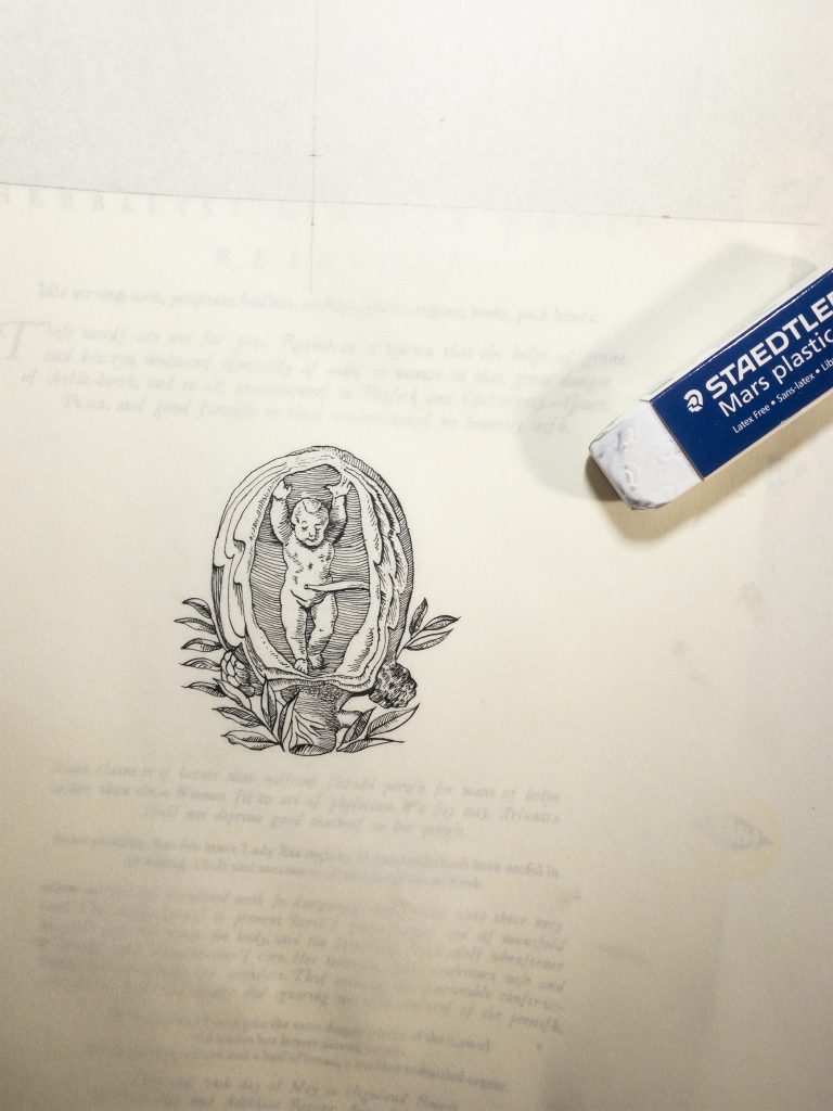
I also made the bebé a girl. The too-universal concept of “default male” is nonsense, a sentiment I felt confident Esa would agree with.
DAY TWO
Not only did I not sketch the illustration before inking, I also attempted my best version of the printed text as-is, without drawing guide lines. With the time constraints, I simply had to get on with it, and I thought that having a clear example to follow would be sufficient.
The title went swimmingly. But that only lulled me into a false sense of ease.
See, I was diagnosed with MS back in 2014. A while back I noticed that my insular minuscule from before my first flare looks entirely different from my insular minuscule after than point. But even now, I still can still look at an example of my calligraphy and think, “that looks like my hand”. My style continues to come through.
So while I was writing the text for this scroll—rather, I should say drawing, for creating this scroll was more like drawing than writing—I felt the distinct sensation of my natural style duking it out with the style of the typeface. Even without having done a “typeface”-style script before, my style still fought to reveal itself. I could feel it with every swash and line.
It was an objectively fascinating experience, I have to say.
Aware of the passing of time, I pressed on, but when 3/4 of the text had passed under my pen, I made the decision to stop for the night. I know from experience that there’s a certain point after which I’m more likely to make a mistake, and I felt that boundary approaching, so I paused while I was ahead.
DAY THREE
The next day progressed largely as before, with the end in sight.
And fortunately, there were no surprises. I crossed the finish line in time to get the scroll in the mail the next morning, so it could safely cross from one end of Atlantia to the other before her elevation.
LESSONS
I’m proud of having managed this scroll in only a few days. It’s not an exaggeration to say that this speed is deeply uncharacteristic of me; my usual artistic process proceeds at the rate of weeks rather than days. But I was honored to be able to help out with Esa’s elevation, so it was 1000% worth the stretch.
As for the result, when I made the decision to attempt to replicate the typefaces in the book, I didn’t understand how ambitious I was being. That fact didn’t become clear until I was already knee deep in words.
The next time I work in this style—and I will—I’ll remember I’m not a forger, but a calligrapher. I’ll mark the baselines and construct a script which is based upon the book typeface but which actually fits my hand, so I don’t have to witness my style battling the typeface of the book.
It’ll be a better choice all around, because I’ll not be trying and failing to be a machine. I learned a long time ago it’s usually best to be myself.
Especially with art.