ARTEM FACIAMUS, QUONIAM MOX MORIEMUR (Let us make art, for soon we will die)
Scroll for Kolfinna Valravn’s Laurel elevation. Wordified by Iselda de Narbonne and Ishmael Stedfast Reed, concept, design, and art by me.
Now buckle up your scroll wheel, this is a big boi.
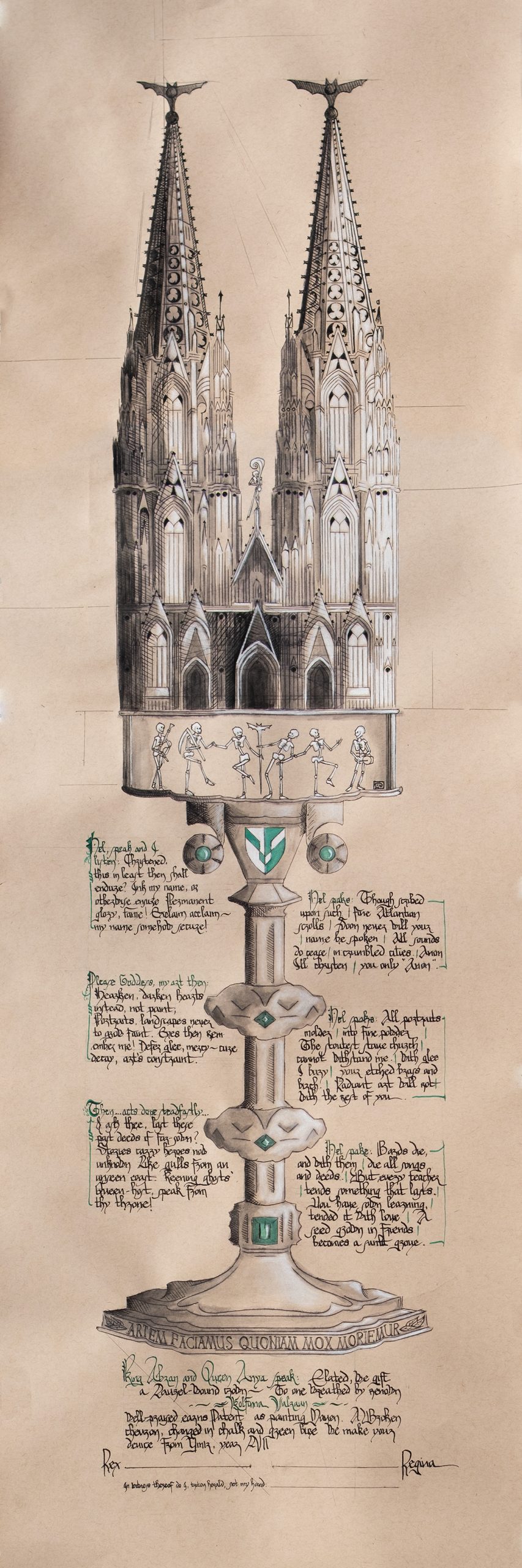
•12″x36″
•Noodler’s Black ink
•Private Reserve “Sherwood” ink
•General’s white charcoal
•Strathmore Toned Tan 80lb paper
•countless episodes of Ted Lasso, on a loop
introduction
A scroll is, at its heart, a gift.
It’s my firm belief that there’s an art to gift-giving. One of my pure joys is to give a gift which acknowledges the soul of the recipient: who they are as a person, the feeling of them, the spirit I witness, the gist of our conversations. I love to capture that essence, and make them feel seen.
When it comes to scrolls, I relish the challenge as an artist to give a gift which captures who they are, while also celebrating their accomplishments and mastery.
Others have seen Kolfinna’s art. I wanted to produce a piece which sees her as a person, too.
the concept
The advantage to making a scroll for someone I’m good friends with is all the insider knowledge.
When I set to planning out this piece, I had a lot of details in my pocket. From previous conversations I knew she liked:
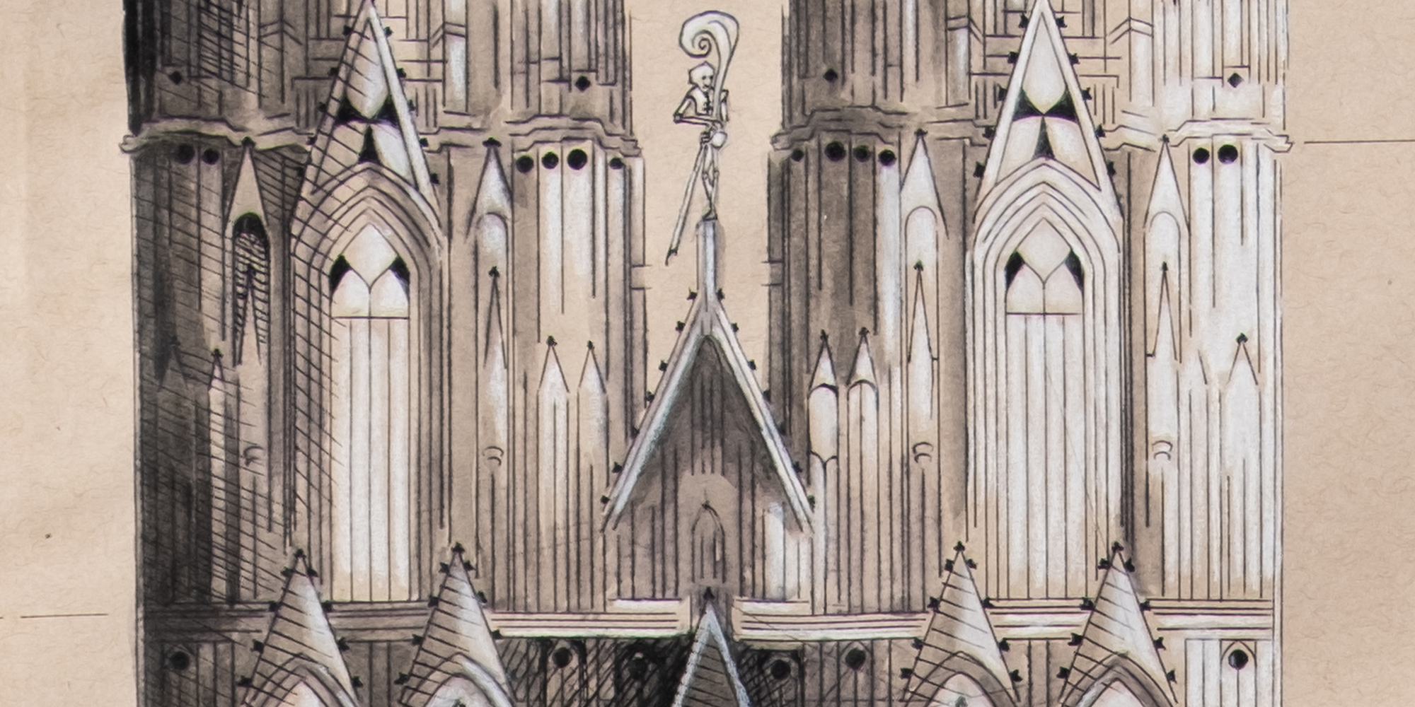
- gothic cathedrals
- the Cologna cathedral in particular
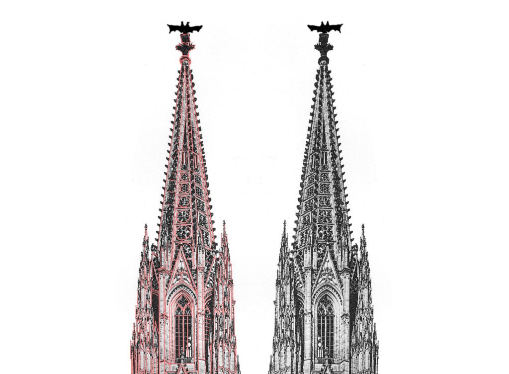
- the knobbly bits (crockets) on cathedrals
- monstrances
- skulls
- bats
I also knew she would be delighted by a concept which meandered off the well-trod path.
The theme for her elevation was the danse macabre, and so almost from the very first time she and I started our “theoretical Laurel scroll” discussions ages ago, I knew that I would be combining as many features from above, and adding in some skelly friends.
And thereby hangs a tale.
“And so, from hour to hour, we ripe and ripe,
Jaques, As You Like It (William Shakespeare)
And then, from hour to hour, we rot and rot;
And thereby hangs a tale.”
churchy
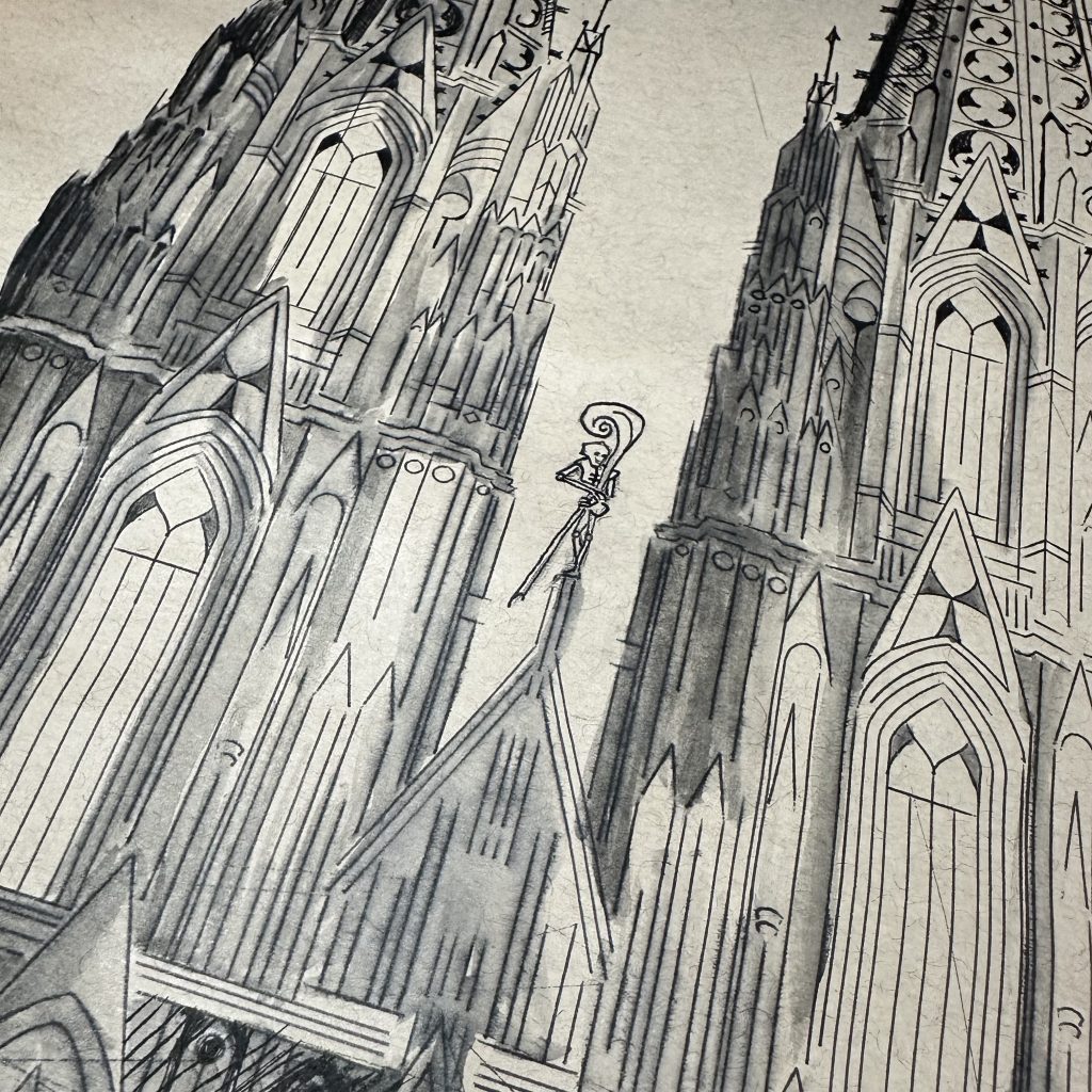
Kolfinna had at some point told me that her favorite cathedral is the Cologne Cathedral. We’d talked about her affinity for the proportions of Gothic architecture, as well as all the knobbly bits (by which I mean the crockets1. Which is a humorous word in itself, but “knobbly bits” is even funnier), so those were features I needed to include.
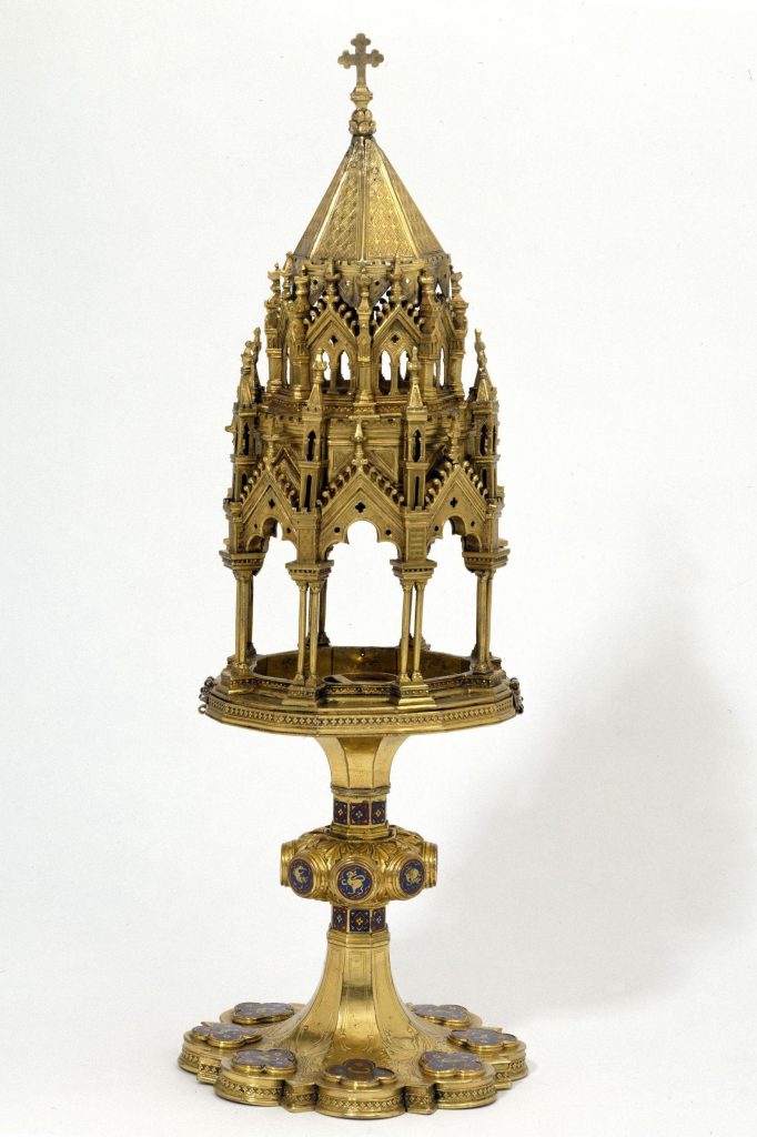
I hadn’t heard of a monstrance before Kolfinna had sent me a link to a few, so I began researching. Immediately I was struck by how often they looked like cathedrals on stems, which made my overall mission clear.
To create the cathedral, I worked both from an engraving from 1911 as well as a photo from its wikipedia page. Both I simply snagged from the Cathedral’s Wikipedia page, but although that made the images low-hanging fruit (so to speak), they were still sufficient for my purpose:
Cologne Cathedral is 515 feet tall2.
The scroll is three feet tall.
I would need…some edits.
(To say the least.)
So I began by creating a simplified representation, rather than a rendering.
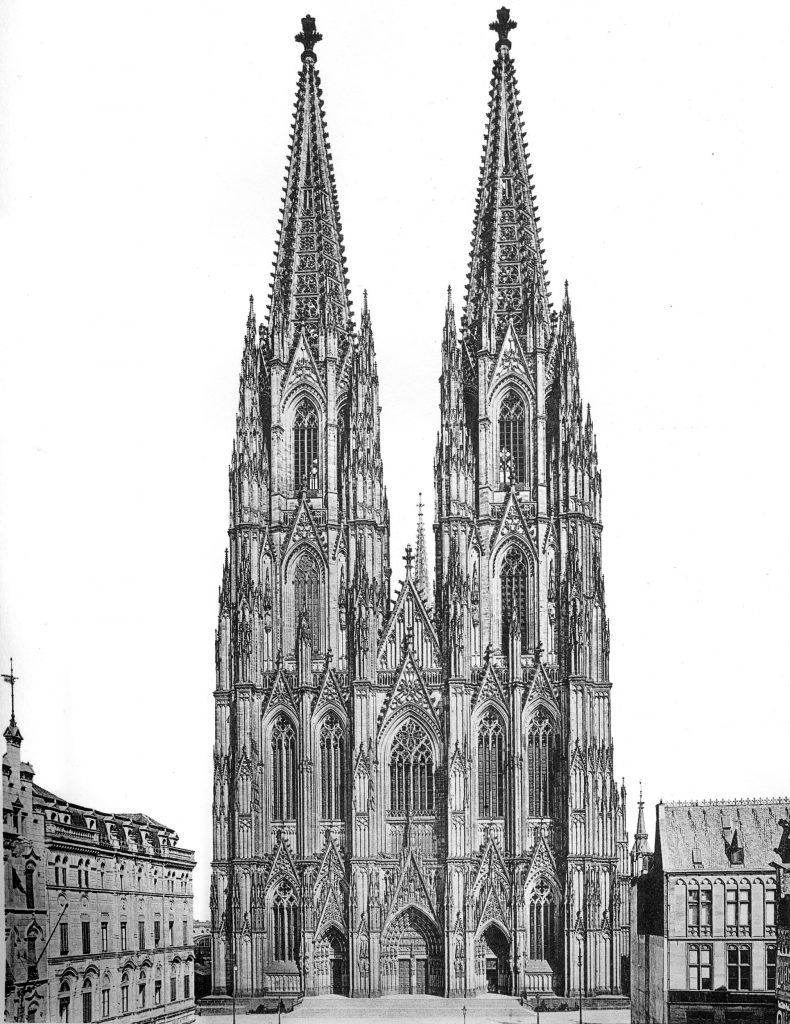
My result is a curation of a cathedral. I planned carefully what to include and what to leave out, and did so at scale so it looked right at actual size.
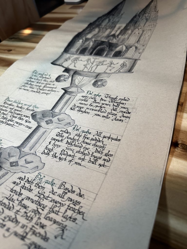
In this early version of the scroll at left, the layout had text spaces stacked on top of each other. The spaces for the host became bubbles in which to house the text, and while the iteration of form was visually interesting, it wasn’t especially practical; I needed a lot more room for writing.
And because the empty space within the cathedral was essentially finite, it would be easier to make more space below.
supportive work
Monstrances were first created in the 13th century to house the consecrated host for display and during liturgical processions3. Once we (Ishmael and Iselda, who were writing the text, and I) decided I needed more space for text, the stem of the monstrance needed to play a larger part. But neither of my preferred objects would work on it’s own; I needed to combine two.
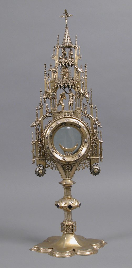
First, the ca. 1450 monstrance at left from Cologne, Germany provided the literal and figurative support. The clean lines of its stem allowed me the space and clean lines around which I could set all the text. It also offered me some natural settings for green gems, tying the architecture of the monstrance to the green of her arms.
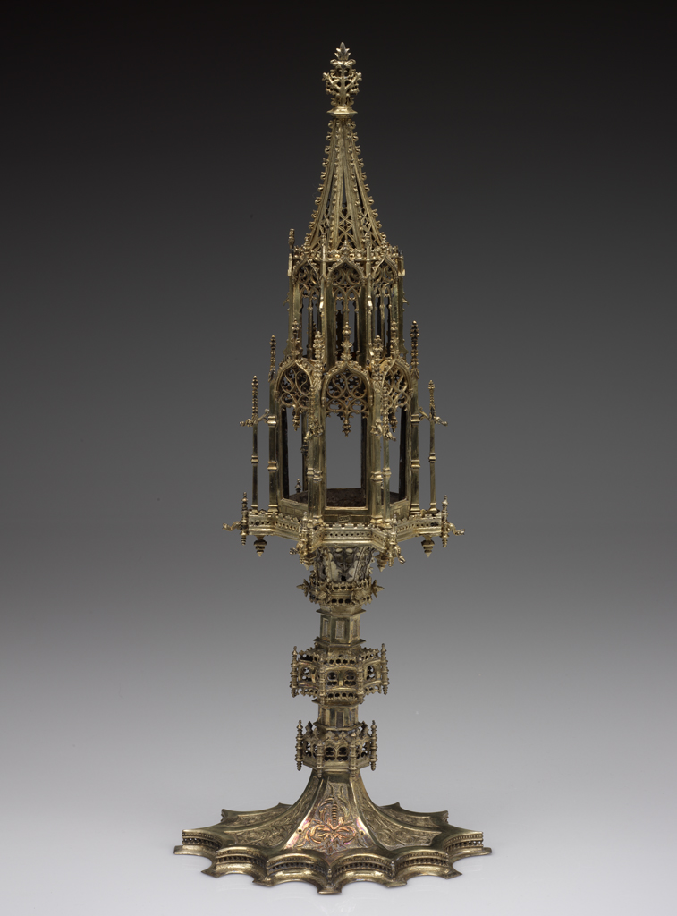
And then the monstrance of the Santa Maria de Belém (Bethleham) gave me a graceful connection with the cathedral. A Dance Macabre would fit easily into the space where enamel figures originally danced, and from there on up the rest of the cathedral could flow.
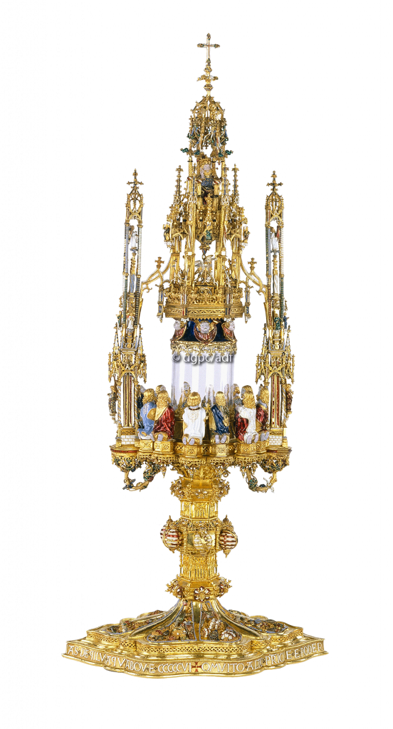
The second monstrance also provided a space for a motto, more of which I’ll discuss later.
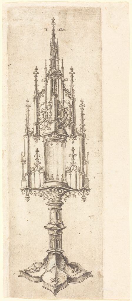
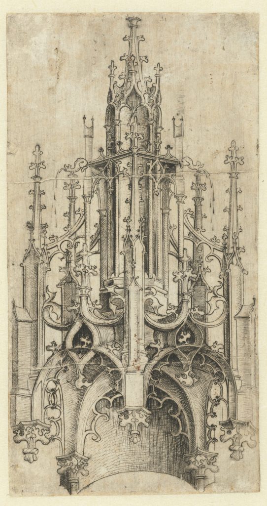
lawks what style
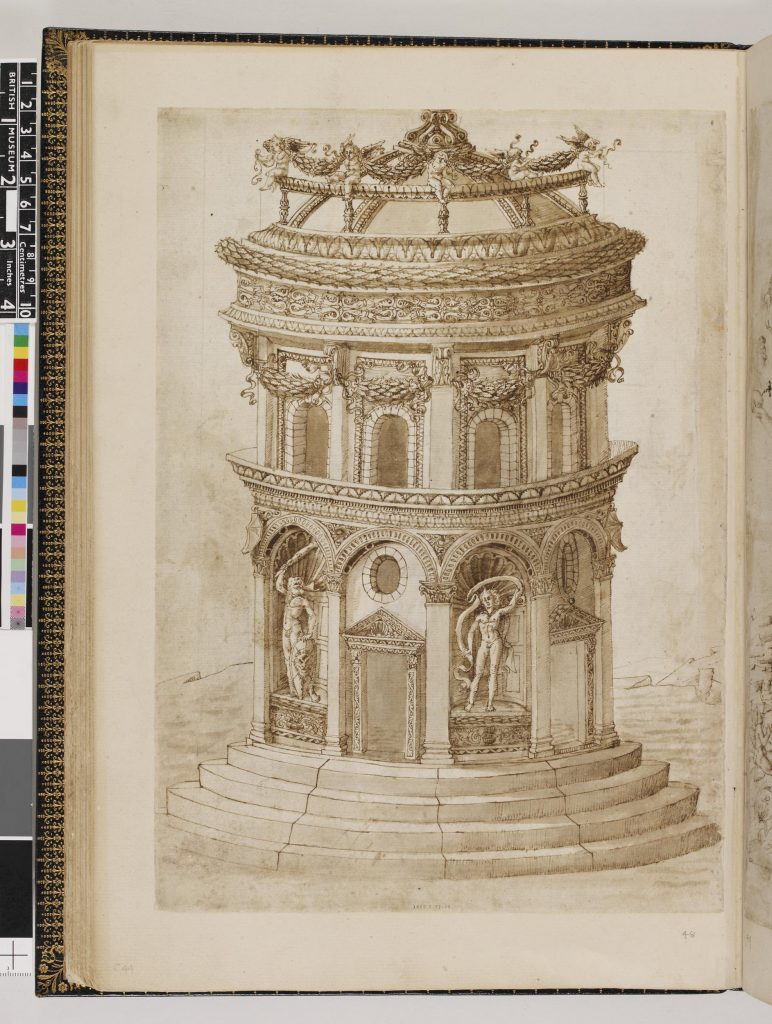
In one of her Pinterest boards, Kolfinna had linked to the engraving of a monstrance at the National Gallery of Art (left-most photo), which referenced a “Master W with the key”4. A bit of research found an engraving made by this same master printmaker of a Gothic canopy created as a demonstration for clients or students, seen at right5.
The concept of a demo sketch was immediately intriguing. Called a “modello”, to borrow from the Italian (not without some (entertaining) previous controversy about the term; feel free to get a handful of popcorn and read this review response6), these demo sketches provided clients or patrons or craftsmen the information either to put an item into production, or to communicate what the artist had in mind for a finished piece.
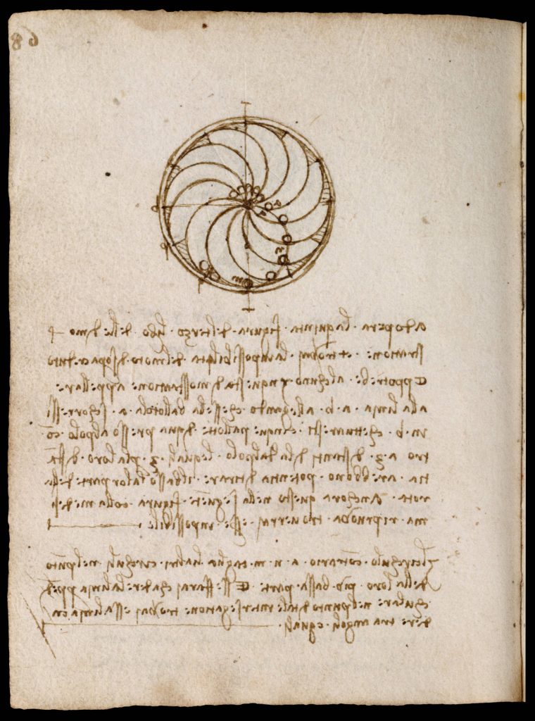
And so around 1495–1500, well-known German artist Albrecht Dürer created just such a modello7.
Below is his sketch of a table fountain, likely created as instruction for his father-in-law to produce it. Because it was neither a painting nor a study nor a prep drawing, its job was to convey information, which means—among other cues like color to indicate gilding and water flow—there are measurement lines on the reverse of the paper. (This has a certain resonance with her writ8. Flarms!)
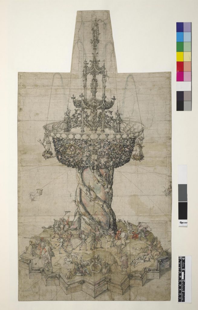
Making a modello for Kolfinna’s scroll functioned as a wonderful metaphor: a reference to all the planning that goes on in the background to create a piece of art, and in a larger sense a model that represents the sheer amount of learning, practice, experimentation, and hard work that has gone on before we see a finished piece. I am reminded of a word that gets thrown around a lot in reference to skilled artists: talent. The concept of “talent” undermines that work, and makes opaque all that has gone into the art and artist before we see the final glorious product. As another artist who comes to the SCA with a lifetime of training behind them, I’m intensely aware of how what folks are witnessing is the now, and it’s not always easy to remember all the effort that has come before. This piece is a concrete nod to work.
Which is to say: I really liked the idea of, rather than a finished painting, creating a piece that witnesses the effort that leads into this achievement.
Dürer’s modello is in pen and brown ink, with added watercolor, touched with red chalk. But over the years he also worked up studies with other materials. Because Kolfinna’s elevation theme would ask skeletons of us, I knew going in that whatever materials I used for this scroll, I’d have to plan it so that our dancing friends wouldn’t be lost in the chaos. Fortunately, there were options.
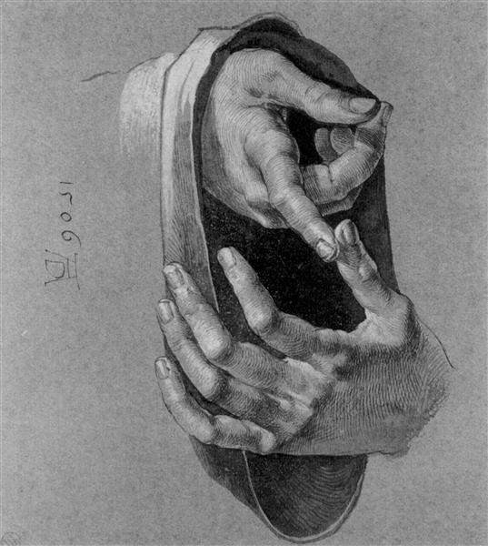
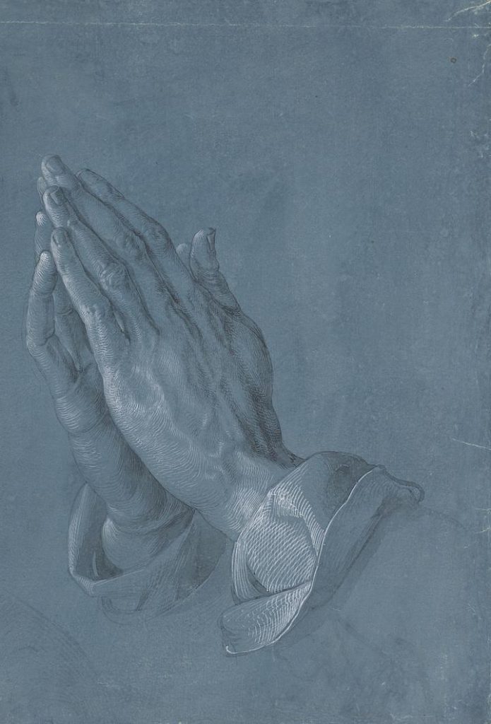
In 1506, Durer created the study of hands at left, in ink and white chalk on toned paper.9 Less famous than his later study of praying hands10 (on blue toned paper at right), this work grabbed me for its contrast and clarity. If I was going to be modeling such a detailed—and potentially chaotic—form as a cathedral on top of a structured form of a monstrance’s stem, I was really going to need the information that deep contrast provides.
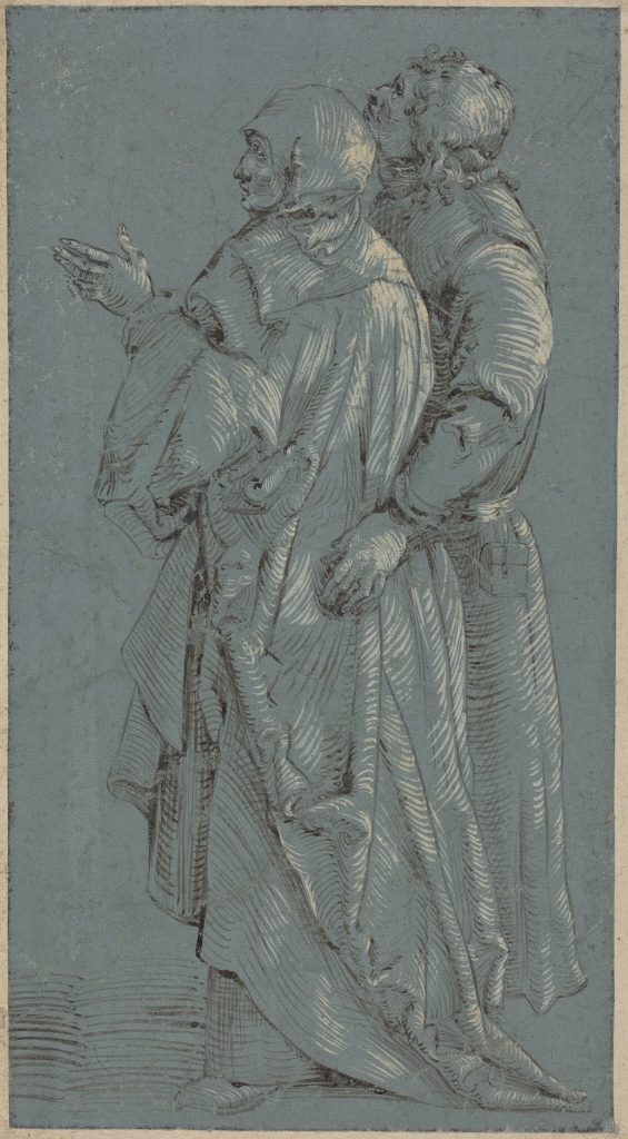
Dürer was a printmaker,11 which no doubt contributed to his markmaking style. And in the particular nature of artist lineages, those who studied with them and those who followed after tended toward the same style. The piece at left, by his student Hans Baldung Grien,12 has a similar printmaking-esque linework even if done in other materials. And the piece at right, by an anonymous artist after Grien,13 does the same thing.
But other artists rendering at this time had other styles.
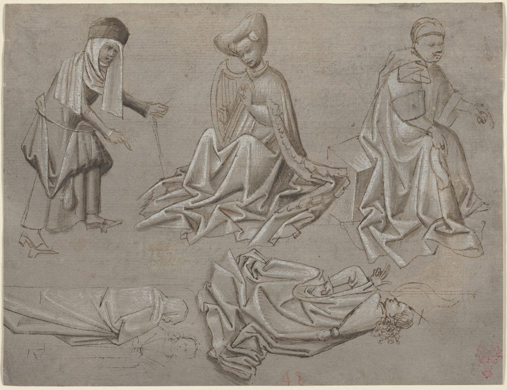
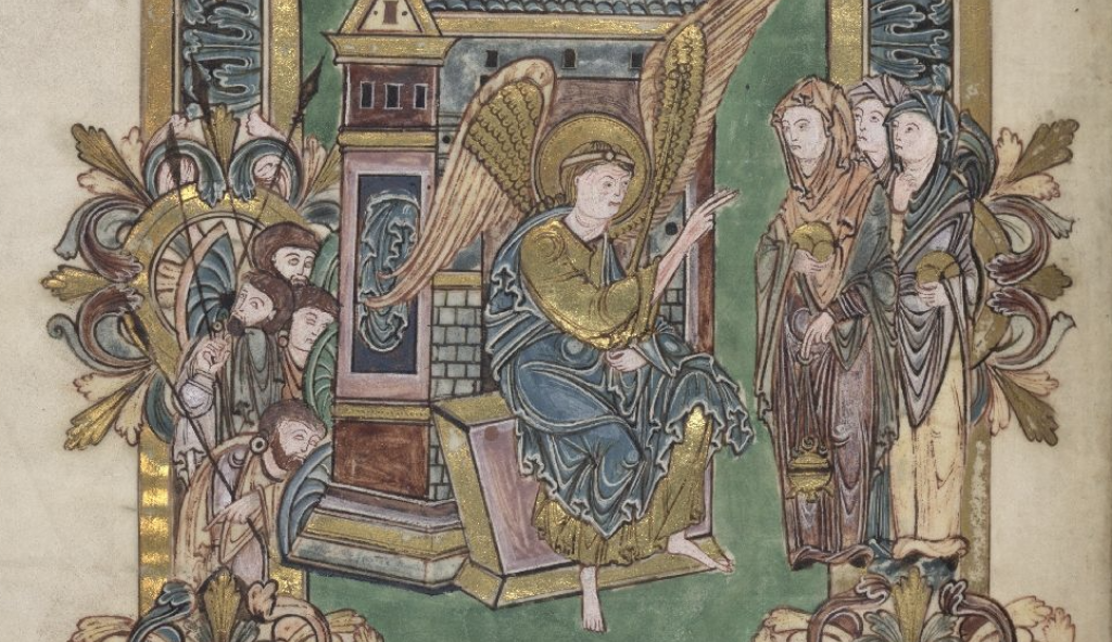
These studies (top, left) by an anonymous German artist in 1450–146014 used pen and washes, highlighted with white, on prepared paper, and their linework is smooth and simple. In 1506, Albrecht Altdorfer drew Samson and Delilah15 (top, right) with many fine strokes, some shaping the form in a similar way to Dürer, but with far, far less structure. (The handling of light reminds me of the 10th century’s Benedictional of St Æthelwold,16 actually, (bottom, right) and the way white becomes a more of a method of highlighting contour than a way of depicting how the light is falling. And working in 1492, the Primary Master of the Strassburg Chronicle created the portrait of the Duke of Austria17 (bottom, left), and they used whatever linework they thought would get the job done. I studied the work of Dürer’s contemporaries for a commonality of pen and ink technique—for instance, direction of stroke, combinations, evenness—but there was great variety, so I felt confident to simply use my own style. (A distinct pleasure.)
There is so much detail in the cathedral, instinct (rooted in experience) told me that that ink washes would be the best way to develop the depth, and sculpt the fall of light with literal fluidity. It also allowed a freedom of line that I felt added some spirit into what could have seemed a very technical drawing, as seen in this ca. 1470–1475 mix of line and wash from the Paduan school of either Maso Finiguerra or Baccio Baldini.18
It was also not uncommon to use washes to help add shape and guide the eye of the patron, as discussed by Ainsworth in the discussion of the function of chiaroscuro underdrawings as preparatory work, or to help explicated future work to patrons19. The depth of contrast gives striking form to the figures, very important for giving this scroll a visual shape from far away, even as the detail would give it life when close up.
The contrast was heightened by the use of white chalk, as seen above in various pieces as a method of shaping figures. In addition, the chalk helped the skeletons pop from the background; important, when the Danse Macabre was such an key ingredient to Kolfinna’s elevation.
you can dance if you want to

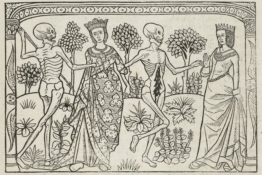
Both the Danse Macabre and Memento Mori bloomed as a reaction to the tumult of the 14th–15th centuries.20 There’s an accessible introduction to the Danse Macabre here at Atlas Obscura, but suffice it to say that the imagery of the dancing skeletons, the reminder of mortality inherent in the Memento Mori philosophy, and then the Northern European fascination with the vanitas style of artwork which developed just after the period of this scroll (example at left) are all related in tone and intent:
Be cognizant of your mortality.
The version of the Danse Macabre used in this scroll features the wood engravings done (possibly by Pierre La Rouge21) for Guy Marchant’s play The Dance of Death. Originally printed in 1485, the play went through several versions, with additions including a version specifically for women (included here), and more with additional art. Many examples still exist, but for these illustrations I consulted the 1486 codex entitled “Miroir salutaire. La Danse macabre historiée. Les Trois morts et les trois vifs. La Danse macabre des femmes. Le Débat du corps et de l’âme. La Complainte de l’âme damnée” (BnF RES-YE-189).22
Find more about this text, including links to other copies, modern translations, and a bibliography for further reading at The Medieval Literature Archive (ARLIMA).
words, words, words
Very few things carry the feel of a design as efficiently as its script.
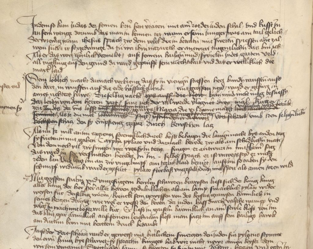
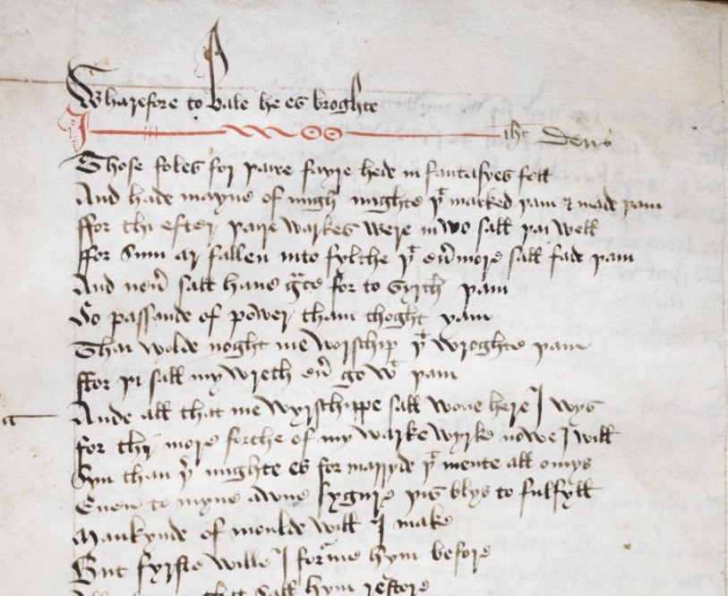
While the later-time-period verses Iselda and Ishmael wrote were inspired by a manuscript from the middle of the 15th century in Austria, making it an appropriate time and place for the artwork, the script in that manuscript (Österreichische Nationalbibliothek (Austrian National Library) Codex 2777, top right) was rounded.24 Consequently the words looked a bit too friendly—especially true when contrasted with the pointier and sharper script of Add MS 35290 (bottom right),25 a late 15th century–16th century version of the York Mystery Plays, a manuscript with which I was already familiar and therefore knew would fit so much better with the Gothic cathedral being built above the text. You can see how the construction of many of the letterforms is similar, but the York manuscript is crisper, more upright, less joined-up, and somehow both sleeker and more angular. I needed the script to help tie the lower half of the scroll with the upper, so the York manuscript was elected.
And having decided to use Add MS 35290, I needed a streamlined way to consult the script as I worked.
Enter Tropy.
Tropy is a new app for researchers,26 an open-source project between a group of historians and developers, a collaboration of multiple institutions. I recently attended an introductory walkthrough with one of its creators through the University of London, and it’s since become an invaluable resource for my art history research and art practice alike. Rather than trying to look through a folder of screenshots all at once, or needing to create a separate document into which I had to place every single writing sample I wanted to look at, instead I only needed to create a project in Tropy and let the app display it all for me at once. Pen in hand, award scroll on one side, laptop scroll on the other. (This isn’t a commercial; I just really appreciate good technological aids for our modern practices. If you’re interested, feel free to ask me about it.)
At right is a waterfall within the Tropy app of a collection of words pulled from Add MS 35290, from which I could assemble my letterforms. As you might be able to see, there is variation even within from word to word, never mind from scribe to scribe.
So I chose the letterforms which worked better for my particular hand, all the while hoping to maintain the spiky feel I was aiming for.
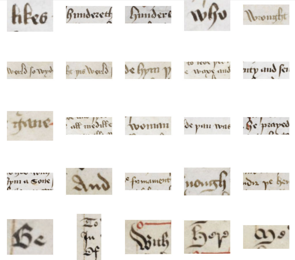
Another consideration was color. Her device consists of white and green, and while the white would be carried up throughout the artwork, I didn’t want the green to be localized either. So I took a cue from the rubrication of both Add MS 35290 and Cod. 2777, but replaced the red ink with green. (Making it…verdination, rather than rubrication? No? I’ll keep workshopping it.)
inscription
Speaking of workshopping…
The base of the Bethlehem Monstrance is inscribed with words, so I needed something fitting for our base. We needed something that would work as a summing-up of the scroll, Kolfinna’s elevation, and perhaps even her artistic philosophy. No pressure.
My Latin scholarship is so old it could drink. After some research with my old textbook, the internet, and a chatbot for the lulz, I was fortunate to gain the help of Latin scholar and teacher Andrixos Seljukroctonis. He kindly helped me with the translation I was looking for, including nuances I didn’t know enough to know. This inscription wouldn’t have been nearly as great without his insight.
Together we developed the phrase “ARTEM FACIAMUS, QUONIAM MOX MORIEMUR”, which means “let us make art, for soon we will die”.
Yes. Let’s.
a change of art
This method of construction felt perfectly contemporary.
To set the scene:
Down in Italy over the course of the Quattrocento (Italian 15th century), art was evolving. The nature of artistic production, an artists role, place, and individuality, the place of imagination… All were in flux.
Artists began the century with the social status of manual laborers. Craftspeople, rather than “creatives” in our modern definition. These makers might have been painters, but they might also have taken up other arts such as goldsmithing, sculpture, and architecture. Artists operated within workshops and/or guilds, and names were rarely noted.27
Art was formal and codified, where iconography and symbolism were the mechanisms of idealism and spiritual meaning. Back in Ancient Greece, Plato had written that perspective was a form of deceit, and that philosophy continued to have impact even a millennium later.28
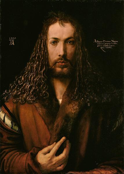
But Europe was changing rapidly, and with religious, economic, and therefore societal shifts, the role of the artist shifted as well. Starting up north in the fifteenth century with Jan van Eyck, the personality and education of an artist allowed greater social mobility.29 And down in Italy, Filippo Brunelleshi was first a goldsmith and sculptor, but then went on to become the foremost Renaissance architect. His friend Donatello (not the turtle) joined him on his journey and became a famous sculptor, also known by name.30 Self-promotion eventually became not only available as a method of career advancement, but welcomed. In Northern Europe, Dürer, creator of our scroll’s modello, was a master of the self-promotional self-portrait (seen at right).31 Artists were signing their work. Artists were getting their own hype men, like famous patrons or artist-biographer Georgio Vasari. Artists were becoming artists, as we think of them today.
And this rise of individualism coincided with the development of humanism. Not to be confused with today’s secular humanism, Renaissance humanism was defined by looking toward the ancient world for examples of how to live and how to reconcile religion with the changing world, and in doing so reoriented the place of humans in the cosmos.32
memesis
Into this changing landscape stepped (wrote?) Albrecht Dürer and Leonardo Da Vinci.
As part of the effort toward elevating the visual arts to the social level of poets, it was not uncommon for artists to write on the nature of art. And it’s in these writings where we can witness various redefinitions of vocabulary—sometimes convergent, sometimes contrasting, but all of them insights into the evolution of artistic thought in the first person. New definitions of imitation, invention, fantasy, genius, and talent were explored, as well as the nature of personal style.33
We see that even once artists gained individualization after the Middle Ages, the goal still wasn’t individual creativity in the post-Romantic sense in which we conceive it now.34 Instead, the goal was something they called memesis.
Memesis is an Ancient Greek word, used at first in ancient writings on philosophy and art to mean imitation.35 But by this point in the 15th century, it had come to mean the imitation of nature, ancient Greece or Rome, or both.36
This became a lodestone, an orienting principle to which all art should aspire. It led to the rising need for naturalism in art, was facilitated by new materials like oil paint, and was both driven and made easier by new techniques like the (re)discovery of perspective and proportion first explored in antiquity.
In this way, they were both looking backward, as well as aiming to improve upon preexisting work; picking up the torch from their forebears, and carrying it further. Which is where invenzione comes in.
invenzione
The Renaissance idea of invenzione (invention) was twofold.
One version held that invenzione was about concept, rather than form, and was limited to the choice of theme. For much of the 15th century invenzione was limited to poets, and only when visual artists had finally gained social status on their par were they too allowed this control. (Until then, the patrons were still in charge.)
But more notably for this scroll was the second definition, invenzione’s connection with the verb excogitare, meaning to discover and devise.37
It might be easier to think of this definition as the “discovery of truth”. This sort of invenzione aligns the humanist perspective of the role of an artist, with the humanist perspective of the role of humanity itself.
The thought process held that God had, in creating humanity, instilled inherent abilities. For example, Dürer “was utterly committed to the view that there is a particular power planted in the true artist by the divine forces”38 through which a person could become human. This latitude therefore extended to artists a further degree of innovation beyond the constraints of the Middle Ages, but with the core idea that it was humanity’s job to complete God’s creation.39
And here is where memesis comes in: if the goal is to imitate nature or Antiquity—or better yet, to build upon either (or both)—then invenzione has to have guard rails.
The constraints of truth are those guard rails.
In practice, Renaissance scholars took Cicero’s statement that “Inventio est excogitatio rerum verarum aut verisimilium (invention is the discovery of things true or probable)” and applied it to subjects like art and architecture. For example, architects could use the proportions of the human body to devise rules about column measurements and declare them a natural harmony.40
We might hold these two concepts in our minds at the same time: the idea that Antiquity/nature were places to build upon, and the idea that God had intended humanity to improve on creation, and we could understand implicitly how truth is the operative word here. The search for truth, its identification, its construction, its capture.
In practice, these constraints would be integral not only to the choice of topic, or the construction of the layout, but also the implementation of the artwork itself. (Which is why oil paint was so helpful; it helped artists depict nature with so much greater verisimilitude than egg tempera.) Different artists swallowed this pill to a greater or lesser extent, even over their lifetimes, trying to find the balance for themselves between imagination, style, and truth. Our friend Leonardo was no exception; he wrote about the usefulness of finding subject and form in random stains on the wall,41 which involved imagination, but at other points wrote about various techniques to ensure the artist is capturing absolute truth in their art, such as looking at one’s work in the mirror to help the brain spot errors. “Leonardo was just as concerned as Alberti that the painter avoid errors caused by working solely from his own judgment.”42
This is relevant for us as makers in an SCA context.
His and Alberti’s concern was chiefly about flaws introduced in accuracy (of presenting nature, chiefly meaning laws of light, proportion, etc) caused by the over-reliance on personal whim or style—in other words, the recording of truth—but in an SCA context “truth” could be easily translated as “historical accuracy”. We will reasonably have other goals for our work, but this accuracy is often an important one. So while our aims (ours and Quattrocento artists) may not be precisely congruent, the intention for truth is the same.
But we are all making art, and each piece of art is made to act on the world differently.
It needs to speak to different audiences.
It needs to highlight different episodes.
It needs to urge different emotions.
It needs to herald different ideas.
So how did they balance the need for truth and the need to meet all these different goals? How do we?
semplici
I was inspired by the writings of Leonardo once again, with his efforts to reconcile the need to accomplish the goals of his art with the necessary guardrails that the need for truth creates. In his writings, repeatedly explored the concept that nature can create the building blocks, but we as humans can only make things from those building blocks, and our divinity stems from our ability to use those building blocks to create infinite forms.
I was inspired by the writings of Leonardo once again, with his efforts to reconcile the need to accomplish the goals of his art with the necessary guardrails that the need for truth creates. In his writings, he repeatedly explored the concept that nature can create the building blocks, but we as humans can only make things from those building blocks, and our divinity stems from our ability to use those building blocks to create infinite forms.
"Nature is concerned only with the production [produtione] of elementary things [semplici] but man from these elementary things (semplici] produces an infinite number of compounds, though he has no power to create (creare) any elementary thing except another like himself, that is his children."43
And further, Leonardo “…cites as an example of man’s inability to produce semplici the inevitable failure of alchemists to “create” gold; while as an instance of man’s ability to compose infinite things from the basic semplici he discusses the enormously diverse sounds and languages which arise from the combined actions of the lips, tongue and windpipe.”44
Even beyond my usual inclination to serve the needs of a scroll by combining elements which balance both art history and art-in-practice, creating this piece in this particular way felt especially eloquent:
Like Leonardo’s elementary things, the historical building blocks of cathedral and monstrance combine into a new form, one which capitalizes on their separate resonant vocabularies to create a whole new verse.
the exquisite dance of experience
There came a point where I was getting closer and closer to finished, and had to be on my toes not to push it too far in the stretch for some undefinable perfection.
One benefit of experience is knowing when to stop.
But I was working with sources that all held a profound sense of humanity. None was “perfect”, by any stretch of the imagination. And they were all beautiful. When you acknowledge the humanity in art, it’s easy to see the beauty in imperfection, and when you give up on perfection, it’s easier to understand what’s really at the heart of all we’re doing here.
(It’s love. We do this because love.)
“Why are theirs [drawings] shit, and yours are…not shit.” “Well I take them away from them before they can fuck them up. They hate it, but I know it’s for the best.”
Roy Kent and Miss Bowen, Ted Lasso
This piece was a labor of profound inspiration, a work of joy, and a celebration of the practice of art. Long may it remind Kolfinna of our love.
notes
[1] John Henry Parker, A Manual of Gothic Stonecarving (Corn-Market, Oxford: Messr. Parker, 1855), p61.
[2] “Cologne Cathedral,” Wikipedia, accessed February 13, 2023, https://en.wikipedia.org/w/index.php title=Cologne_Cathedral&oldid=1144417390.
[3] “Monstrance | German,” The Metropolitan Museum of Art, accessed February 26, 2023, https://www.metmuseum.org/art/collection/search/467485.
[4] “A Gothic Monstrance, c. 1480”, The National Gallery of Art, accessed December 10, 2023, https://www.nga.gov/collection/art-object-page.3380.html.
[5] “Een gotisch baldakijn, Meester W met de Sleutel, ca. 1480 – ca. 1490.”, Rijksmuseum, accessed March 22, 2023, https://www.rijksmuseum.nl/nl/collectie/RP-P-OB-1097.
[6] Michael Hirst and Carmen Bambach Cappel, “A Note on the Word Modello,” The Art Bulletin 74, no. 1 (1992): 172–73.
[7] “Drawing | British Museum.”, The British Museum, accessed January 20, 2023, https://www.britishmuseum.org/collection/object/P_SL-5218-83.
[8] “Lady Jill Dýravörður – Scribal.” Accessed March 22, 2023, https://sites.google.com/view/jill-dyravorthur/scribal.
[9] “Study of Hands, 1506 – Albrecht Durer – WikiArt.Org.” Accessed February 22, 2023. https://www.wikiart.org/en/albrecht-durer/study-of-hands-1506. I’m usually reticent to link to a site like this, but since the artwork is in a private collection, my options are limited.
[10] “Zeichnung & Druckgrafik,” Albertina Museum Wien, accessed February 23, 2023, https://www.albertina.at/sammlungen/zeichnung-druckgrafik/. No direct link or collection page was easily found, so this is the Albertina’s “Drawing and Printmaking” collection.
[11] “Albrecht Dürer | British Museum.” The British Museum, accessed February 10, 2023, https://www.britishmuseum.org/collection/term/BIOG24299.
[12] “The Lamentation”, The National Gallery of Art, accessed January 21, 2023, https://www.nga.gov/collection/art-object-page.73843.html.
[13] “The Virgin and St John, c. 1600”, The National Gallery of Art, accessed January 21, 2023,
https://www.nga.gov/collection/art-object-page.53146.html.
[14] “Studies for Six Figures (sheet from a model book) [recto], c. 1450/1460”, The National Gallery of Art, accessed January 21, 2023, https://www.nga.gov/collection/art-object-page.54194.html.
[15] “Albrecht Altdorfer | Samson and Delilah”, The Metropolitan Museum of Art, accessed January 21, 2023, https://www.metmuseum.org/art/collection/search/334769.
[16] “The Benedictional of St Æthelwold,” British Library, accessed March 06, 2023, https://www.bl.uk/manuscripts/FullDisplay.aspx?ref=add_ms_49598.
[17] “Maximilian, Duke of Austria, on Horseback, 1492”, The National Gallery of Art, accessed January 21, 2023, https://www.nga.gov/collection/art-object-page.75812.html.
[18] “Album; Drawing | British Museum”, The British Museum, accessed January 22, 2023, https://www.britishmuseum.org/collection/object/P_1889-0527-40.
[19] Maryan W. Ainsworth “Northern Renaissance Drawings and Underdrawings: A Proposed Method of Study.” Master Drawings 27, no. 1 (1989): 16.
[20] S. Oosterwijk, “Fro Paris to Inglond’? The danse macabre in text and image
in late-medieval England” (PhD diss., Leiden University, 2009). For more about the Dance of Death, including the interplay between image and action, see Elina Gertsman, “Pleyinge and Peyntynge: Performing the Dance of Death,” Studies in Iconography 27 (2006): 1–43. http://www.jstor.org/stable/23923692.
[21] “Dance of Death,” Library of Congress, accessed January 10, 2023, https://www.loc.gov/item/2021667030/.
[22] “Miroir Salutaire. La Danse Macabre Historiée. Les Trois Morts et Les Trois Vifs. La Danse Macabre Des Femmes. Le Débat Du Corps et de l’âme. La Complainte de l’âme Damnée, 1486,” accessed December 26, 2022, https://gallica.bnf.fr/ark:/12148/btv1b8615802z.
[23] “LA DANSE MACABRE,” The Medieval Literature Archive (ARLIMA), accessed March 07, 2023, https://https://arlima.net/no/995.
[24] “Sammelhandschrift Mit Geistlichen Und Weltlichen Liedern,” Österreichische Nationalbibliothek, accessed January 12, 2023. https://digital.onb.ac.at/RepViewer/viewer.faces?doc=DTL_6671236.
[25] “York Mystery Plays,” British Library, accessed January 12, 2023, https://www.bl.uk/manuscripts/FullDisplay.aspx?ref=Add_MS_35290.
[26] https://tropy.org/ Tropy not only helps you display by folder, but it lets you organize by tags, set a folder to automatically import, and more. Aside from looking at scripts, I also have an ongoing research project which I’ve just started using this app for, and I can tell it’s going to be incredibly helpful. Sorry, I’ll stop gushing over this thing now. (I won’t.)
[27] Noah Charney and Ingrid Rowland, The Collector of Lives (New York, NY: WW Norton, 2018), 27, https://books.apple.com/us/book/the-collector-of-lives-giorgio-vasari/id1215382287.
[28] Sharon Bailin, “Invenzione e Fantasia: The (Re)Birth of Imagination in Renaissance Art” Interchange 36, no. 3 (September 2005): 259.
[29] Charney and Rowland, The Collector of Lives, 27.
[30] Charney and Rowland, The Collector of Lives, 98.
[31] Bailin, “Invenzione e Fantasia”, 266.
[32] Bailin, “Invenzione e Fantasia”, 261.
[33] For wide discussion on the myriad changes, see Martin Kemp, “‘Equal Excellences’: Lomazzo and the Explanation of Individual Style in the Visual Arts.” Renaissance Studies 1, no. 1 (1987); Kemp, “From Mimesis to Fantasia: The Quattrocento Vocabulary of Creation, Inspiration and Genius in the Visual Arts.” Viator 8 (January 1977), as well as pretty much any other item in the bibliography.
[34] Bailin, “Invenzione e Fantasia”, 271.
[35] Caroline Anthérieu-Yagbasan, “THE RENAISSANCE AND MIMESIS : A NEW PARADIGM FOR PAINTING ?” in SGEM Florence: The Magic of the Renaissance (Florence, Italy, 2018), 1.
[36] Kemp, “Memesis to Fantasia”, 347.
[37] Kemp, “Memesis to Fantasia”, 347–349.
[38] Kemp, “Equal Excellences”, 12.
[39] Bailin, “Invenzione e Fantasia”, 262.
[40] Kemp, “Memesis to Fantasia”, 349–350.
[41] Kemp, “Memesis to Fantasia”, 377.
[42] Andrea Bolland. “From the Workshop to the Academy: The Emergence of the Artist in Renaissance Florence” in Renaissance Florence: A Social History, ed. Roger J. Crum and John T. Paoletti. (Cambridge: Cambridge University Press, 2006), 467.
[43] Leonardo Da Vinci ca. 1510. Trans. E. MacCurdy, The Notebooks of Leonardo da Vinci, 2 vols. (London 1954) 1.137, quoted in Kemp, “Memesis to Fantasia”, 377–378.
[44] Kemp, “Memesis to Fantasia”, 382.
bibliography
Ainsworth, Maryan W. “Northern Renaissance Drawings and Underdrawings: A Proposed Method of Study.” Master Drawings 27, no. 1 (1989): 5–38.
Anthérieu-Yagbasan, Caroline. “THE RENAISSANCE AND MIMESIS : A NEW PARADIGM FOR PAINTING ?” In SGEM Florence: The Magic of the Renaissance. (Florence, Italy, 2018). https://hal.science/hal-01911739.
Bailin, Sharon. “Invenzione e Fantasia: The (Re)Birth of Imagination in Renaissance Art.” Interchange 36, no. 3 (September 2005): 257–73. https://doi.org/10.1007/s10780-005-6865-3.
Bambach, Authors: Carmen. “Renaissance Drawings: Material and Function | Essay | The Metropolitan Museum of Art | Heilbrunn Timeline of Art History.” The Met’s Heilbrunn Timeline of Art History. Accessed February 7, 2023. https://www.metmuseum.org/toah/hd/drwg/hd_drwg.htm.
Charney, Noah, and Ingrid Rowland. The Collector of Lives. New York, NY: WW Norton, 2018. https://books.apple.com/us/book/the-collector-of-lives-giorgio-vasari/id1215382287.
Cohen, Charles E. “The ‘Modello’ for a Lost Work by Lorenzo Lotto.” Master Drawings 13, no. 2 (1975): 131–86.
Hirst, Michael, and Carmen Bambach Cappel. “A Note on the Word Modello.” The Art Bulletin 74, no. 1 (1992): 172–73. https://doi.org/10.2307/3045860.
Holmes, G. “Renaissance Florence: A Social History.” The English Historical Review CXXII, no. 499 (December 21, 2007): 1389–91. https://doi.org/10.1093/ehr/cem361.
Kemp, Martin. “‘Equal Excellences’: Lomazzo and the Explanation of Individual Style in the Visual Arts.” Renaissance Studies 1, no. 1 (1987): 1–26. http://www.jstor.org/stable/24410006.
———. “From Mimesis to Fantasia: The Quattrocento Vocabulary of Creation, Inspiration and Genius in the Visual Arts.” Viator 8 (January 1977): 347–98. https://doi.org/10.1484/J.VIATOR.2.301573.
“Methods and Materials of Northern European Painting in the National Gallery, 1400-1550.” National Gallery Technical Bulletin 18 (1997): 6–55.
Oosterwijk, S. “Fro Paris to Inglond’? The danse macabre in text and image in late-medieval England” (PhD diss., Leiden University, 2009) Retrieved from https://hdl.handle.net/1887/13873.
Parker, John Henry. A Manual of Gothic Stonecarving. Corn-Market, Oxford: Messr. Parker, 1855.