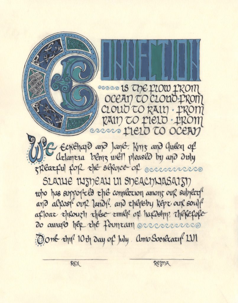
THE BRIEF
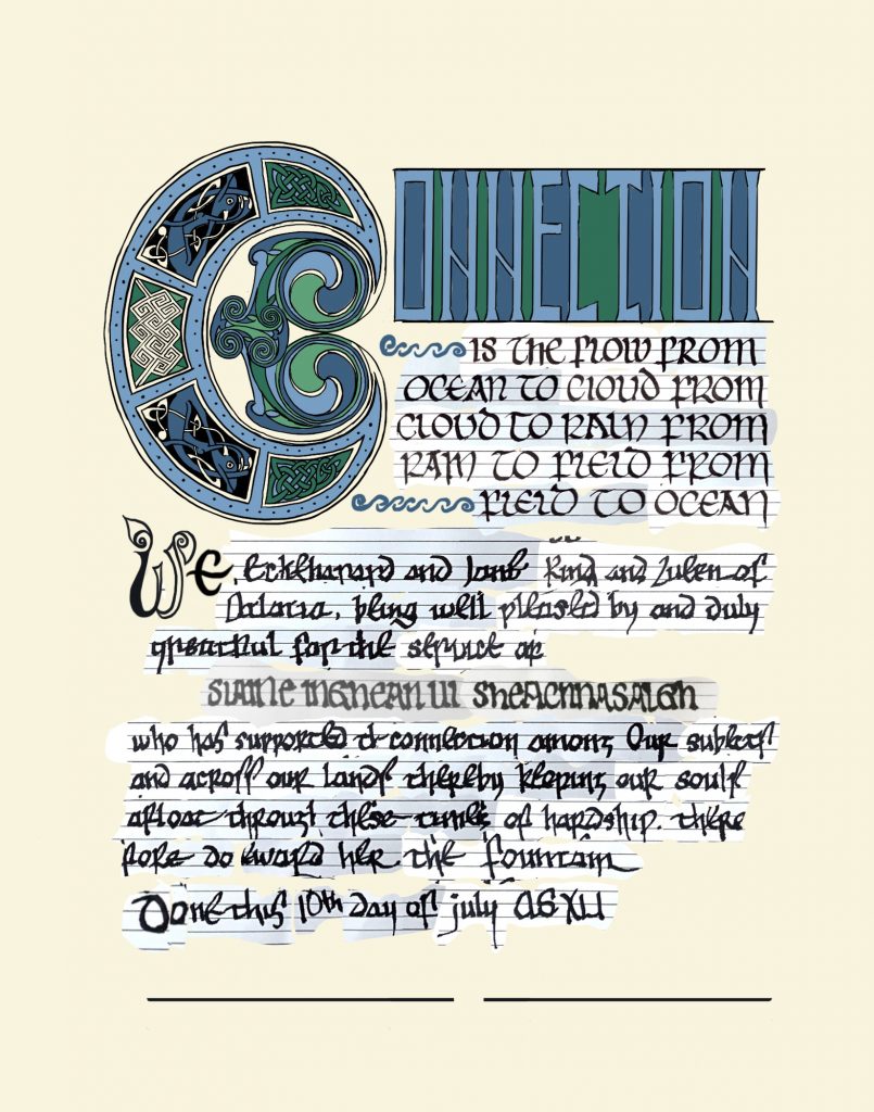
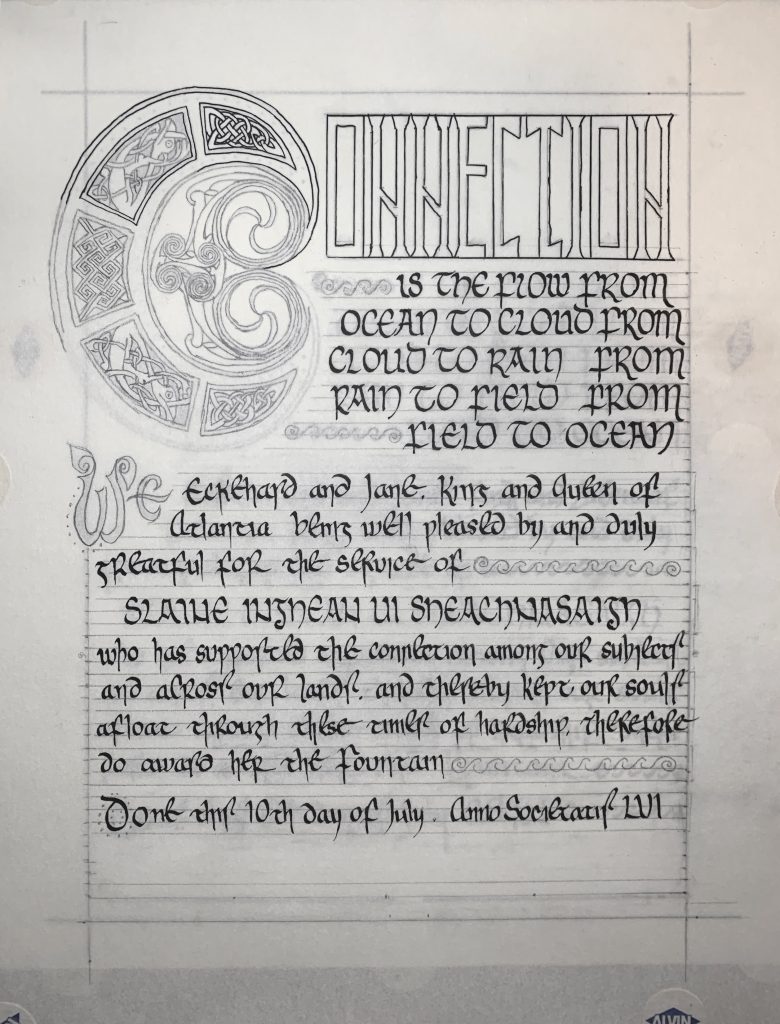
Fountain scroll for Slaine inghean ui Sheachnasaigh. Given 10 July, 2021 at Warriors’ Games.
I was honoured that Failenn had specifically asked me to create this scroll, knowing that Insular artwork is my specialty. I was also delighted to create something for a Baronial compatriot.
THE INITIAL
So because initials are so important for Insular manuscripts, I needed to know which one I needed to create. Therefore, before beginning any design work, I wrote the scroll text.
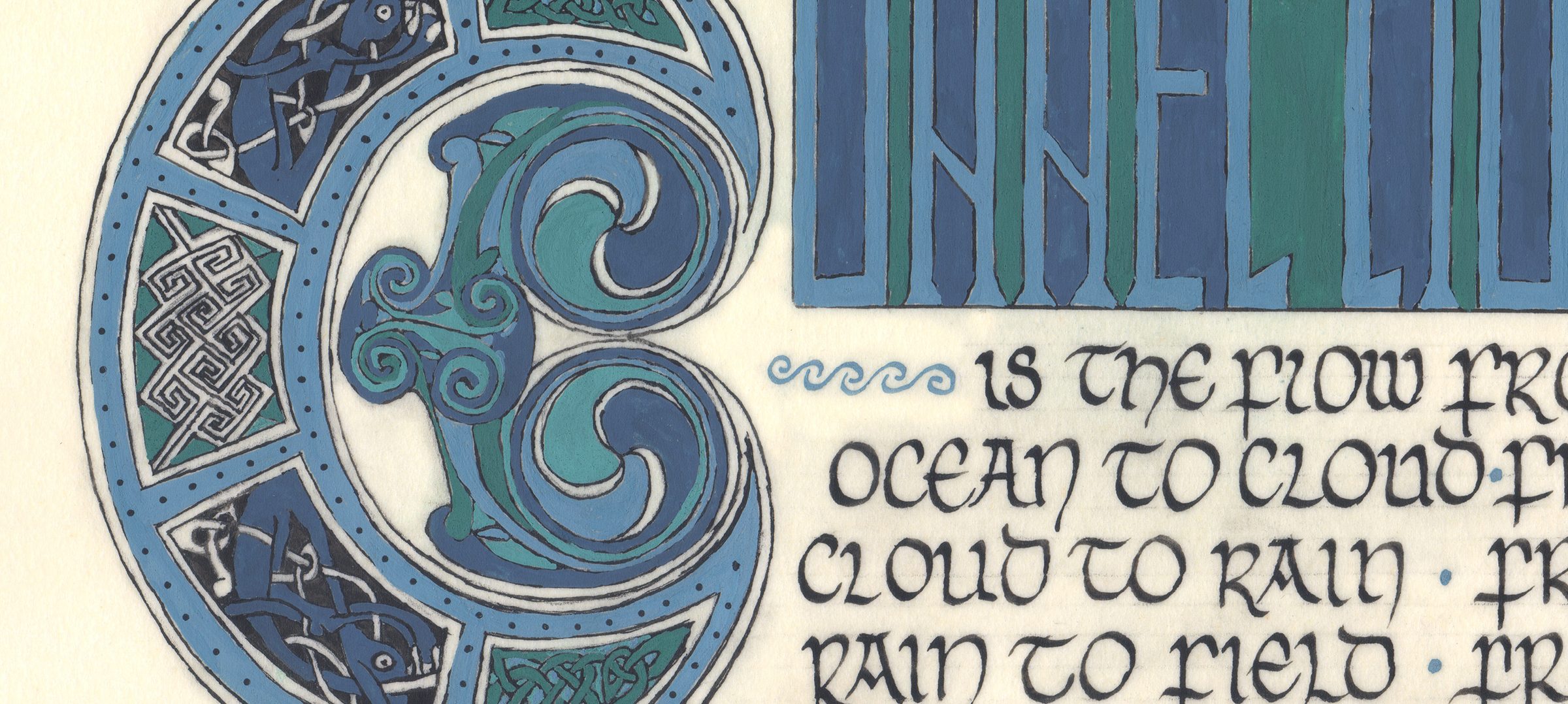
I decided on a C.
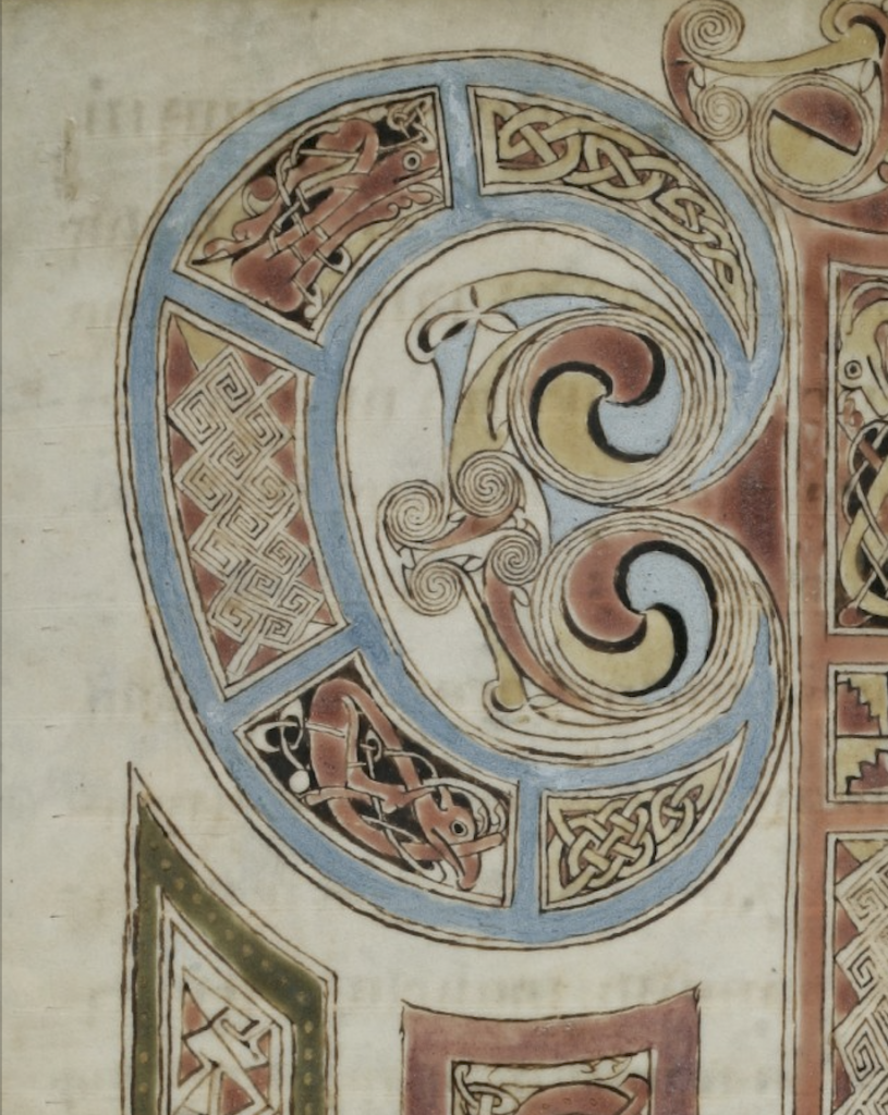
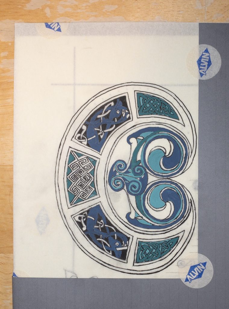
To create this C, I broke off a section of the q from the Quoniam page of the Gospel of St Gall. I mirrored parts of the elements, so it looked a bit more like a C, and so the decoration was easier. But even with that mirroring, I needed to revamp the key design—which perhaps took longer than it might have if I’d been practicing key designs the way I always mean to.
THE TEXT
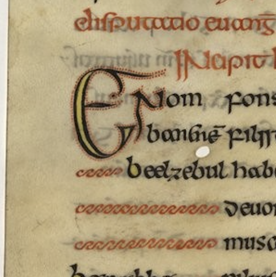
I needed a visual contrast between the main text and the intro, as well as with the name. In Insular manuscripts we often see script used to create that sort of hierarchy and contrast, so I chose an Insular minuscule for the main text, buoyed by stately Insular majuscule. The caps style I cribbed from the Gospel of St Gall.
To highlight the beginning of the main text, I created a large initial and diminuendo; these two features are common in Insular manuscripts, including the St Gall. To fill in a few areas of white space, I included a common wave-style fill, reminiscent of the ones in The Book of Durrow and the Echternach Gospels, among others.
THE COLOUR
After the layout, I turned to colour.
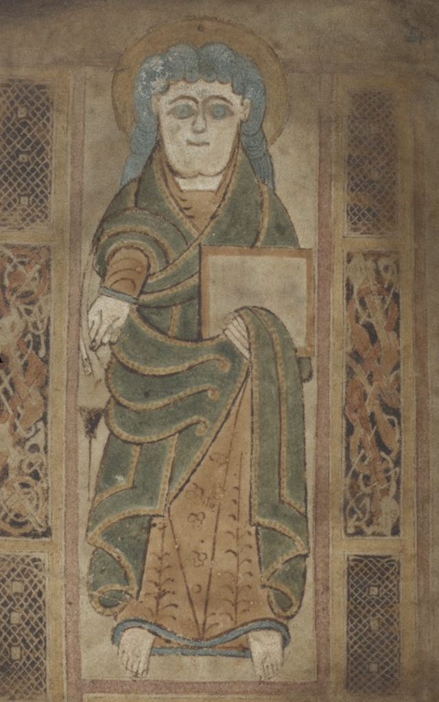
As the award is called “The Fountain”, I chose watery colours: dark blue, light green, a powdery light blue such as the one in the Gospel of St Gall, the Book of Dimma, and the Book of Mulling, and a jade-like green featured in many other Insular manuscripts, such as the Book of Mulling and the St Chad/Lichfield Gospels.
THE MATERIALS
M Graham gouache
Noodler’s Ink black
Pergamenata
Brause and Hunt nibs
THE PROCESS
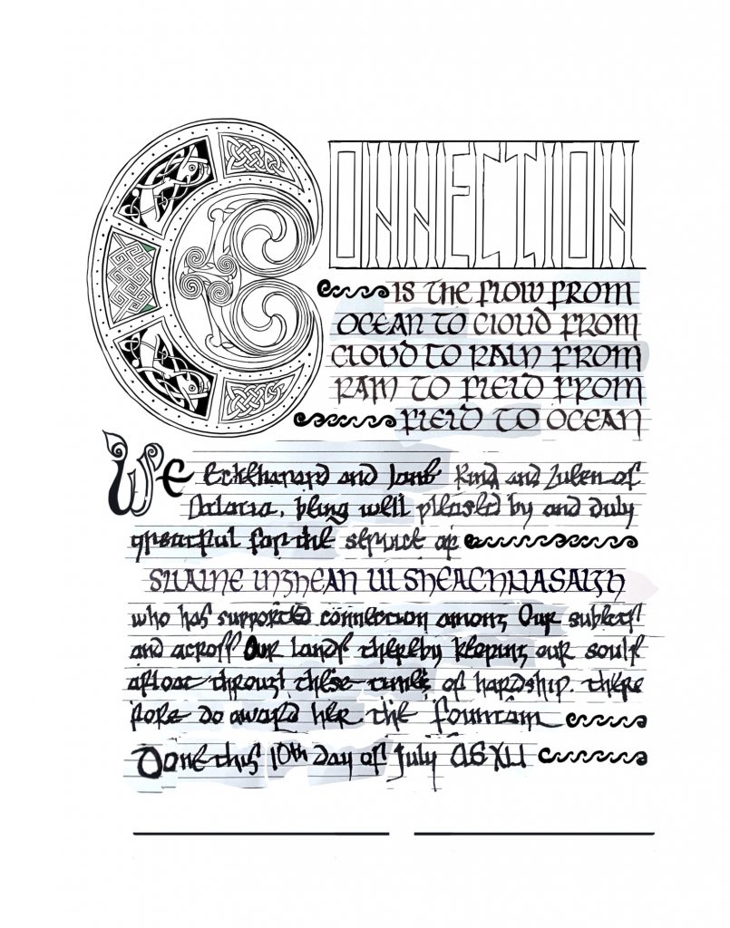
This is a 30 second timelapse of the initial layout design, using Procreate.
I sorted through and arranged the exemplars (mostly the Gospel of St Gall), cut together the C, traced the interlace and zoomorphics, then redesigned the key design so it fit within the new shape.
Next I planned the initial’s colours, drafted out and placed the headline, figured out its colours, then got to work laying out the rest of the text.
It went faster than it might have, since I’m familiar with the material, but it’s by no means a trivial production. (Certainly goes smoother with the iPad than it does with paper and Exacto, though. Perfect for a part-time scribe.)
LESSONS
The plan had been to stick to a very limited palette. In future I’d not limit myself quite so much; in retrospect, the background colours of the headline don’t contrast enough, so it looks like a solid block and doesn’t catch the eye as much as I’d prefer. I’d also add a bit more line variation to the initial, and maybe include some black fills. Contrast is my achilles heel, and even though I know that, I’m always learning to calibrate better.
All in all, though, I’m pleased with how this turned out. I think it’s a readable, legible design, perfect for an award being given as thanks for the service of communication.