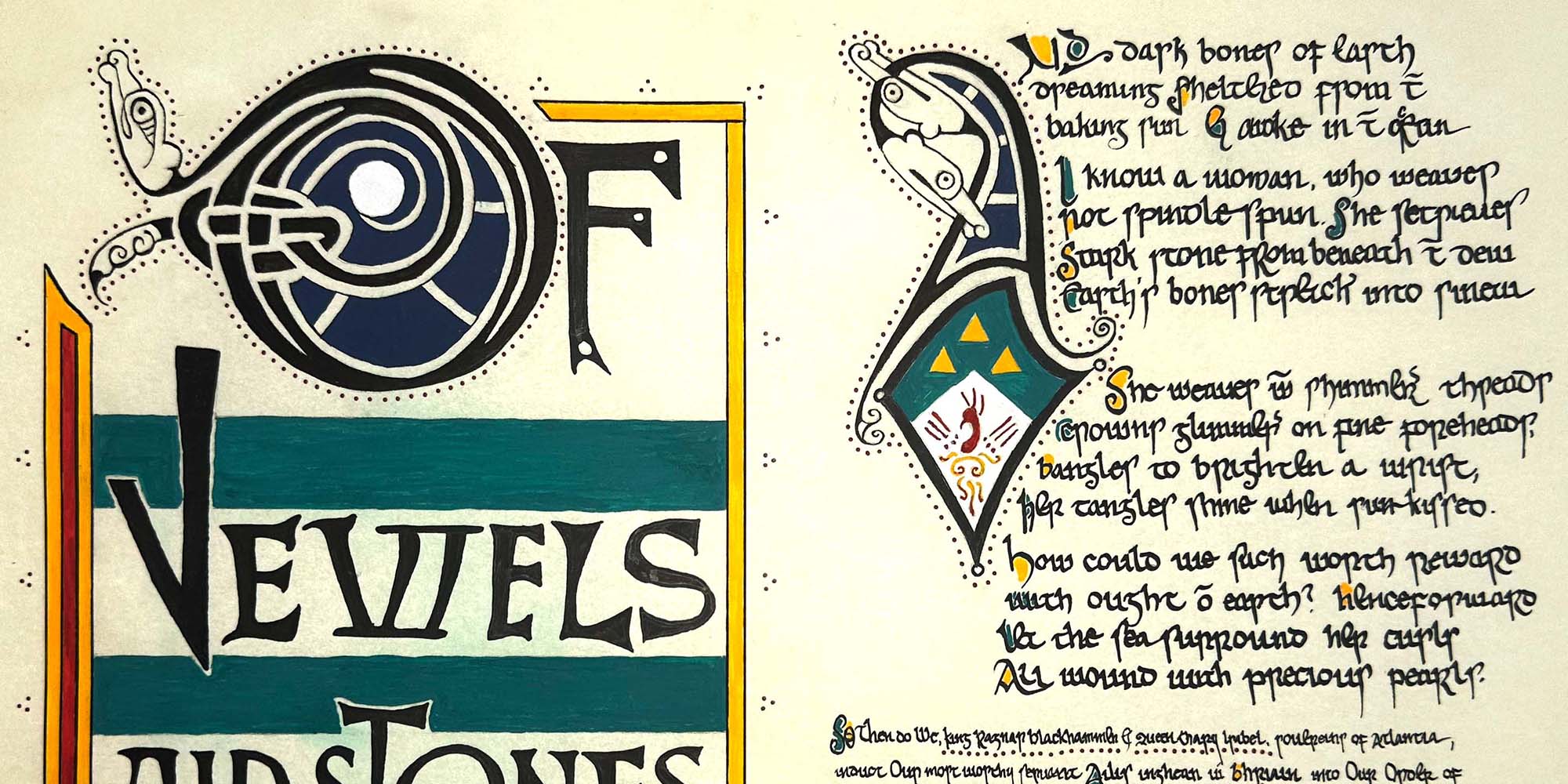
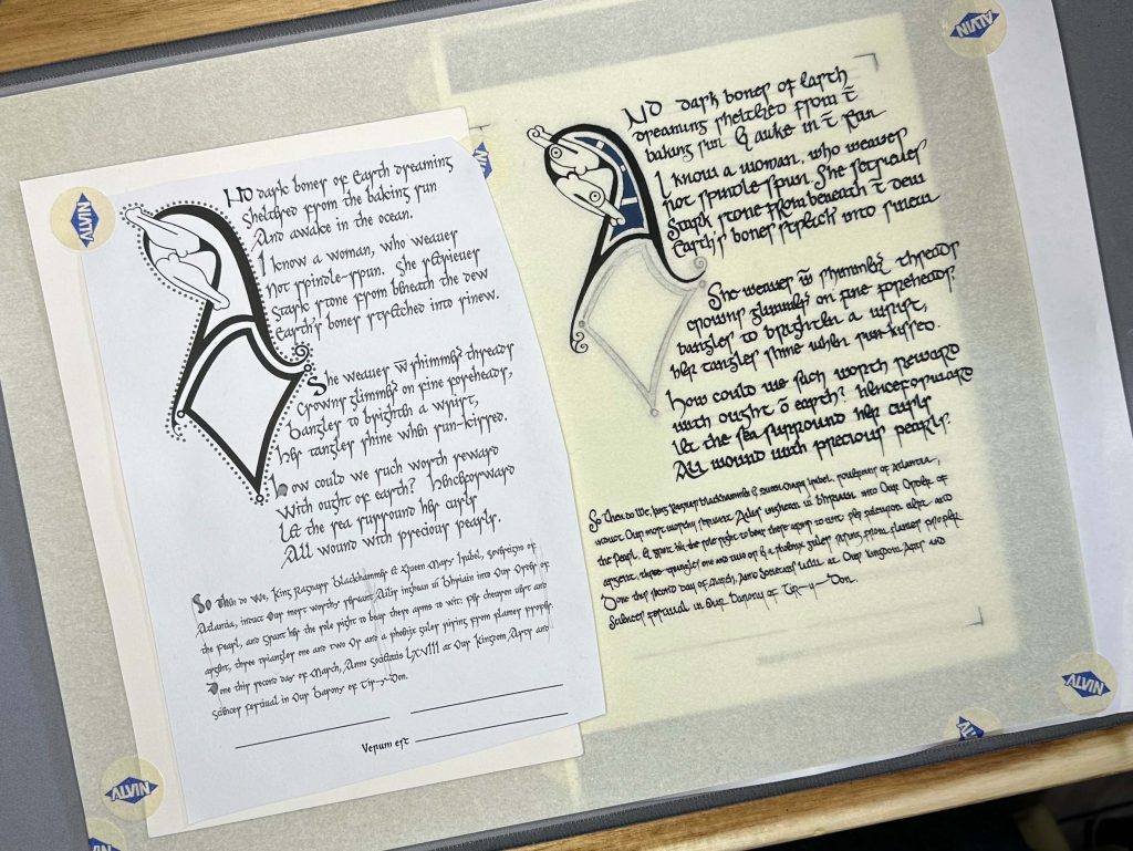
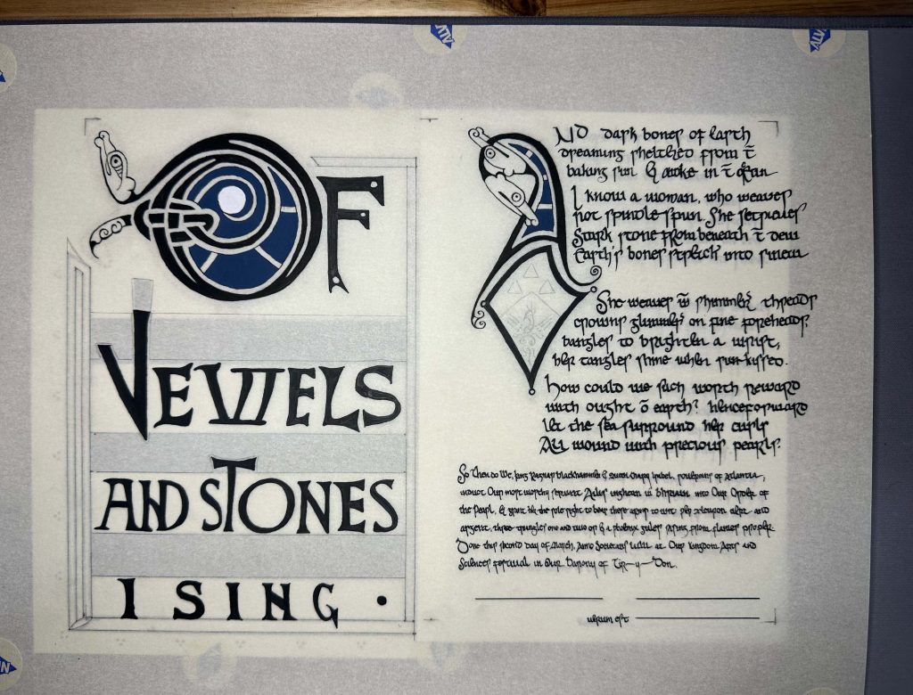
It was my honor to create this Pearl award scroll for Ailis inghean uí Bhriain, awarded this past Saturday at Kingdom Arts and Sciences Festival. Words by Iselda de Narbonne. Scroll, obviously, by me.
Of jewels and stones I sing,
And dark bones of Earth dreaming
Sheltered from the baking sun
And awake in the ocean.
I know a woman, who weaves
Not spindle-spun. She retrieves
Stark stone from beneath the dew
Earth’s bones stretched into sinew.
She weaves with shimmering threads
Crowns glimmering on fine foreheads,
Bangles to brighten a wrist,
Her tangles shine when sun-kissed.
How could we such worth reward
With ought of earth? Henceforward
Let the sea surround her curls
All wound with precious pearls.
The brief for this scroll was 11th century Irish/Viking. For good or ill, there aren’t that many manuscripts of that time period remaining to us from which I could pull my references1. That being said, it’s a timeframe/place I know fairly well having delved into it myself before, and having advised others in its exploration, so I already had a jumping off point ready.
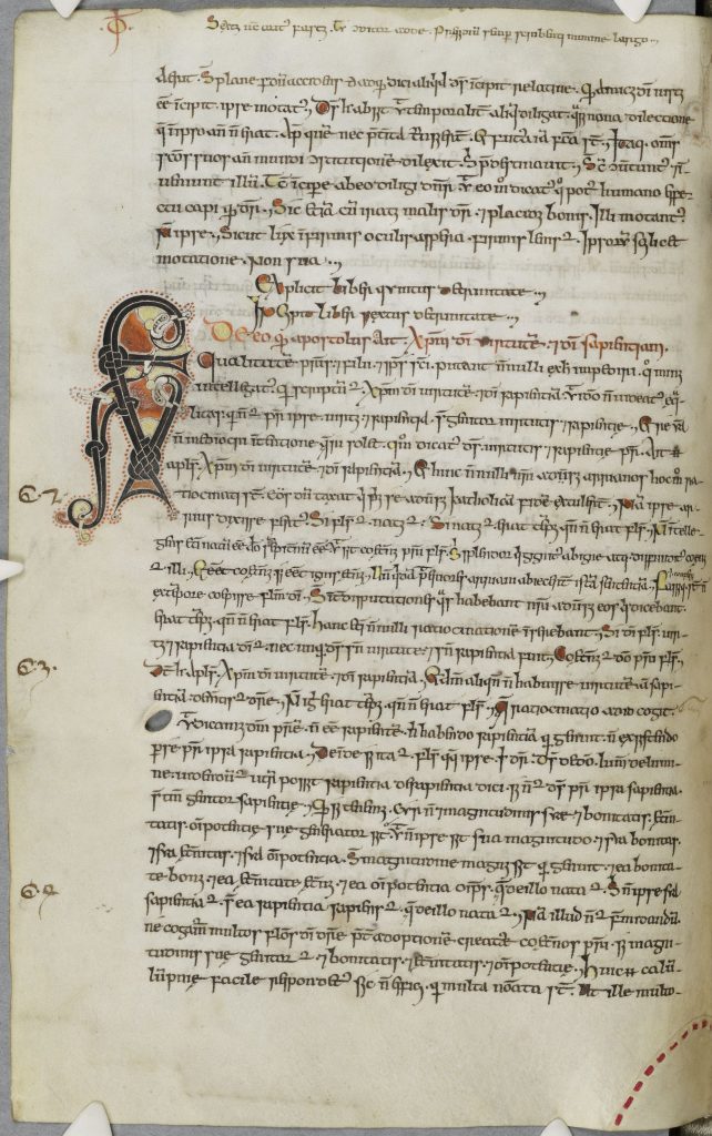
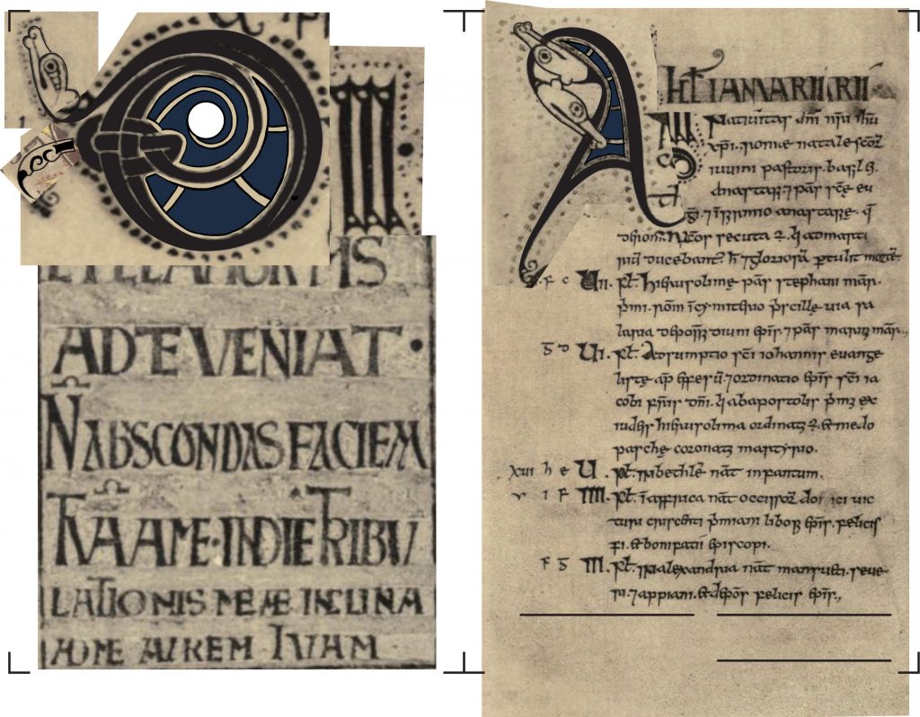
The main reference is the Ricemarch Psalter, created in the back half of the 11th century in Wales.
—record scratch—
Wales? Didn’t I say the brief was Irish?
See, this is where knowing art historical context becomes necessary.
an inheritance
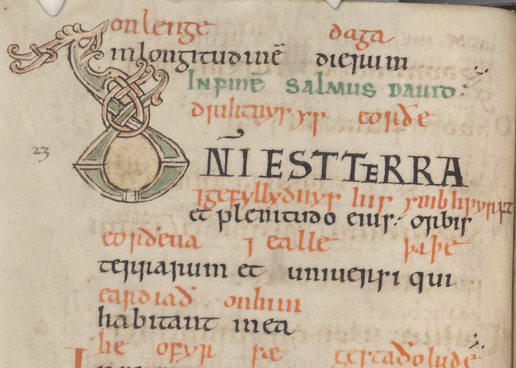
This psalter was one of two surviving books2 created at the scriptorium of Llanbadarn Fawr in Wales. It was created by scribe Ithael, and decorated by Ievan (Ieuan), both sons of the Bishop Sulien, then presented to their brother Rhygyfarch/Ricemarch3. Sulien had studied in Ireland for some years before returning home to Wales, bringing with him an Irish artistic program instructed in part by referencing the best Irish manuscripts he could lay eyes on, both recent and older. It’s for this reason that the Ricemarch shares features with Irish manuscripts like the Southhampton Psalter (St John’s College MS C.9, created c1000 in Ireland, despite the name) and the Cotton MS. Vitellius F. XI (heavily damaged in the Ashburnum House fire of 1731)4, as well as the division of the text into “the three fifties”, common to all Irish psalters of the 11th–12th century.
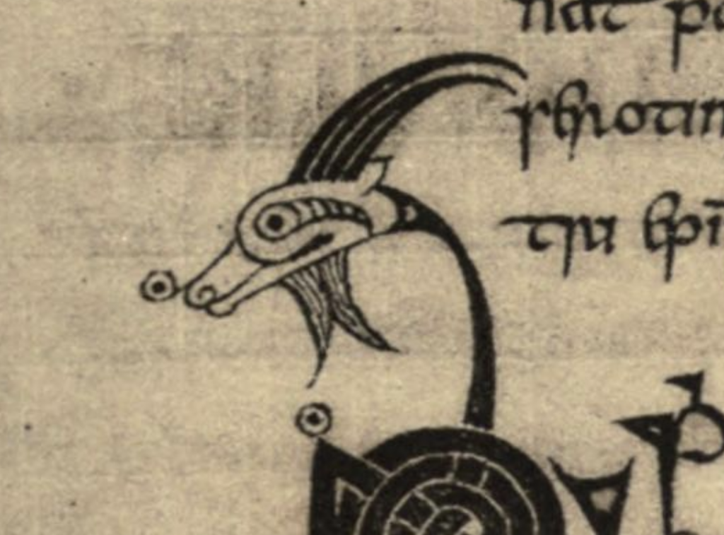
Some of its initials also feature a little goat’s head terminals like those seen in the 9th century Book of Armagh (IE TCD MS 52). The Ricemarch also contains the page layout established in 8th-9th century Irish manuscripts of a full introductory page featuring a large initial. At the point in time at which the Ricemarch was being created, this particular layout was becoming obsolete in Ireland, but it held fast here in Llanbadarn Fawr.5
initials
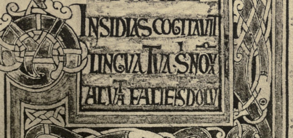
The Ricemarch shares a distinctive feature with a number of manuscripts. The Southhampton and Cotton manuscripts mentioned above, as well as other Irish manuscripts especially of the 11th and 12th centuries like the Psalter of St Caimín (MS A 1) and the Liber Hymnorum (MS A 2), both at University College Dublin, and the Parker MS 199 discussed at length below, alongside a Scottish manuscript with Irish features at the University of Edinburgh (MS 56) all feature characteristic heavy black initials. Art historian Francoise Henry has described them as “knotted-wire” style initials6, which is especially fitting given Ailis weaves with wire.
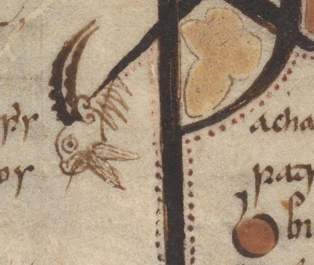
The initials in these manuscripts are often of two types: colored ribbon animals with interlace, and knotted-wire. In earlier manuscripts (like the damaged Cotton Vitellius, mentioned above) these types alternated, and this alternation became the norm in the 12th century, but when creating the Ricemarch Ieuen ignored such a systematic program7. The latter consist of thick black ribbon, tightly woven such that in some places the path isn’t easily followed. Terminals can consist of animal heads, curled triangles, bulbs, 2/3 of a triskele, spirals, feather-shaped or vegetal lobes, or variations of this list. Sometimes they can be filled with pieced colored fills reminiscent of cloisonné or stained-glass, a motif which might have an English (Saxon) origin8. They are surrounded by a dotted line, a common feature of Insular manuscripts which Carol A. Farr calls “dotted contours”9.
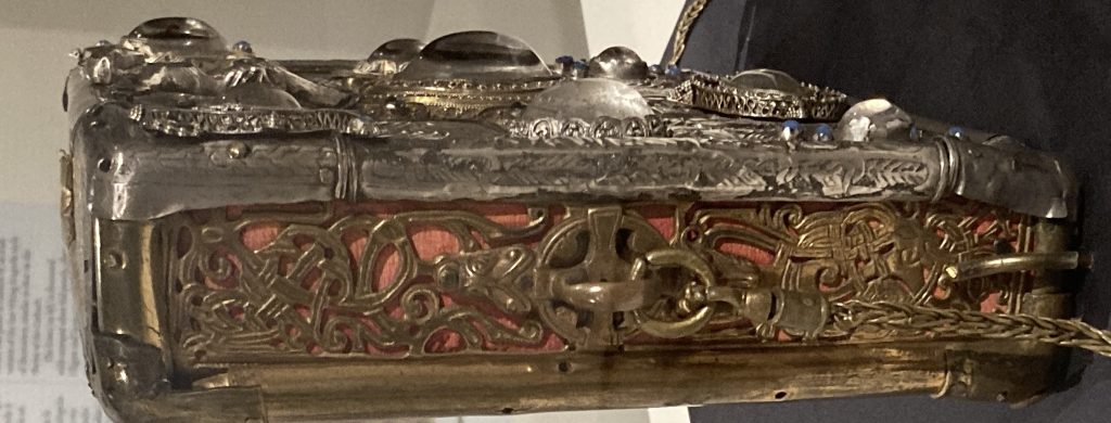
The lobed terminals described can be interpreted as the influence of Viking Ringerike style, which demonstrates a proliferation of such lobes—a Scandinavian connection, although subtle. Ringerike style is defined by the British Museum as “Viking-age art style featuring large, drawn-out animals with spiral hip joints, snakes, plant ornament and acanthus buds, and tendrils with lobed ends, which cross and re-cross, often in clusters.10. It occurs in manuscripts and metalwork, such as the Liber Hymnorum (below left) and side panels of the Shrine of Miosach, both seen below11.

As for our current main manuscript, apart from the initials there are even more pronounced Ringerike elements in the borders of some Incipit pages of the Ricemarch, as seen at left, where two lobed acanthus terminals sit at the very center of the image13.
Now, just because I didn’t use any of these Ringerike-inspired elements in this particular scroll doesn’t make this information extraneous. On the contrary, it paints a picture of stylistic syncretism across the islands, and further establishes the relevance of this specific manuscript for the brief. This is an Irish-Viking manuscript (Hiberno-Norse, to some) regardless what elements are or aren’t included.
visual transliteration
In his 2011 article “Writing in Tongues: Mixed Scripts and Style in Insular Art”14, Benjamin C. Tilghman discusses the use of alternate alphabets in the Incipit pages of Insular manuscripts, especially display scripts. He describes a flexibility in the use of alternate alphabets, using them as transliteration or translation or, sometimes, for their shape in the context of Roman-scripted language without regard to their original sound or meaning. Most relevantly, an Incipit page of the Ricemarch sometimes uses Delta-like variation on an Insular Uncial A, interspersed with the regular display capitals.
Tilghman includes runes or rune-like forms in this visual transliteration; there are numerous examples of runic characters within art otherwise featuring Roman-scripted language, as in the Franks Casket or the Lindesfarne Gospels, and while can’t know definitively why these alternate alphabets were used, but it’s been posited that they could have functioned to parade the scribe’s great learning, to obscure meaning, or to heighten the sanctity of the text.
It’s with all this in mind that I adapted a runic character to help solve a regular problem when using non-English exemplars to convey the English language, namely what to do with sounds that aren’t in the original language. In this case, I needed a J. With guidance from original Insular scribes to adapt and adopt orthography as needed, I rotated the runic L or a flipped Younger Futhark d, and created a straight-lined J letterform. As described above, I’m not alone in divorcing orthographic meaning from shape; Tilghman describes this phenomenon specifically. “Rather than thinking about these letters as equivalent phonetic forms, they are thinking of them as equivalent visual forms.15“
The inclusion of a rune had a supplemental benefit of introducing more Viking DNA into the scroll, which helped with my “11th century Irish or Viking” brief.
frameworks
The layout of this scroll is an adaptation from Ricemarch in response to the size of page, the amount of content, and my capabilities as an illuminator. (I am only a part-time scribe, after all, not a monk.)
Rather than soak a lot of real estate with the sort of borders seen on the large full page illustrations of Insular mss, full of interlace, key, and step patterns, I opted to slim them down to one of their sometimes overlooked but arguably most important features: the outlined border.
The geometric relationship between border and interior elements is important to Insular manuscripts. As Tilghman noted in 2017, “a concern with frames, both as a determinative compositional structure and as a dynamic foil against which letters and figures might act, is one of the distinctive features of Insular art.16” Or, if you like, “However coherent in themselves, the ornaments could not do without a fixed framework to rivet them, as it were, to the page. For this purpose the Hiberno-Saxon artists introduced yellow fillets whose brightness made for a clearly legible structure, divided largely into geometric compartments of different size and form.17“
(In fact, a strong border can be sufficient to support the feeling of Insular art—or “Celtic artwork”, in the popular consciousness—even in the absence of true historical reference. A forthcoming essay will explore this point.)
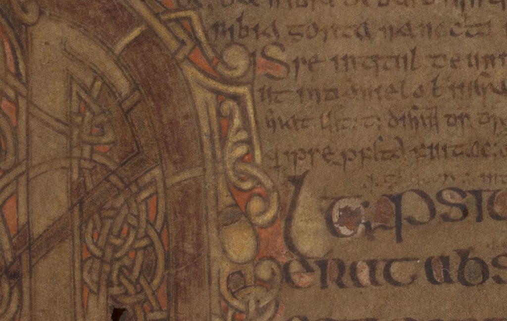
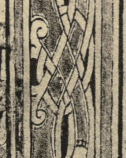
In the page from the Echternach Gospels seen at left, the layout consists solely of large geometric shapes formed by outlined borders. “Since the feet of the Lion cut into the borders, it is probable that they were intentionally left without a filling18.” And in the page from the Book of Deer seen at right, even with the empty or uncolored border fills the page’s layout remains legible. Strong. Additionally, the almond-shaped details in the corners echo a traditional lentoid (lens-shaped) La Tène ornament, which I also borrowed for this scroll.
The contrast between the intricate fill or letters and the bold and simple stripes of the border are what makes the page layout legible. And even in manuscripts which lack decorative fill—whether intentional or not—the geometric shapes formed by the border outlines are enough to support a strong layout.
With or without decorative fill, the borders make the page.
On our scroll, the deep yellow border, outlined in black, forms the majority, and the boldness of the red fill strengthens the smaller red details of the design.
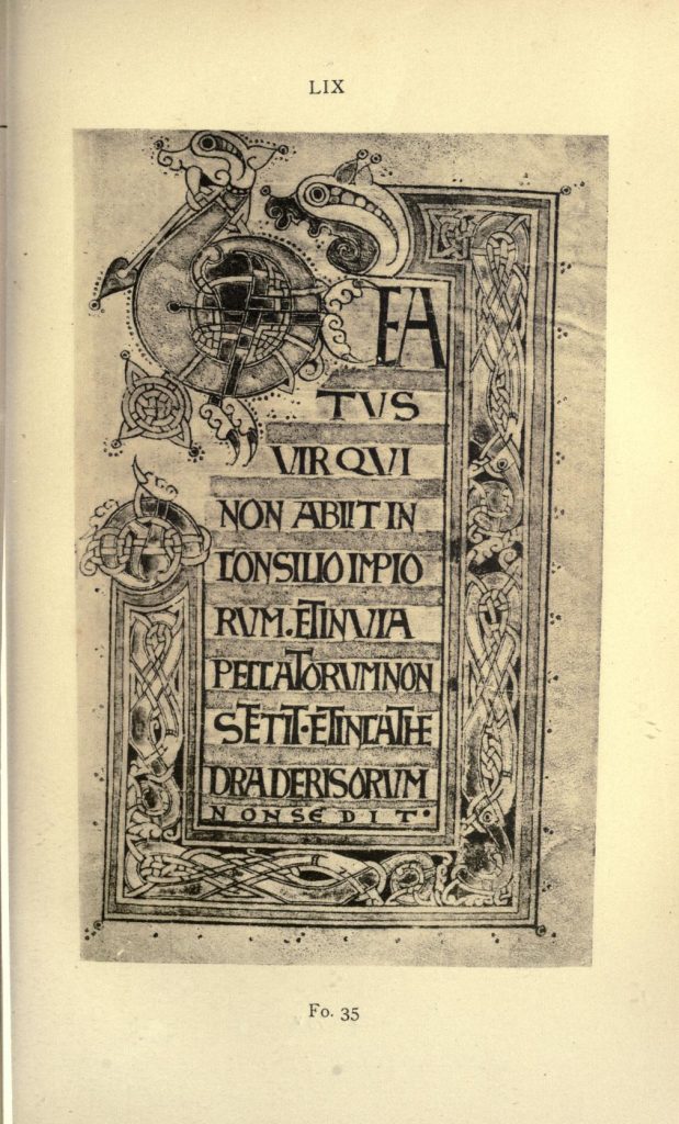
The rest of the page layout echoes the Incipit pages of the Ricemarch Psalter: initial top left, large display caps decreasing in size down the page, sometimes flattened and expanded at the bottom, with stretched letters when required, and sometimes a dot to hold the space. (See folio 35r at left for one example of letterform stretching and expansion. The dot occurs on every illustrated Incipit page.) The background alternates light/dark, the green fill alternating with substrate color, functioning like rows on a spreadsheet.
Our righthand page follows the form laid out by both the Ricemarch Psalter and Parker MS 199.
So let’s talk about Parker MS 199.
textual healing
As previously mentioned, there is no high-quality scan of the Ricemarch available. At present the only references are some scattered low-quality (and non-trustworthy) images on the internet, and a scan of a 1914 facsimile available on archive.org. Some day I will pay Trinity College Dublin for high quality photos, but in the meantime my best option is to extrapolate from what’s available: the blurry archive.org facsimile, and analogous manuscripts with full scans.
Enter Parker MS 199.
Manuscript shelfmark MS 199 in the Parker Library at Corpus Christi College, Cambridge is a circa-1090
copy of St Augustine of Hippo’s De Trinitate. Like the Ricemarch, Ievan (Ieuan) was its scribe, and it’s thought he might also have been its illuminator. But unlike the Ricemarch, in Parker 199 we have its very nice high quality scan to reference.
So not only can adding this secondary manuscript help fill in the gaps left by Ricemarch’s nonexistent scan, it can help broaden my understanding of the work of this specific family of scribes. It adds even more accurate stylistic datapoints to the list of manuscripts mentioned above, since the Parker manuscript is not just of a similar style, but it’s literally by the same creator.
It’s like a second opinion, but for art history.
Excellent.
Because of the blurriness of Ricemarch’s images, it’s harder to tell if the Parker MS 199 is a finer ms, but it certainly is a fine one, and well cared for; the vellum is likely made in the thicker, suede-like Irish-insular style19 it looks smooth and uniformly colored, with nary a difference in hair and flesh sides. Holes are few and far between. And because it’s such a fine mss, I could easily pull details blurred or obscured in the Ricemarch. I could see details of the initial fills. I could more accurately follow the ductus, and make more accurate extrapolations about each letter.
Between the two of them I could draw examples to help lay out the verse form on the page, and follow how to set the body text tightly or widely with respect to the large initials.
I could parse out his abbreviations, which would be helpful when setting my own text. (Rather than traditional substitutions, because this is English and not Latin I abbreviated “ing” on certain lines, and replaced a few common words with a letter and a macron.) Unfortunately, I forgot that at this time the abbreviation for “and” was not yet the more familiar ampersand-inspiring “et” ligature, but looked more like a backward 720. Hopefully I won’t forget that in the future.
I also could see where Ieuan used diminuendo, the term for a common practice in Insular manuscripts where a line starts out with a larger initial and diminishes as it moves into the line.
And with the examples of both Parker 199 and the other manuscripts of this place and time, I could also make better judgements about color.
color
Based on J. J. G. Alexander’s 1978 survey of Insular manuscripts, the Ricemarch was done in red, yellow, and green21. That said, the analogous and contemporaneous manuscripts listed above display a wide range of color; we’ve long, long since left behind the stereotypical red, yellow, and green of early Insular books. Therefore I felt confident choosing colors based on heraldic and iconographic requirements.
Ailis’s arms are red and green, yellow/gold and white/silver, while the Pearl’s iconography is white and blue. I would need these five colors to represent all that needed representing, and it would be my job to mix up gouache to approximate the traditional pigments.
Cheryl Porter has warned us that “you can’t tell a pigment by its colour22“. Heather Pulliam has described the insufficiency of gauging a manuscript’s true color from an online image23. But since the Ricemarch Psalter lacks even a modern high quality scan, spectroscopic analysis of its pigments is out of the question. Fortunately, we have other relevant manuscripts from which I could derive an educated guess.
The Lindisfarne Gospels—created in early 8th century Northumberland by scribes in the Irish tradition, much as these Welsh scribes created in the Irish tradition—was verified by Raman spectroscopy to have been made entirely by a restricted palette of red/orange, yellow, green, blue, purple, white, and black, made from toasted lead, orpiment, verdigris or vergaut, woad or indigo, plant extracts like folium or ochil, chalk, and carbon, respectively. The wide variation in colors comes from the myriad techniques of the scribe24.
(As for gold, according to Michelle Brown, “Gilding never seems to have been practiced by Irish scribes, perhaps because in Ireland what gold there was was so valued for use in the production of high-status metalwork”25, or perhaps because gold was the province of goldsmiths only, in a society carefully divided by skill26.)
This potential palette remained unchanged until the 14th century27, so when I mixed my paints, I did so in emulation of orpiment (yellow), woad (blue, verdigris (green), toasted lead (red), with chalk white and carbon black.
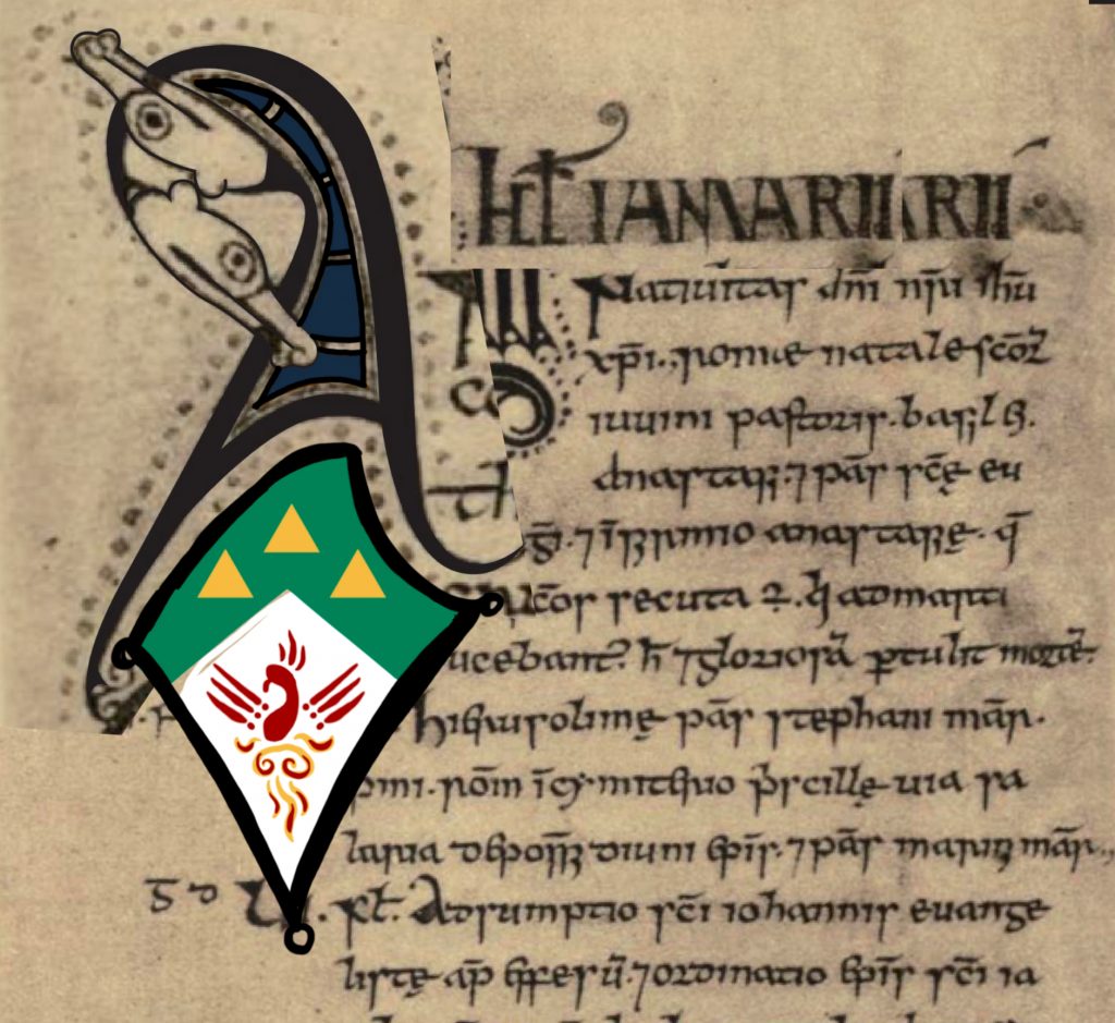
As for the initials themselves, I chose an O which could be easily worked into a shell and pearl, and an A to represent her name. (The pair also had a bit of an “alpha and omega” thing going on, but that was accidental and not particularly pertinent.) When it came to their fills I made a slight adaptation; I divided up the spaces as usual, like cloisonné or stained glass, but because the left initial represented SCA Pearl heraldic iconography, I filled both of them entirely with blue so they would balance.
The caps in the referent manuscripts are filled with color. In European manuscripts both before this timeperiod and after, capitals alternate color, the contrast of which functions (as in the alternating background fields of our Incipit page) like the background shades of rows in a spreadsheet. In our scroll, this was done by fills of yellow and green, sometimes stacking, as was done in various source manuscripts. Green was chosen to balance out the green on the lefthand page, and yellow was chosen not just because extant fills often alternate a bright color with yellow, but because this is a really good strategy to make sure the alternation is easily legible at a glance.
As mentioned previously, the dotted contours are red (as is common in Insular manuscripts), and the initials are filled with blue.
And four of these five colors are pinned down in Ailis’s arms.
arms laid bare
Arms. Coins. Logos.
All are about communication.
If you’re not creating arms for a time and place that uses heraldry—which, given the depth and breadth of history, is a majority of the time—we need to get creative. Our hobby is played with a large dose of heraldry, and it can be helpful to have a strategy for this creativity.
Ailis’s arms contain a phoenix rising up out of flames—iconography I’d have to extrapolate from alternate sources, since a) as far as I’m aware, there isn’t a direct reference in a contemporaneous manuscript, and b) it likely wouldn’t fit the needs of arms on a small shield.
The key thing about adapting art for arms is that they were created for identification quickly, from far away or small. It is a logo. So the principles of good logo design—contrast of color, line, form—will stand you in good stead for inventing arms. Fortunately, contrast of color is built into the heraldic framework, while easy identification of form is implicit.
Well-designed coins need the same thing; even if you don’t know what the symbols mean, you should still be able to visually disambiguate the shapes from one another. This use of visual shorthand is what makes coins successful instruments of propaganda.
So I stretched back in time and looked to coins.
There is a coin with a phoenix—Roman, from the 4th century—but doesn’t do what our heraldic conception of a phoenix needs it to do. (Honestly, it looks more like a victorious chicken, which would be a fantastic band name.) Instead, I assembled a bird based on those from an assemblage of Celtic coins, since that’s the region our Irish manuscript style grew from.
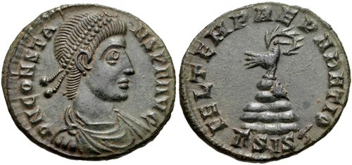
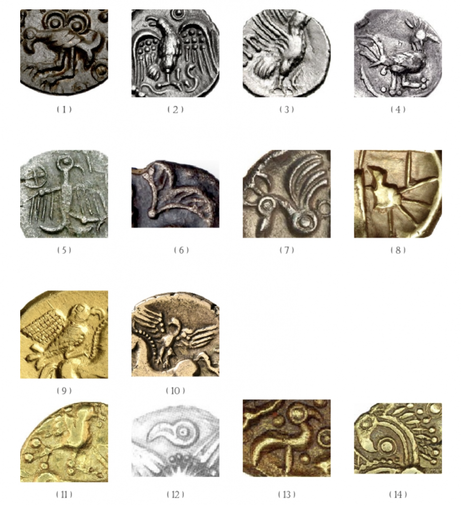
The dots at the joints is a classic motif of animals on their coins, and the crest on its head is a nod to common heraldic examples. The line of its body, its upswept wings, its beak, all are derived from coin design. The result is a simple iconography which communicates “phoenix” without clashing too horribly with the overall style of the scroll.
opportunity
Every time I use these references I learn something new. This time I learned that a prominent art historian called the initial style “knotted-wire”, which not only offers a useful handle for talking about them, but also helps me see their nuances. And I got a chance to delve further into the historiography of Insular art, then follow it down the rabbit hole of Scandinavian/Viking influence, which I suspect will bear greater fruit down the road.
Ailis, congratulations. I was delighted to make this scroll for you, and I hope it makes you feel seen. Thanks for the opportunity.

notes
- In fact, there are such holes in the record that Françoise Henry mentions that “By a strange chance the only manuscripts which have come down to us from the tenth and early eleventh-century period are all psalters, while no psalters of the eighth and ninth centuries have survived.” If more manuscripts have been discovered since 1967, that remains for me to discover in my future. Françoise Henry, Irish Art During the Viking Invasions (800-1020 A.D.) (York: Cornell University Press, 1967) 105. ↩︎
- Michelle Brown, Art of the Islands: Celtic, Pictish, Anglo-Saxon and Viking Visual Culture (The Bodleian Library, 2016), 154. ↩︎
- J. J. G. (Jonathan James Graham) Alexander, Insular Manuscripts, 6th to the 9th Century / by J. J. G. Alexander., Survey of Manuscripts Illuminated in the British Isles ; v. 1 (London: H. Miller, 1978), 89. ↩︎
- Henry’s “Remarks” contains notes about about her efforts to access adequate images of the remains of the manuscript, some of which were included in her paper. Ironically, because of the recent hacking of the British Museum’s website, her hard-sought images were all I had to go on, too. Françoise Henry, “Remarks on the Decoration of Three Irish Psalters,” Proceedings of the Royal Irish Academy. Section C: Archaeology, Celtic Studies, History, Linguistics, Literature 61 (1960): 23. ↩︎
- Henry, “Remarks”, 40. ↩︎
- Henry, “Remarks,” 33. ↩︎
- Henry, Irish Art, 108. ↩︎
- Henry, “Remarks,” 33. ↩︎
- Carol A. Farr, “Red-Handed in the Barberini Gospels: The Rubricator Did It,” in Peopling Insular Art: Practice, Performance, Perception, ed. Cynthia Thickpenny et al., (Oxford: Oxbow Books, 2020), 5. ↩︎
- “Ringerike Style | British Museum,” accessed February 20, 2024, https://www.britishmuseum.org/collection/term/x95686. ↩︎
- S H. Fuglesang, Some Aspects of the Ringerike Style: a Phase of 11th Century Scandinavian Art (Odense: Odense University Press, 1980), 52–54. ↩︎
- Fuglesang, Some Aspects, 70–72, 75. ↩︎
- Lee Boltin et al., Treasures of Early Irish Art 1500 B.C. to 1500 A.D. from the Collections of the National Museum of Ireland, Royal Irish Academy, Trinity College, Dublin : Exhibited at The Metropolitan Museum of Art [et al. 1977-1978], (New York: The Metropolitan Museum of Art New York, 1977) 146. ↩︎
- Benjamin C. Tilghman, “Writing in Tongues: Mixed Scripts and Style in Insular Art,” in Insular & Anglo-Saxon Art and Thought in the Early Medieval Period, ed. Colum Hourihane, (Princeton N.J. University Park Pa: Index of Christian Art Dept. of Art and Archeology Princeton University ; in association with the Pennsylvania State University Press, 2011) 93–108. ↩︎
- Tilghman, “Tongues,” 98. ↩︎
- Benjamin C. Tilghman, “Pattern, Process, and the Creation of Meaning in the Lindisfarne Gospels,” West 86th: A Journal of Decorative Arts, Design History, and Material Culture 24, no. 1 (March 2017): 10, https://doi.org/10.1086/693796. ↩︎
- Carl Nordenfalk, Celtic and Anglo-Saxon Painting : Book Illumination in the British Isles 600-800 (New York: G. Braziller New York, 1977) 16. ↩︎
- Nordenfalk, Painting, 52. ↩︎
- In a lecture on the materiality of the Medieval book, Michelle Brown mentioned that up until the 12th century, even scribes on the continent who were nevertheless working in the Irish tradition would send away to Ireland for Irish-style vellum, in part due to its particular qualities such as these. Michelle Brown, “The Medieval Book,” London Rare Books School short course, Zoom, 6 March, 2024. ↩︎
- Brown, “Medieval Book”, 2024. ↩︎
- Alexander, Insular Manuscripts, 89. ↩︎
- Cheryl A. Porter, “You Can’t Tell a Pigment By its Color,” in Making The Medieval Book: Techniques of Production. Proceedings of the 4th Conference of The Seminar in the History of the Book to 1500 (Oxford, July 1992), ed. Linda L. Brownrigg (Los Altos Hills, Calif. : Anderson-Lovelace ; London : Red Gull Press, 1995), 111–116. ↩︎
- H. Pulliam, “Eyes of Light: Colour in the Lindisfarne Gospels,” in Newcastle and Northumberland: Roman and Medieval Architecture and Art vol. 36, BAA Conference Transactions_, ed. J Ashbee & DJ Luxford (Maney Publishing, 2013) 55. ↩︎
- Michelle P. Brown, The Lindisfarne Gospels : Society Spirituality and the Scribe (Toronto: University of Toronto Press, 2003), 281. ↩︎
- Brown, Lindisfarne Gospels, 280. ↩︎
- Michelle Brown, Art of the Islands: Celtic, Pictish, Anglo-Saxon and Viking Visual Culture (The Bodleian Library, 2016) 75. Referencing MacLean, D., 1995b, “The Status of the Sculptor in Old Irish Law and the Evidence of the Grosses, Fertia 9, pp. 125-55. ↩︎
- Brown, _Islands,_ 43. ↩︎
bibliography and further reading
Alexander, J. J. G. (Jonathan James Graham). Insular Manuscripts, 6th to the 9th Century / by J. J. G. Alexander. Survey of Manuscripts Illuminated in the British Isles ; v. 1. London: H. Miller, 1978.
Boltin, Lee, Polly Cone, National Museum of Ireland, Royal Irish Academy, and Trinity College (Dublin). Treasures of Early Irish Art 1500 B.C. to 1500 A.D. from the Collections of the National Museum of Ireland, Royal Irish Academy, Trinity College, Dublin : Exhibited at The Metropolitan Museum of Art [et al. 1977-1978]. New York: The Metropolitan Museum of Art New York, 1977.
Brown, Michelle. Art of the Islands: Celtic, Pictish, Anglo-Saxon and Viking Visual Culture. The Bodleian Library, 2016.
Brown, Michelle P. The Lindisfarne Gospels : Society Spirituality and the Scribe. Toronto: University of Toronto Press, 2003.
Brown, Michelle. “The Medieval Book.” London Rare Books School short course. (Zoom, 6 March, 2024).
Farr, Carol A. “Red-Handed in the Barberini Gospels: The Rubricator Did It,” in Peopling Insular Art: Practice, Performance, Perception, ed. Cynthia Thickpenny, Katherine Forsyth, Jane Geddes, and Kate Mathis, 3–12. Oxford: Oxbow Books, 2020.
Fuglesang, S H. Some Aspects of the Ringerike Style: a Phase of 11th Century Scandinavian Art. Odense: Odense University Press, 1980.
Henry, Françoise. Irish Art During the Viking Invasions (800-1020 A.D.). New York: Cornell University Press, 1967.
Henry, Françoise. “Remarks on the Decoration of Three Irish Psalters.” Proceedings of the Royal Irish Academy. Section C: Archaeology, Celtic Studies, History, Linguistics, Literature 61 (1960): 23–40.
Kershaw, Jane. “Viking-Age Scandinavian Art Styles and Their Appearance in the British Isles. Part 2: Late Viking-Age Art Styles. Finds Research Group Datasheet (2011).” Accessed February 25, 2024. https://www.academia.edu/1078280/Viking_Age_Scandinavian_art_styles_and_their_appearance_in_the_British_Isles_Part_2_Late_Viking_Age_art_styles_Finds_Research_Group_Datasheet_2011_.
Nordenfalk, Carl. Celtic and Anglo-Saxon Painting : Book Illumination in the British Isles 600-800. New York: G. Braziller New York, 1977.
Porter, C A., “You Can’t Tell a Pigment By its Color.” In Making The Medieval Book: Techniques of Production. Proceedings of the 4th Conference of The Seminar in the History of the Book to 1500 (Oxford, July 1992), edited by Linda L. Brownrigg, 111–116. Los Altos Hills : Anderson – Lovelace, The Red Gull Press, 1995.
Pulliam, H. “Eyes of Light: Colour in the Lindisfarne Gospels.” In Newcastle and Northumberland: Roman and Medieval Architecture and Art vol. 36, BAA Conference Transactions_ edited by J Ashbee & DJ Luxford, 54–72. Maney Publishing, 2013.
Tilghman, Benjamin C. “Pattern, Process, and the Creation of Meaning in the Lindisfarne Gospels.” West 86th: A Journal of Decorative Arts, Design History, and Material Culture 24, no. 1 (March 2017): 3–28. https://doi.org/10.1086/693796.
Tilghman, Benjamin C. “Writing in Tongues: Mixed Scripts and Style in Insular Art.” In Insular & Anglo-Saxon Art and Thought in the Early Medieval Period, edited by Colum Hourihane, 94–108. Princeton N.J. University Park Pa: Index of Christian Art Dept. of Art and Archeology Princeton University; in association with the Pennsylvania State University Press, 2011.