Scroll to honor the new knighthood of Arundoor of Anglesey (Arnoddr i Ongulseyju). Hearty words by Anubh na Preachain, design by me, made gorgeously real by Kolfinna Valravn (link to her writeup), with the steadfast support of Lanea inghean Uí Chiaragáin.
Whenever I’m designing anything, whether it be a business logo or an award scroll, it’s important
at its heart that it feels right. The details can grow from there.
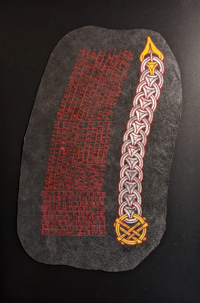
For this scroll, the concept of “feeling” was tied up with the concept of materiality. While usual, a paper or vellum substrate seemed wrong for a scroll which was intended for a recipient who resonates with a culture, places, time which isn’t exactly known for its books. Leather, however, seemed like a perfect substitute. It was still paintable, but had a slightly more appropriate spirit.
But what would go on it?
Kolfinna and I were told that Arundoor particularly likes Borre, and that was a good start. But which items would we include? How? Why? It would be literally “chivalric” to include one of the many extant horse pommels, as an example. Or perhaps we should create a badge? Whichever artefact we included needed to not just accompany but support the words of Anubh.
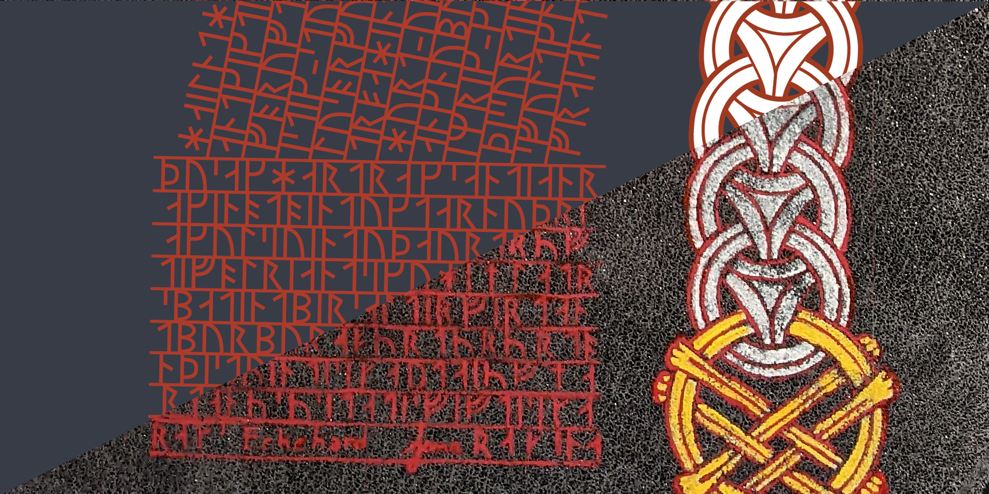
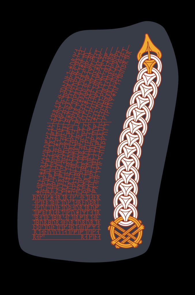
Disregarding the brief (and frankly ludicrous) notion of making a saddle, ultimately I decided to start looking at the design of runestones, hoping they’d steer not only my design but the materiality as well. Perhaps the design might be burned into the surface, with painted accents? Would that work? Only the process would tell.
the design
There are literally thousands of runestones to look at. Anne-Sophie Gräslund categorized them by style back in the 90s, which gave me a decent leg up on winnowing them down to a few helpful exemplars, and because there are more Swedish stones than in any other region, choosing to focus solely on Swedish stones could focus this project down even further.
It’s also helpful to know that Borre style is the earliest Viking art style, dated to around the mid-9th to late 10th century. If I wanted to choose a contemporaneous runestone, that pretty much limited me to the earliest of the stone types, named RAK. This group is typified by flat ends to the bands, with no tapering or animal terminals. Think words, words, words.
Which is why being limited to the RAK category was no bad thing. Our scroll text was way more than a ribbon’s worth of words, and the runestone with the largest number of words comes from this group, the stone called the Rök runestone. There’s also another stone in this group called the Karlevi Runestone which would grant me more datapoints.
But the ultimate goal of a scroll is as an award, and I didn’t feel comfortable just setting the words without ornament. So if I wanted more art, I needed to look beyond the RAK stones.
the ornament
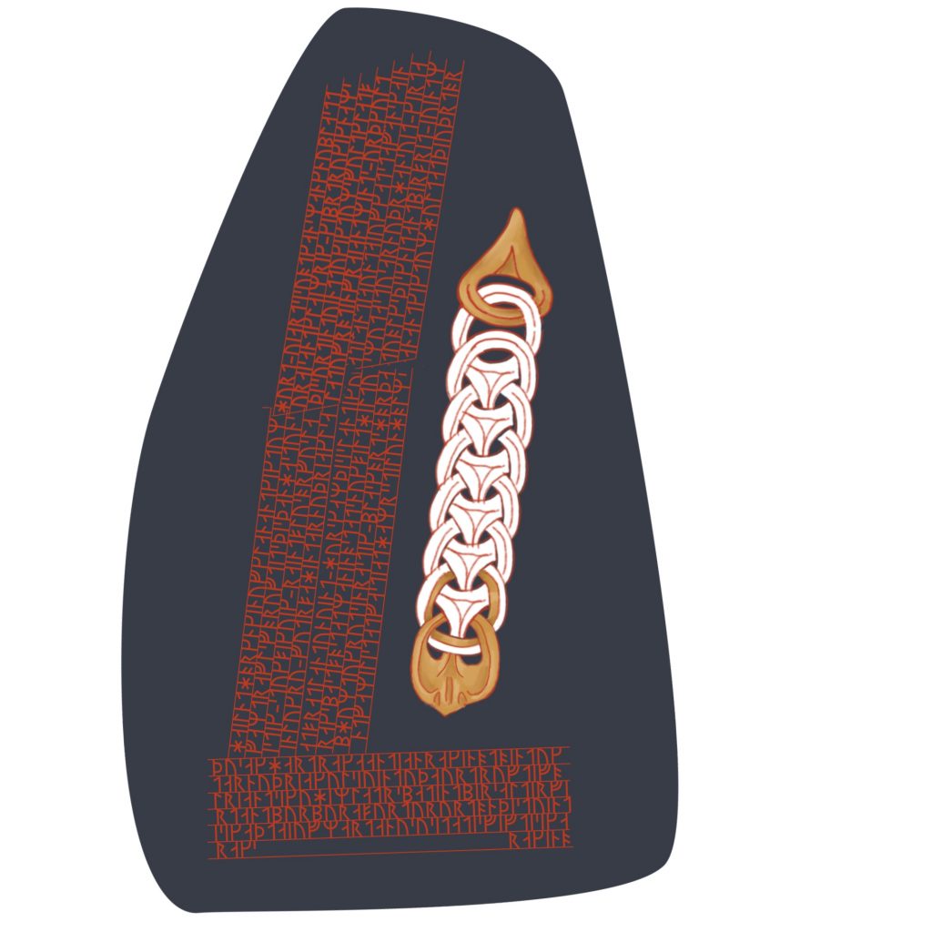
A white belt and a gold chain are the material testaments to a knight’s achievement. It made sense, then, that any ornament on the scroll would suggest these two items.
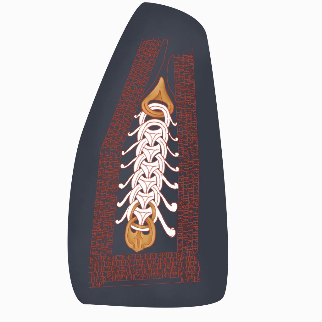
Fittingly, one element of Borre style is called “ring in chain”. A particularly Anglo-Scandinavian variant is called a “vertebral” ring-chain, because its concave-sided triangular lozenges make it look like a spine. Arundoor is part of the Free Company of Anglesey (see discussion of the ang below), a household “on” a Welsh island with international personae, so I felt comfortable integrating design elements from Anglo-Scandinavian England as well as those solely Scandinavian.
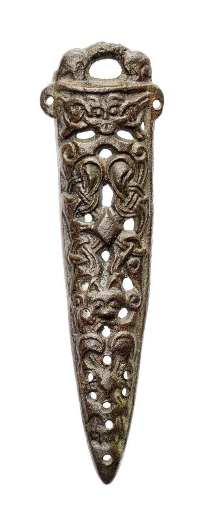
This style shows up in strap ends and other items of a similar shape. It’s not a far cry from other interlaced Borre designs in a long, strap-like configuration, either.
It’s not unheard of to feature this sort of ornament on stonework.
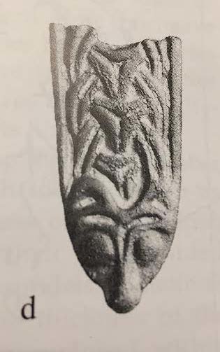
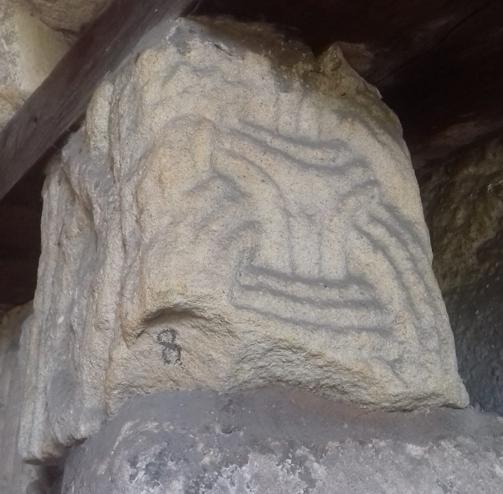
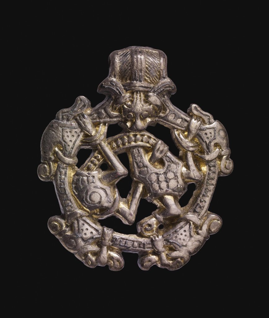
There are multiple stone crosses from the same time period in the UK which feature this style, including two ascribed to an artist named Gaut, and at least one fragment found during the renovation of a church in Darbyshire, seen to the right.
To create Arundoor’s belt-chain, I used links made from a distillation of the most popular forms of this style.
But a belt often needs a buckle.
the buckle
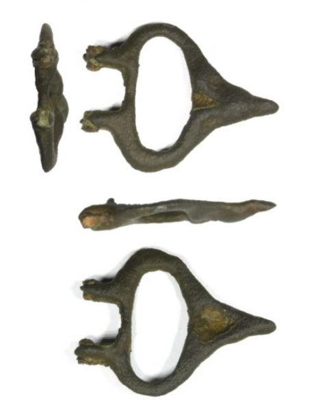
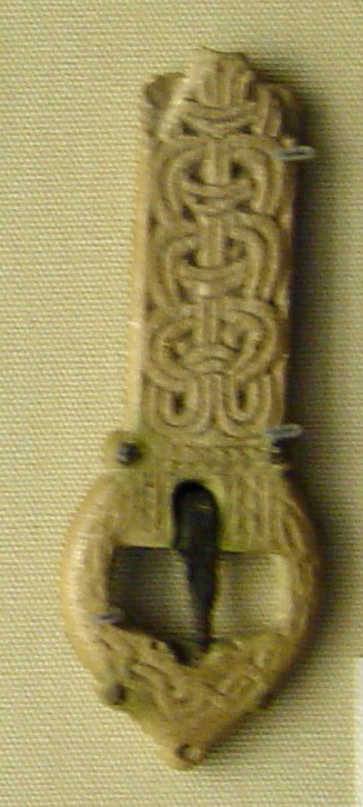
The buckle shape at the top end is based upon a copper example found in Leistershire, as well as the bone buckle mentioned above.
The buckle shape on the bottom is the ang, the symbol of Anglesey. In order to integrate it with the rest of the Borre style, I brought in a common Borre element called the “gripping beasts”. I thought that by adding hands to the end of the bars, it would work succinctly to suggest the style without detracting from either the form of the ang or the rest of the ornament.
the paint
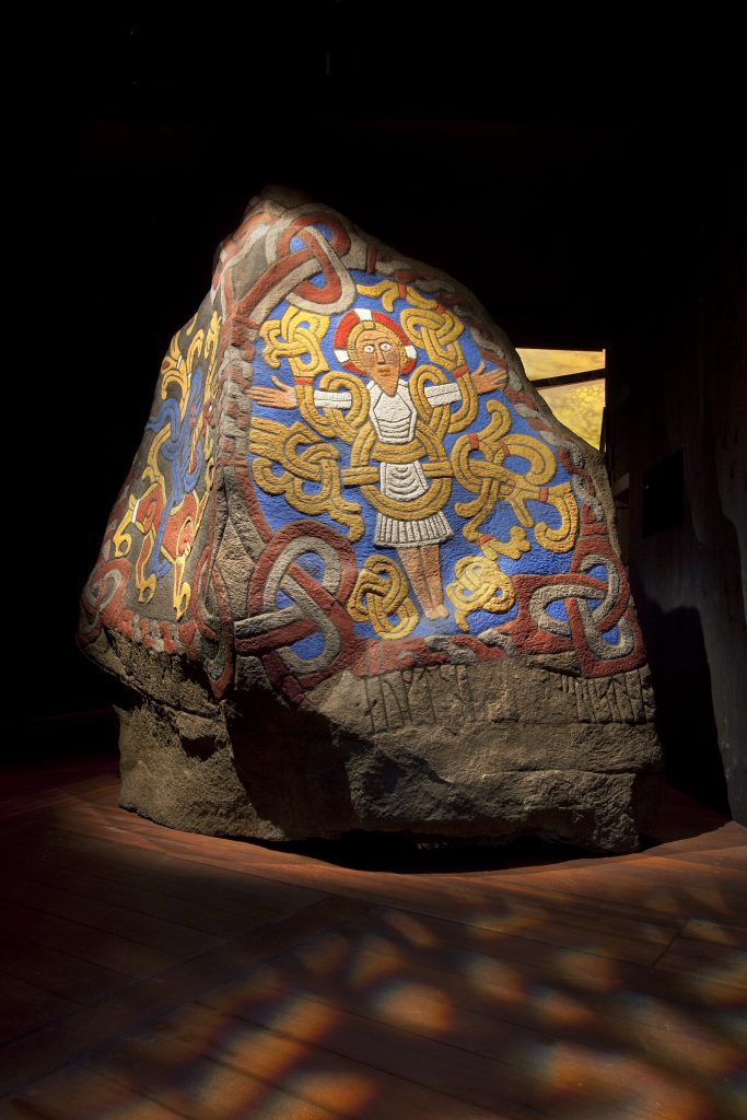
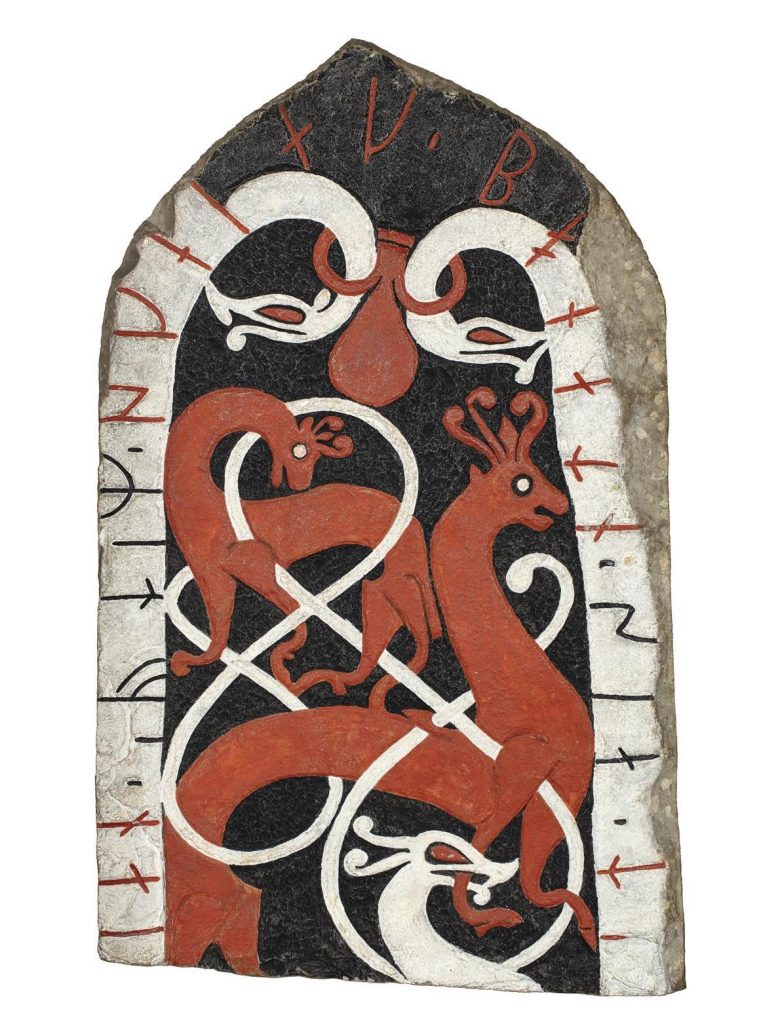
There is ample evidence that runestones were painted. This roughly-contemporaneous Jelling stone (at left) has been repainted based on existing residual flakes, and this later Urnes-style stone at the Swedish History Museum (at right) has been repainted based on examples elsewhere. Because our ornament is meant to represent a white belt with gold fittings, and because (as far as I could tell) there isn’t evidence for gold on a runestone, I chose white and yellow.
the layout
So the style of the runestone was determined.
The form of the ornament was determined
The next problem to solve for this scroll, then, was the layout.
And it definitely required some problem-solving.
As mentioned earlier, the layout of the Rök and Karlevi stones allows them to bear a whole lot of runes. Many runes, but no ornament. In fact, we don’t see ornament on runestones until the category “Fp” develops about thirty years or so later. And when it does, arguably the biggest change besides the addition of ornament is the ribbon shape the words begin to take.
Which meant I spent a good deal of time trying to find a layout which balanced the earlier runic layout of the RAK-style stones with the later styles’ integration of tunic ribbon as well as ornament. Particularly helpful for me was the Anundshög runestone. It’s SO similar in feeling to the vertebral ring chain designs seen on the crosses above, even though the interlace is a lot looser and the links are abstract human figures instead of rings, so I felt like that had to be an answer.
(It wasn’t.)


I tried various iterations: treating the stanzas like a thick ribbon, adding in some of the spine-like tendrils of the Anundshög stone, before eventually giving up on finding a way to combine blocks of stanza-as-ribbon, and beginning to work the problem with the text as a simple block.
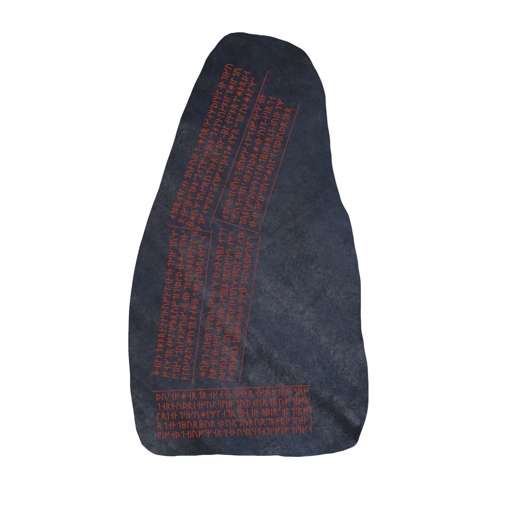
Even when it’s in a different alphabet to what we’re used to, it’s still helpful to break text up into discrete areas so the eye can process it in pieces. Fortunately the Rök stone subtly divides up its text into sections so I had a clue how to lay out our stanzas.
It may not seem it now, at the end, after the work has been done, but it took a fair amount of experientation before I could discern the parts of designs which wheren’t serving me, find some which worked better, and suss out what it really needed to be.
Compromise is a necessary part of any design, as is iteration. After a healthy dose of both, eventually I found my layout.
And it happened with an almost-audible click.
“For the true art is that which conceals the labor that produced it.”
Ballet Maestro Enrico Cecchetti
Sometimes in design (and many other creative disciplines), there comes a point after a great deal of experiment and iteration when you wonder if you’re ever going to find the right solution. But then suddenly, out of the blue—often when you’ve stopped actively working and given your brain a chance to process—a good solution reveals itself, and it all seems obvious. Once all the struggle is in the rearview mirror it often can appear as if there were only one way it could have gone. And sometimes it can feel boggling that it took so much effort to find it.
The process is necessary, though. The work is important. You need all the things which come before, the failures and missteps and wrong notes and errors in order to learn what’s necessary, what’s not, what works, and what doesn’t.
Often it’s the designs which make us go, “…oh, duh, of course” which turn out to be the most successful. And they might not look like they took much work at all.
Good design is transparent to the end viewer.
I want to thank Lanea for her humor and insight, and I specifically want to thank Kolfinna for her patience as I wrestled with this layout. I’m grateful for her sense of experimentation, and the deep wisdom she’s developed over the years which allowed her to take this concept and know what needed to be done to make it real. The trust in our partnership is a true gift that keeps giving…to me, and to the individuals we get to create for together.