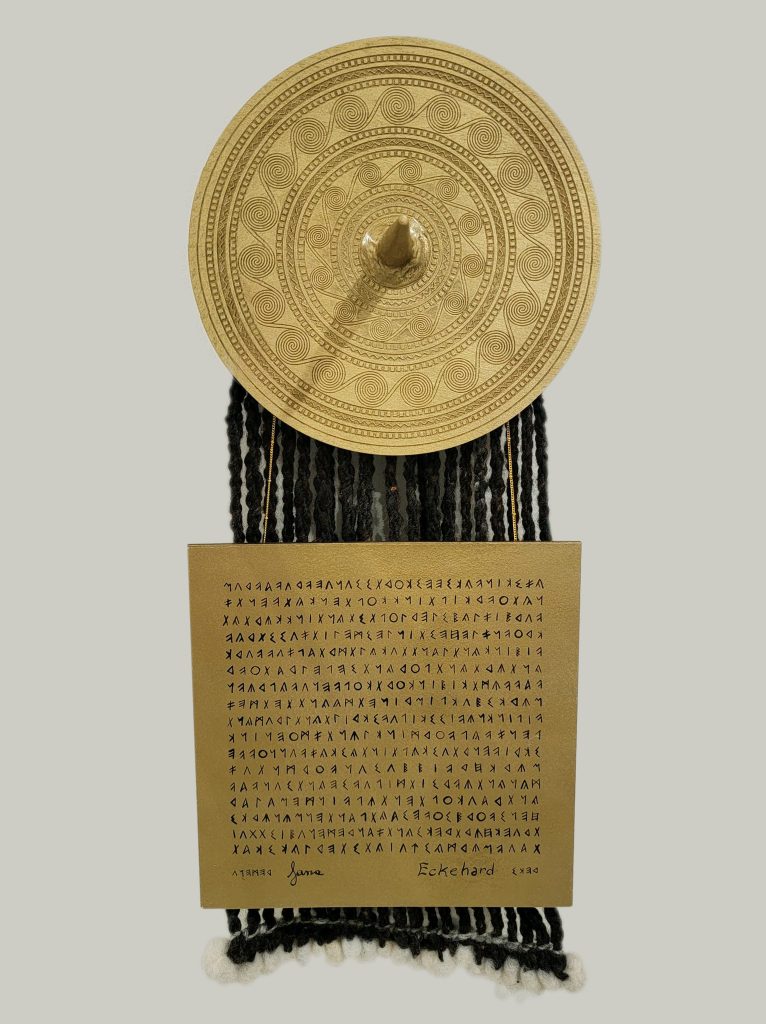
A gilded version of the bronze age veneration of a sun goddess. A bright, shining, Golden Dolphin.
Words by Lanea inghean Uí Chiaragáin, design and transliteration by me, belt plate created by Aurri le Borgne, weaving and text plate created by Ela Mæru.
For this piece, I and a few of Kolfinna’s friends joined together specifically to create a piece which echoed the wonderful alternative scrolls she’s been creating for others.
Kolfinna has become important to me over the past year or two, so I wanted to design something that felt to me like her. In spite of the fact that this award is specifically about her deeds—her generosity, her helpfullness, her resourcefulness—ultimately those deeds come about because she is who she is.
For that matter, although many people strongly associate her with her scribal accomplishments, she is, and her contributions to the SCA are, SO much more than her artistic output. This piece needed to be something different. It needed to be something that addressed her personally.
She and I have spoken in the past about her interest in the Nordic Bronze Age, particularly the Egtved Girl and belt plates. Lanea was on that exact same page, so the choice of time and place was an easy decision.
Immediately I came up with the concept of a burial wall hanging: something reminiscent of a grave site, but which could be hung on the wall. I thought it would be something she would totally dig. (Pun 100% intended.)
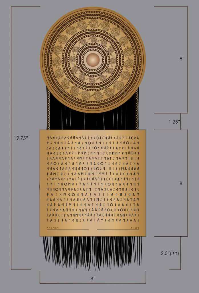
This scroll consists of three main parts: the belt plate, the text plaque (for lack of a better description), and the skirt falls.
the belt plate
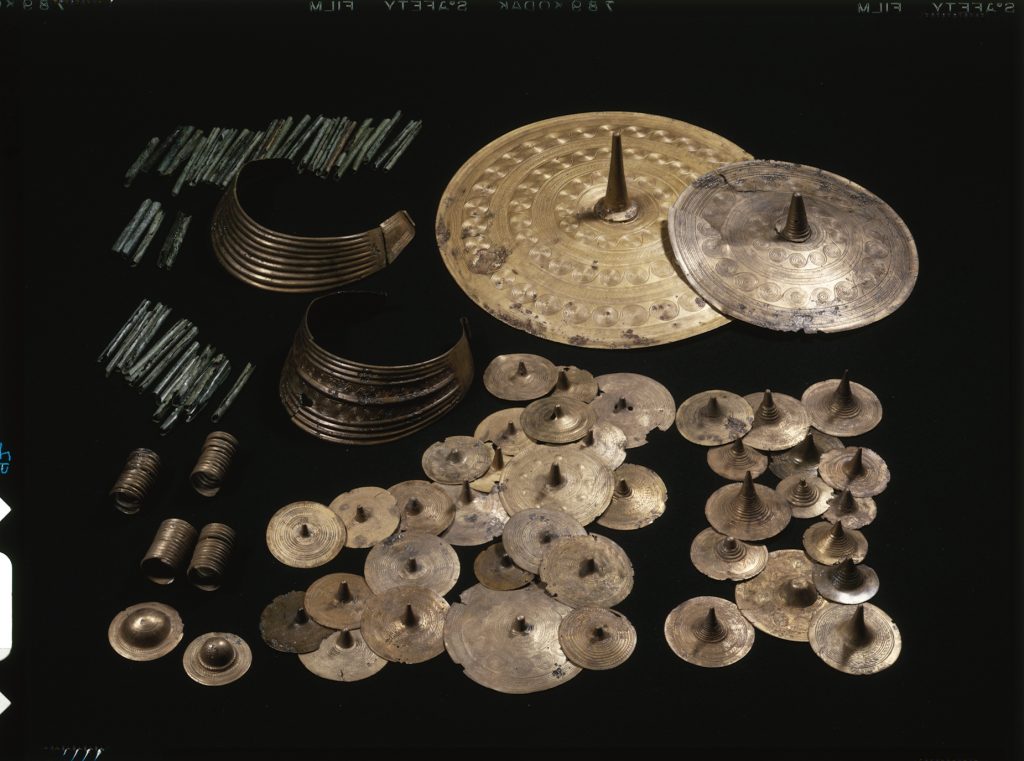
The round plate-like belt ornaments of the Nordic Bronze Age can be divided into two groups by size: the smaller belt discs (<10 cm) and larger plates (>13cm). These two groups can then be subdivided further. Details of all of which can be found in “Bronze Age Metalwork: Techniques and traditions in the
Nordic Bronze Age, 1500-1100 BC” by Heide W. Norgaard, which was extremely helpful for me in researching this piece.
In order for any of the plate designs to be made into a scroll, I needed to take into consideration size and complexity as well as looks. Norgaard has demonstrated that stamping designs was a common way to create the lost wax molds, and stamping in clay might be a workable method for us as well. Therefore, the design needed to be stamp-able by a non-expert.
(It turned out the stamping method wasn’t possible; ultimately Aurri ended up needing to create a woodcut version. Sometimes art needs to zig instead of zag, and that’s just the way it works. Still, when I planned the design, a combination of stamping and carving were what I had in mind.)
That being the case, I specified a belt plate of 8 in/~19.5cm, because based on my experience with clay that seemed the most doable.
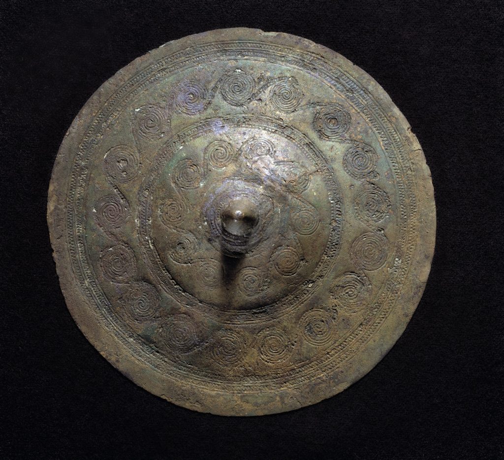
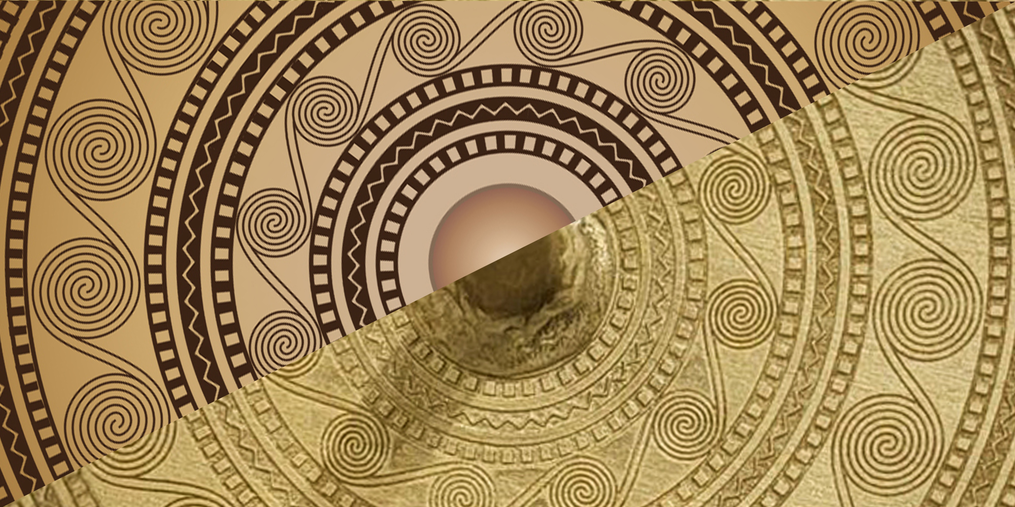
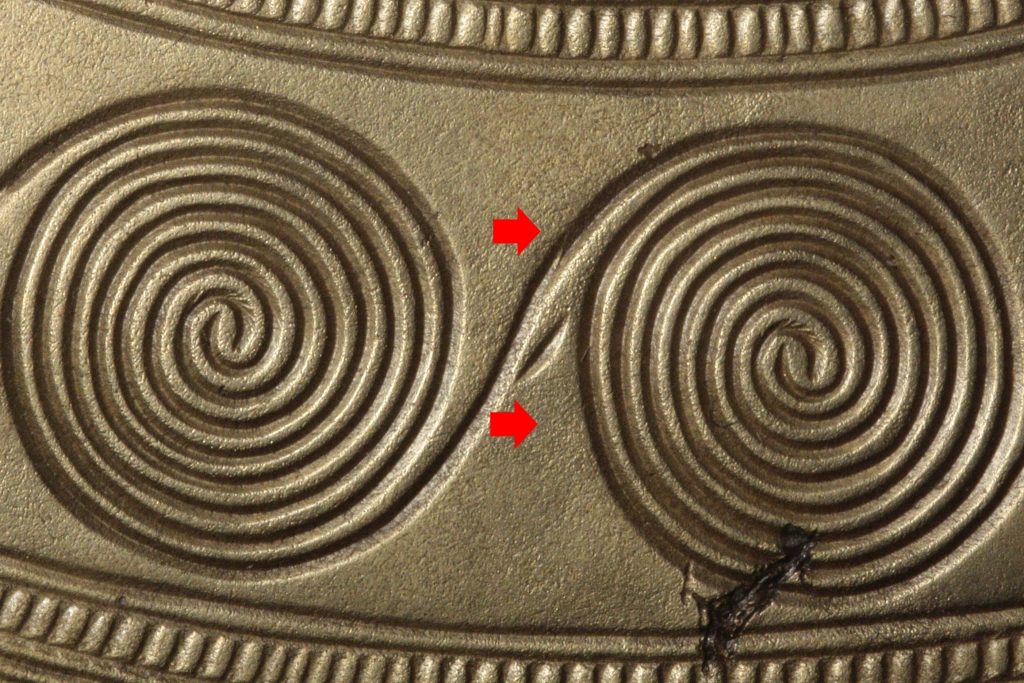
As for plate decoration, I wanted more than one concentric ring of spirals, but not too many, with rings of pressed-in zigzags as well as a ladder-type designs in between. It turns out what I was looking for has been described by Norgaard as belt plate type IIb: a flat profile with two rows of spirals, the most common type.
In fact, it’s so common that its proportions I took directly from the belt plate of the Egtved Girl herself, but for details of construction and ornament I relied upon the better, clearer photography of the Vognserup Enge votive finds. The layout of the next-to-largest plate from the latter burial is remarkably close to that which was buried with the Egtved Girl.
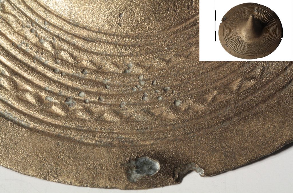
Speaking of zigging and zagging, the bands between the spirals needed to be filled with something that could be stamped or carved into the clay, and in Norgaard’s exploration of artifacts of stamping there are wonderful close-up photographs of bands of the zigzag and ladder designs. The photographs are so good, in fact, that I can see their construction methods.
Which is rather obviously the point of their inclusion in the paper. From the closeups I can see that the zigzags were constructed of more-or-less-overlapping triangles pressed alongside one another, and also I can see that what looked in many larger photographs to be a beaded border was in fact an incised ladder. With this information, I could create a template for Aurri made up of exactly these pressed-in shapes.
the skirt/falls
The skirt/falls consists of black cords, grey twining, white ends and (hidden) weaving, all from Jacob wool. For more detail I defer to Ela, who knows far, far more about it than I do. Not least because she’s the one who actually made it.
the text
I took the text transliteration as seriously as I did the plate design.
And it took almost as much effort.
It would have been easy enough to simply transliterate them into Elder Futhark runes, but I thought I could do better. At first I began constructing something that went even further back than the East Rhaetic alphabet I eventually settled upon, something potentially possible based on the letterforms of Phoenician, Eruscan, and Rhaetic, but I wasn’t too far into my research before I found that not only is the Norse Runic Elder Futhark likely derived from Rhaetic, but that was likely the first development of Norse writing. So it didn’t make sense to try and flail further back. Rhaetic isn’t perfect—it’s about a thousand years too late—but it’s the best I could do.
At this point in our understanding of Rhaetic, we set its span at period from the second half of the 6th century CE to the 1st century CE. I relied heavily on the resource at the site “Mnamon: Ancient writing systems in the Mediterranean”, which not only had a chart of letterforms, but a decent amount of other context.
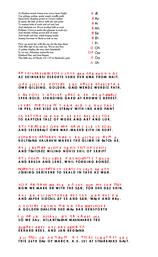
My overall philosophy was to translate based on sound, not letter. I started by creating a draft of the scroll text with spelling changes and a vowel guide to help me work out the sounds l needed.
English’s diphthongs are particularly greasy. To help a bit, I utilised all four extant versions of A, so that at least a few of our language’s sounds were represented by a different letter. I did my best, but as many language scholars will tell you: English is hot nonsense. (That’s the technical term.) I’m glad that a time traveller isn’t relying on this plaque to save their life.
It’s not only dipthongs which required alphabetic dexterity. Rhaetic also has far fewer consonant sounds than English, so I needed to make some educated decisions there, too.
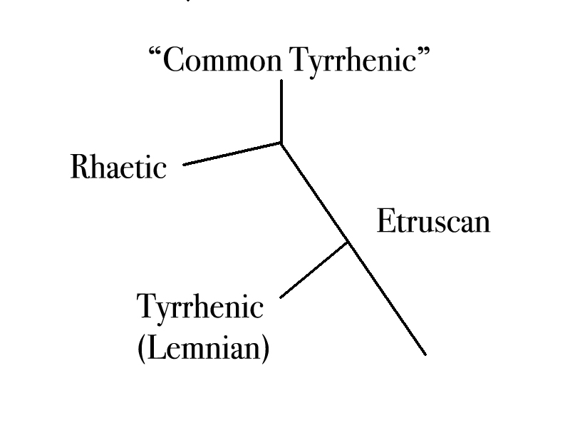
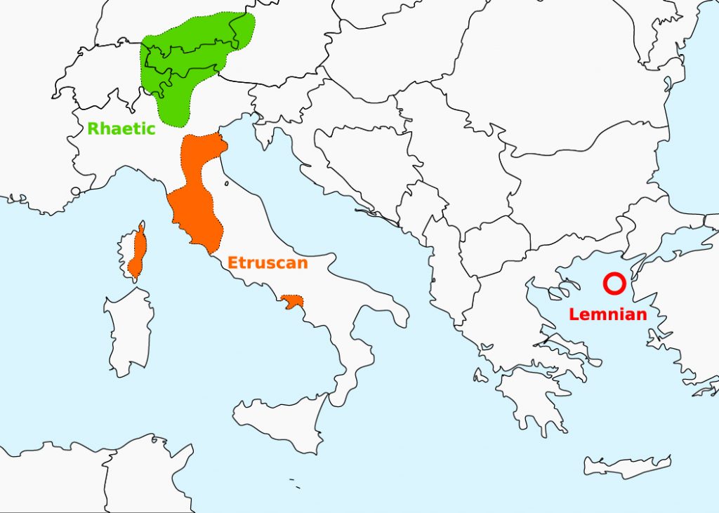
We believe Rhaetic belongs to the Tyrrhenian language family along with Etruscan and Lemnian. The Tyrsenian language family stems from Greek, which becomes relevant when looking at the use, name, and pronunciation of letters. When I lacked a suitable Rhaetic letter I borrowed from Etruscan—again, in the same family—and when I needed to make a judgement call on pronunciation, I looked to the Greek. For example, Raetic’s Digamma is a V sound, but the Archaic Greek Digamma is also called a waw, a W sound. But the Digamma was derived from the Phoenecian wāw, which became the vav in Hebrew, for just one example, and the wāw also led to the W, V, and F (an unvoiced V) in Latin, the latter of which is why our letter F looks like it does. One letter for F, V, and W.
So that’s what I did.
In other situations, rather than pulling an Etruscan letter, I simply combined D with the existing Rhaetic T, since they’re both alveolar stops (voiced and unvoiced, respectively). It seemed efficient. I made a similar call with hard G, using K instead.
For a very brief moment I considered representing the -ng sound with something akin to the Elder Futhark’s Ingwaz rune, and so began to delve into the history of the English gerund…which point I felt the yawning abyss of a research hole opening up beneath my feet, and heard a small voice on my shoulder saying “please…please do not do this”. I translated it straight. But there was definitely a moment.
J and CH sounds were tricky. Depending on context I either used Rhaetic’s SH or zeta, sometimes with an added T. (There are some arguments that the Ancient Greek zeta was pronounced as “dz”, which is an affricate along with j and ch. But in some words the English sound lacks the same plosive. Not wanting to dive too far down a conjectural rabbithole, I made a judgement call. Again: perspective.)
Honestly, none of this is any more or less hot nonsense than English itself. Needs must.
the numerals
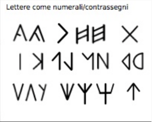
I couldn’t find much about numbers specific to Rhaetic, so I borrowed information from Etruscan, which we know so much more about.
By comparing the “Lettere come numerali/contrassegni” section of the Rhetic resource page with the list of Etruscan numbers, I could build a picture of what orthography was shared between the two, and use the relative wealth of research on Etruscan numbers to inform the way I used those numbers.
For example, given that both Etruscan and Roman numerals use additive notation, I felt confident using it for Rhaetic. But unlike Roman numerals, Etruscan was constructed slightly differently: instead of adding 1, 2, or 3 to 5 to get 6, 7, and 8 respectively, and only then switching to a subtractive method to get nine (1 from 10 equals 9), Etruscan begins using subtractive construction back at 7 or perhaps 6. (Because we’re not certain about 6, I used the additive construction we’re familiar with from Roman numerals: 5 + 1, rather than 4 from 10.)
the plaque
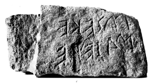
After I had all the letters transliterated, it was time to lay them out.
Rhaetic was written right to left, so I manually flipped the words as I placed them, leaving the letters the correct orientation, removing spaces to create scripta continua. (Some sources use limited punctuation, but I decided against it.) During this process I discovered that it was helpful that a) I study languages read from right to left, b) that I can read English backwards, and c) that I’ve studied enough languages which use an alphabet other than Latin, because these three skills meant I could more easily double-check my work as I placed each individual letter. Once each letter was vaguely in place, I subsequently adjusted their size and distribution to account for the shape and size of the substrate, as well as the fact that Ela wasn’t going to be scratching it in like we see in our extant artifacts. More than anything else I wanted her not to have to worry about anything but transcribing the shapes in place. If I could front-load most of the work, I was happy to.
I’m grateful Lanea asked me to work together with other people who also love Kolfinna, and I sincerely thank Ela and Aurri for helping make this big vision of mine real. Not only was it a pleasure to create a scroll for a good friend, someone who is so incredibly generous with her time, experience, planning, and ability, but it was also a distinct delight to make a nontraditional scroll for someone with whom I’ve worked to create the same for others. A beautiful payback, you might say.
At the end of the process we all discussed how enjoyable it is to be a little extra for our friends.
And Kolfinna certainly deserves it.