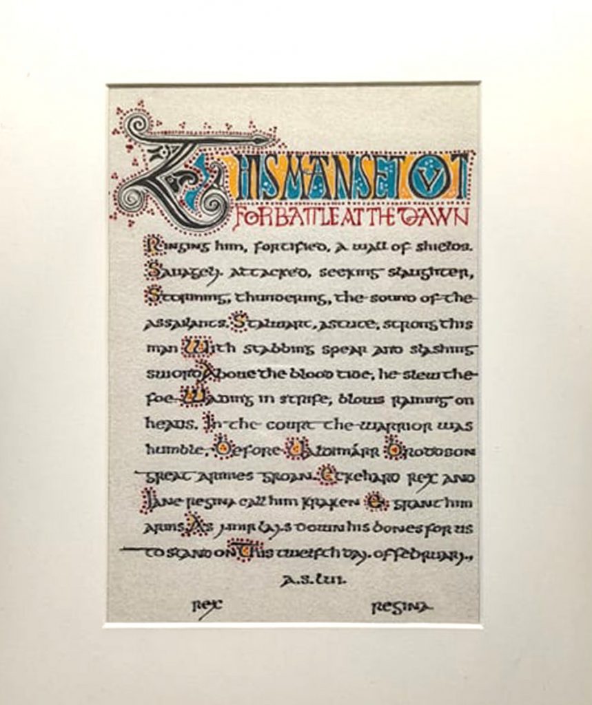
Kraken award for Valdimárr Broddson, presented 12 February, 2022. Design by Bran Mydwynter, with powerful wording by Lanea inghean Uí Chiaragáin, and gloriously executed by Kolfinna Valravn. Details below.
More than any of our collaborations so far, this scroll was truly a product borne up by our creative experience. If we hadn’t spent decades experimenting with a broad array of media, I’m sure we wouldn’t have been half so successful. (Or had so much fun.)
The brainstorm
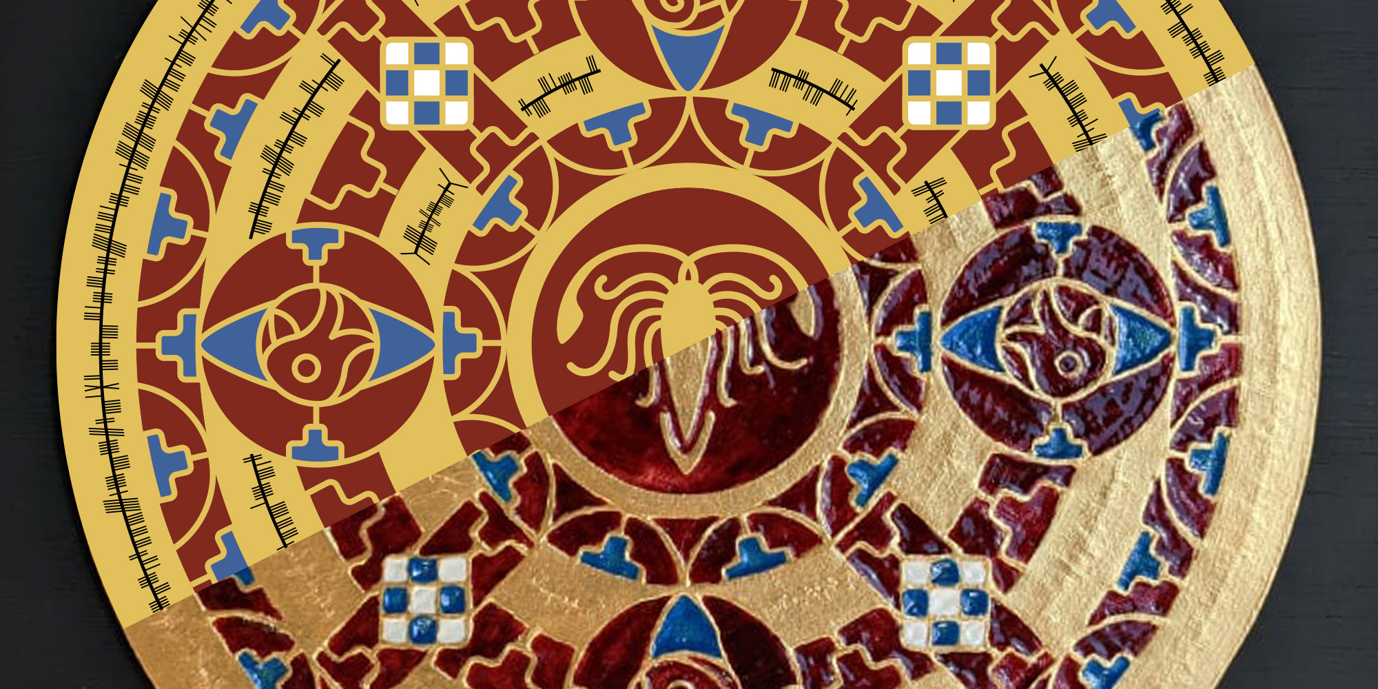
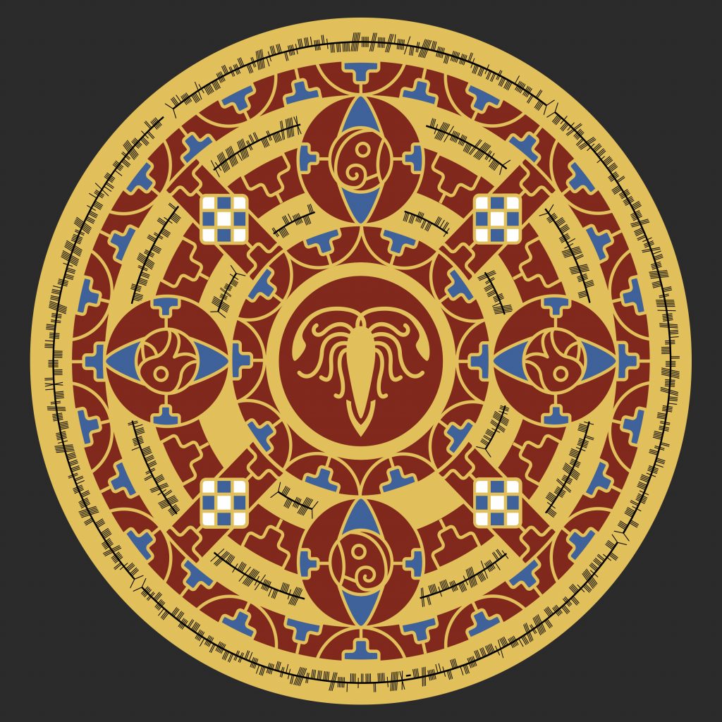
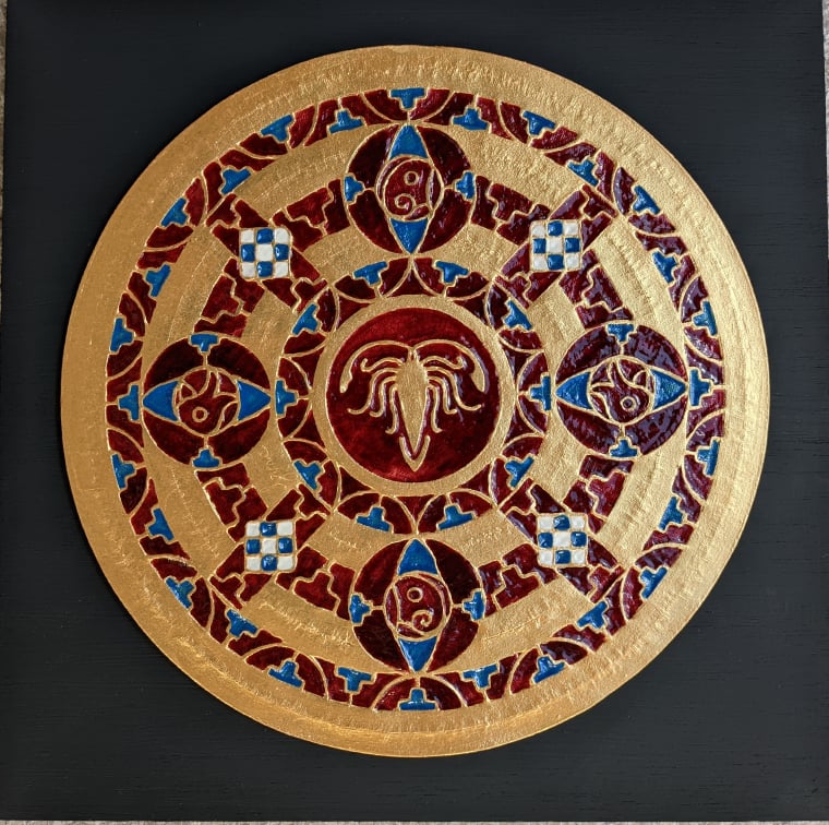
It was established early on that Valdimárr liked Early Medieval English styles, and even more than that, said dude really likes shiny things. Excited by the prospects, we decided on a nontraditional scroll in the classic Early English gold and garnet style, and began to brainstorm materials.
So we set to it with enthusiasm. Would our top surface be metal? Wood? Balsa, Bass, or chipboard? How would we need to prepare the surface so it would be smooth enough to look like gold? What should our garnet be made from? What if we cut away something hard, to reveal a layer of “garnet” underneath?
Whatever we went with, there would need to be a layer of—ideally, patterned—gold under the garnet, because that treatment scatters the light and makes the stone look brighter. (Early English goldwork frequently has a stamped pattern behind the garnets for this very reason.)
Materials aside, we also brainstormed methods. To save her hands, Kolfinna thought she might try using her Cricut to cut out the wood. (She’d already tried cutting everything manually for a scroll last year, and it was an experience her hands would never let her forget. One of my SCA mottoes is “no martyrs”. Suffering for one’s art is bullshit, no matter whether emotional or physical.) Further, it would be easy enough for me to create a file that the machine could use, so that seemed a doubly-logical direction to progress with.
It was at this point that Kolfinna and I simultaneously thought of using resin to fill in the voids cut into our substrate to create our faux garnet, proving that we were once again riding the same brainwave.
(That’s always a delightful moment.)
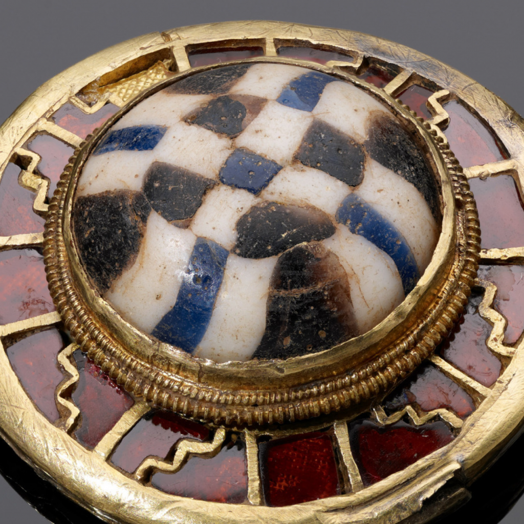
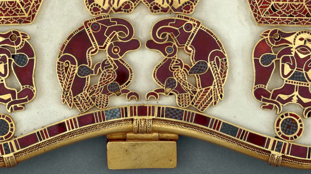
But we weren’t done getting creative. To my mind, one of the most interesting parts of the style was the contrast created between the gold-and-garnet areas and the punctuation of checkered white and blue millefiori glass. So how would we create those sections with resin, which, being a liquid, would not exactly pour into neat cubes without strategy? Would we create different cells? Dry and assemble? Could we find silicone molds small enough?
What if we found small square glass beads, and placed them sideways in a resin matrix so the stringing holes would be hidden?
Or what if we used clay, instead of resin? Millefiori glass is produced by creating patterns using a cross section of thin canes, and it’s not unheard of these days to do the same with air-dry clay.
We hadn’t yet crossed the threshold of decision, and we relished that delicious stage of ideation, where anything was possible.
As we continued to discuss all of our options, Kolfinna’s colleague recommended using a metal plate for the top surface, adding one more possibility to the pile. So while she learned more about its potential and did further experiments, there was something I could be doing.
I began the design.
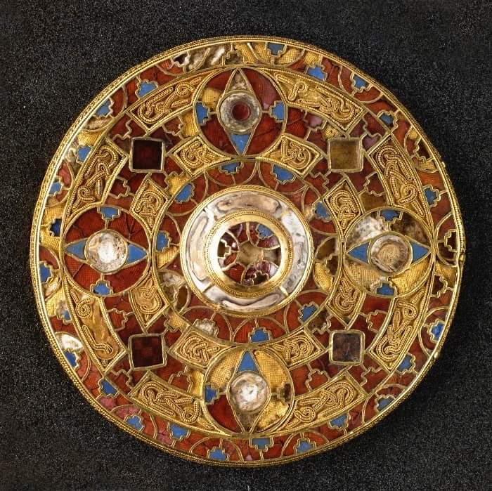
Using Korrin’s recommendation of using the Kingston Brooch for a shield design, I laid out our basic format. Simplifying the areas of gold wirework left us space for Ogham, which, while Irish and not English, seemed not only more likely than runes to lay smoothly within the round area I was filling, but they also would take up less space. And if I knew anything after our past collaborations, we were definitely going to need space.
The centre would contain our kraken. The square sections would be the checkerboard pattern of the millefiori. And the roundels would be animals: crow, for Preachain, and wolves, because he likes wolves.
All this time Kolfinna had been doing material experiments, and she determined that wood wasn’t going to work so well with our Cricut plan. Metal was a likewise non-starter.
I commented offhand that someday I’d like to try using tooled leather to simulate the metal, and subsequently inlay resin into the recesses. At which point I could practically hear Kolfinna light up from several hundred miles away, and over text. It was the gear-like ratchet sound of her brain winding up, ready to add another tool to her artistic toolbelt.
It’s a delightful sound. It always means good things for us.
I had faith she could do it, so we set about discussing what materials she’d need, and what the process would be. It was easy enough to give direction from afar, since tooling leather is not very complicated and I have extensive experience, and luckily Lanea was nearby to lend materials and her own experience.
Now that leather was a go, it was time for brainstorming pigments and painting materials. We decided resin wasn’t going to work, alas, but in our second moment of hivemind Kolfinna and I both simultaneously hit upon using acrylic gloss medium. It would be shiny, translucent, and I knew from my time as a maskmaker that it would stick beautifully to the leather. This decision being made, Kolfinna did colour tests while I finished up the design with the confidence of knowing what our materials would need from me.
For example, now that I had a better idea of the size of the roundels and knew what the fidelity of the leather was likely to be, I knew I’d have to simplify the cross-quarter animals—the crows and the wolves—so that they’d be both readable and so that the blade didn’t make pulp out of the leather.
The design
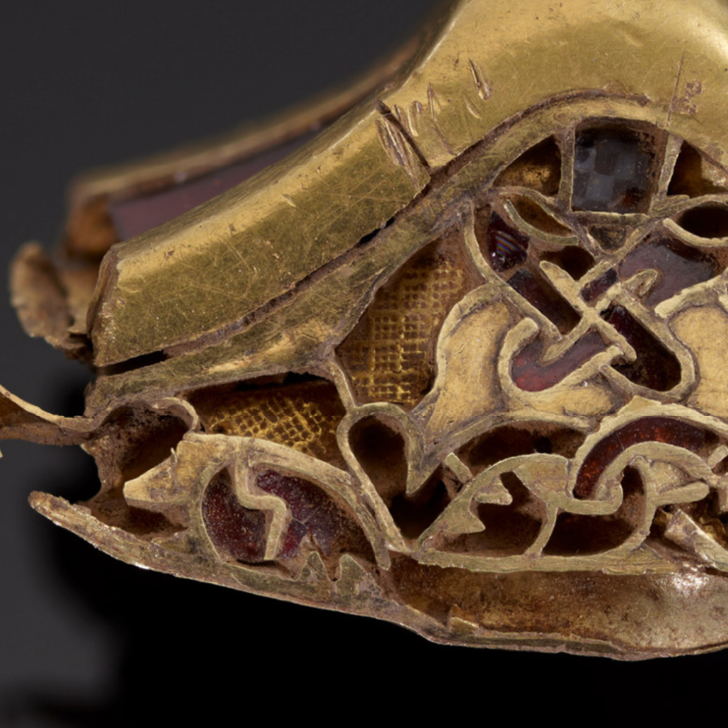
For their forms, I looked at three birds of prey: two from Sutton Hoo, and one from the Staffordshire Hoard.
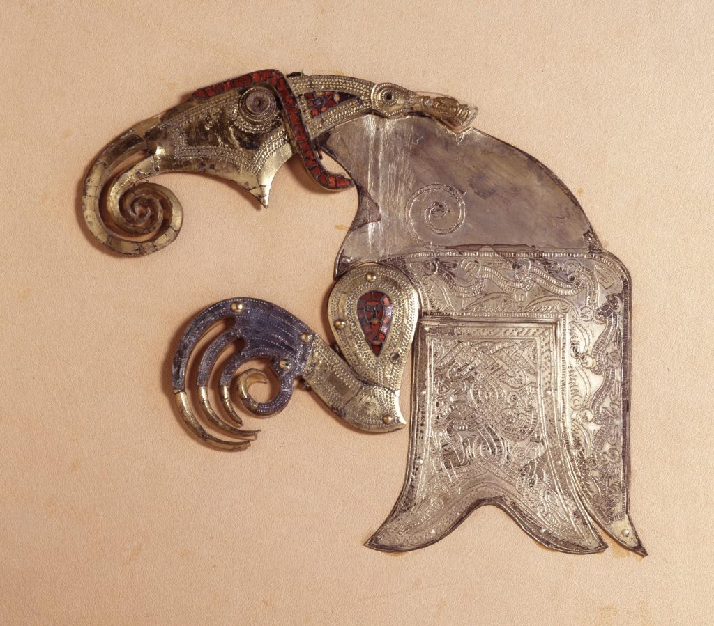
Unfortunately, the first element to be cut was the characteristic angled head element, because there wasn’t a way to include it as well as the eye and beak without running into problems from lines being too close together. (If they were, not only did we risk the design tearing out from the leather itself, but also Kolfinna wouldn’t be able to tool it.) The eye and beak were the priority, so they stayed. I aligned the head so that the back of the head connected to the triangle design elements above and below.
The wolves are taken directly from the lid of the Sutton hoo pouch; they’re charming and goofy, and I couldn’t resist. They were also easier to simplify, needing very few changes. The lines dividing the head into quarters had to go for similar reasons to the above, but the character remained the same.
As I’ve said, in the square sections I planned for millefiori checks inspired by ones in the Staffordshire Hoard, as well as other places. I kept the same colour—white and blue—instead of black and red, the colours of his household. Alas, black and red visually blended into the rest of the scroll, and added neither contrast nor content, only busy-ness.
This only left the kraken.
The kraken
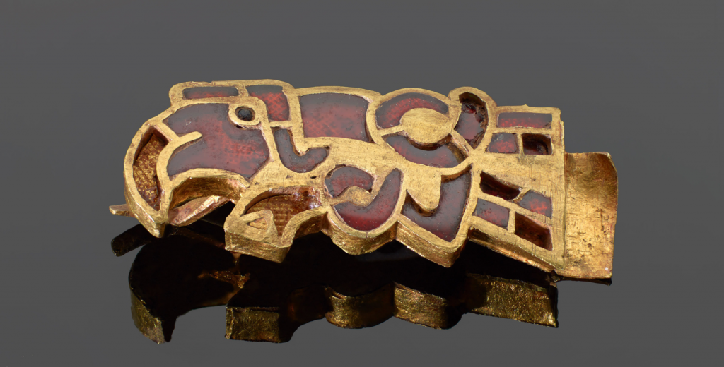
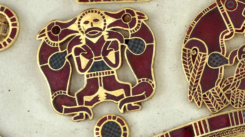
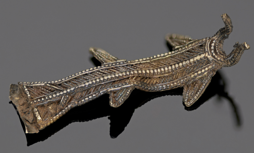
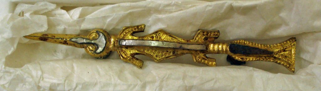
There are a lot of extant Early Medieval English sea creatures in the archaeological record. There’s the Crundale Buckle, which features a cute bony fish at its center. There’s the fish hanging bowl from Sutton Hoo, sturdy yet still sleek. There’s the fish clutched by two eagles, in the folded plaque from the Staffordshire Hoard.
For this project, however, I began by looking at two fishes from the Staffordshire Hoard for inspiration, as well as an indeterminate being from Sutton Hoo which was described by cataloguers as an “aquatic creature”.
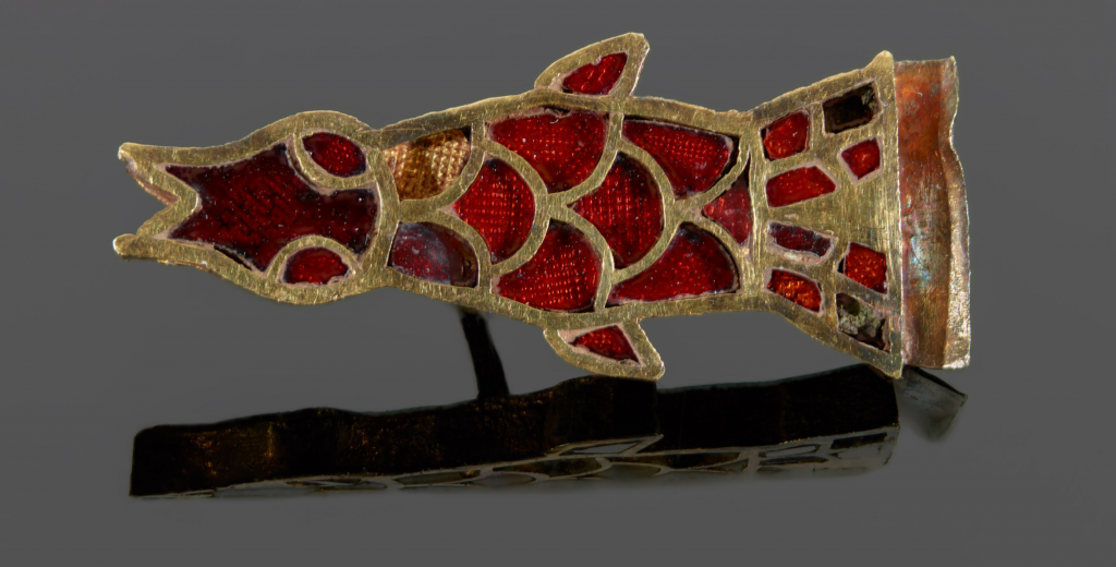
There was a lot to play with, so I began by combining these with a knot of interlaced tentacles. But almost immediately it became clear that, once again, size and fidelity would force me to redirect. In the end I designed two versions: one that looked more heraldic (therefore later period), and one that looked more streamlined and abstract, which was closer to the spirit of Early Medieval English artwork without the interlace. We ended up choosing the former in spite of its later-period aesthetic, in part because the way its movement echoed the movement of interlace, if not its actual execution.
As I was working on it, however, I ran up against a familiar problem: the kraken looked like a penis. (But it always looks like a penis. I once designed a business logo featuring a squid, and it was…a whole thing.) Adding a sharp space to break up the silhouette helped a good bit.
The illustrative elements being completed, I turned to the words.
Ogham in the round is…tricky. Using a computer makes it both harder and easier. If I were working it out by hand, I can’t even imagine how many iterations it would have taken to get the words spread out evenly, and so the signature blocks were isolated on their own lines. But if using Illustrator, it requires a bit of trickery to get the words to reflow around the circle without the program trying to introduce line breaks. As it was, it took me a decent amount of faff. Trying to convince the code to do the thing might not have been easy as zhuzhing by hand, however, working out how big the letterforms need to be is far easier using software, so overall I feel it was a net gain.
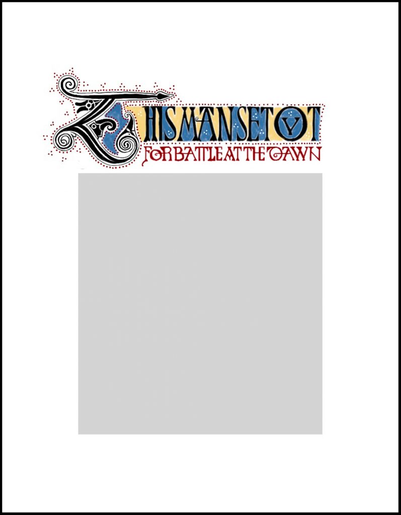
The sidecar
Kolfinna wanted to make a mini “sidecar” scroll so that so Valdimárr could read Lanea’s lovely words. So I created for her an initial and headline, sufficient to announce the beginning of the poem with appropriate pomp.
I largely based my design upon the Barbarini Gospels (Vatican Barb.lat.570), my favourite of the Tiberius Group of Early Medieval English manuscripts, chose for its use of colour and La Téne spirals at the finials as well as its delicacy. I filled it out with elements from the Tiberius Bede (BL Cotton MS Tiberius C II) and the Royal Bible (BL Royal MS 1 E VI).
In spite of the fact that the characteristic lacy display script of the Barbarini Gospels is one of my favourite features, they wouldn’t strike the right martial tone, nor would they fit well with the solidity of the main scroll. (There will be a scroll using that script someday. But this was not that day.) The Bede and the Royal Bible helped me fill in the gaps so I had enough square caps for the headline.
And instead of the biting heads characteristic of the Tiberius Group (and others of the period), I integrated a wolf and a crow head into the initial, based entirely on the design for those set within the roundels on the main scroll.
Color-wise, I chose a blue to coordinate with the blue on the main scroll. I chose red not only to coordinate with the main scroll, but because red is an extremely common colour for manuscripts—so common that it lends its name to the word “rubrication”, the extratextual additions which highlight or add context to manuscripts, often made in red ink. (Think ruby, as in red.) And I chose yellow to compliment the blue and the red. Because they were intended to fill fields among the black lettering, both the blue and the yellow needed to be pale enough to leave suitable contrast.
I’m delighted with the way this scroll came out. If I did it again, for visibility’s sake I might go with two rows of runes instead of a single row of Ogham going around each circle. Even at a small-enough size that it’d fit, it probably would allow us to darken the lines and deepen its impact. (Which the Ogham didn’t.)
Regardless of learning experiences, I’m so proud of the result. The gold worked beautifully on the leather, Kolfinna mixed up perfect fake garnet and glass, and I’m so proud of how she jumped right in to learn a new skill. Lanea was a wonderful co-conspirator, not only for her wordsmithery, but her support and ideas (and jokes). I continue to be honored to work with this crew, and I hope Valdimárr loves what we’ve created for him.